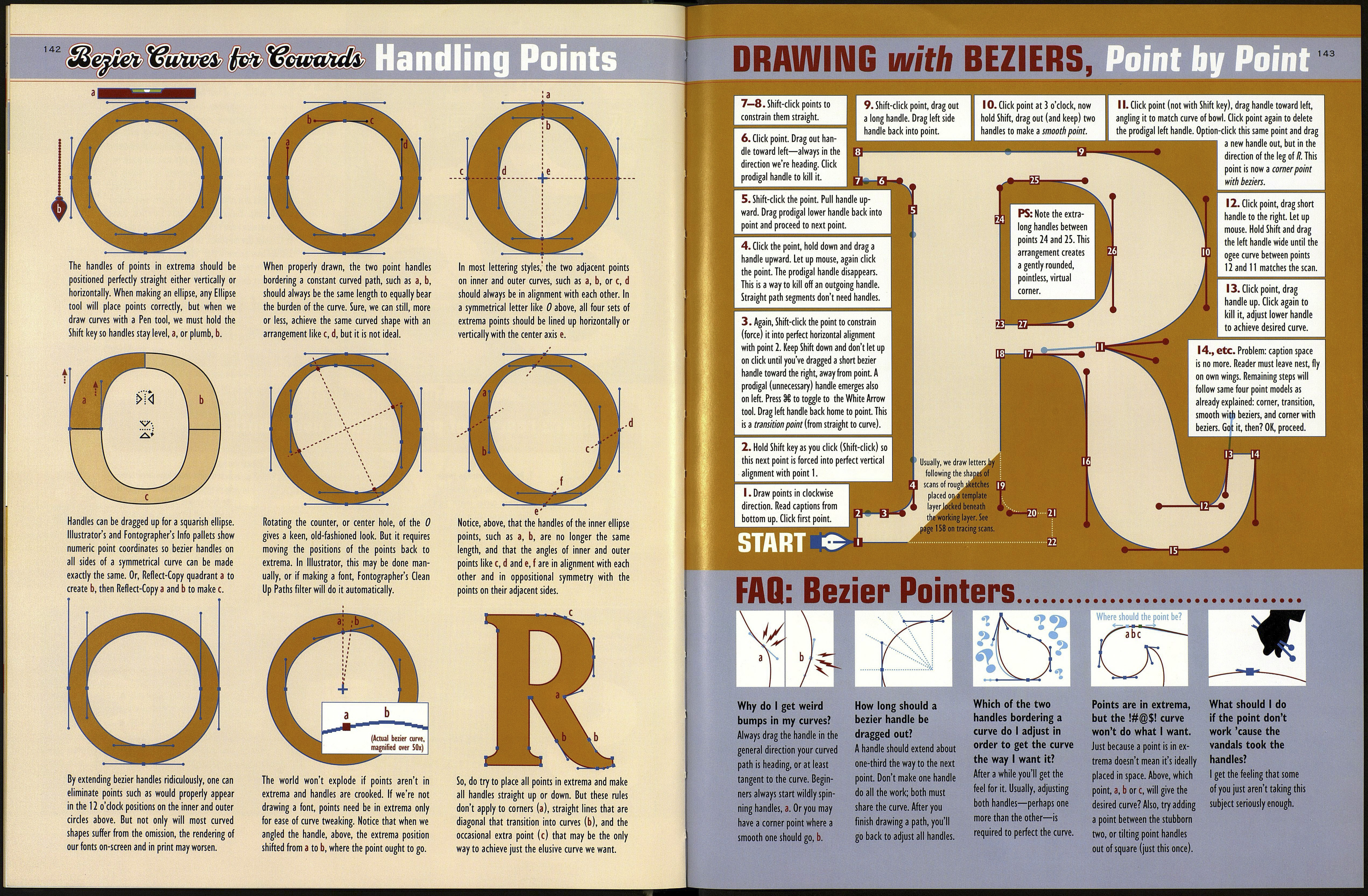
in extrema and keep all handles orthogonal
(straight, vertically or horizontally) by holding
down the Shift key as we drag them away from
each new point we draw.
If we are not drawing a font, the extrema rule is
not absolutely essential, except, as mentioned, it
makes curve editing easier.
Some designers may assume, incorrectly, that
using more points guarantees better rendering of
letter shapes in printers and on-screen. Actually,
the fewer points the better, so long as the extrema
rule is observed. Fewer points usually also means
smoother curves.
I've seen many commercial fonts designed on
now-outmoded font creation software, containing
tons of extraneous points. Sometimes the process
of converting a font to TrueType causes extra
points to be added. Autotracing from scans also
places too many points and puts them in the
wrong positions, i.e. not in extrema. Such fonts can
give the wrong impression about point placement,
(continued on opposite page)
In 1990, when we had 80MB hard drives and 16MB of
RAM, too many bezier points may have contributed to a
general slowing up of font loading or printing, but now,
if you use too many points, it really doesn't matter.
Except as previously mentioned: Points in extrema
may produce better "hinting" for viewing fonts on
computer monitors and the web. Hinting is the manner
in which a letter arranges itself into stairstep pixels on¬
screen. Some conscientious designers edit hinting to
ensure their fonts look good in all sizes and situations.
But I'm told that other reputable designers never bother
with hinting. Personally, I couldn't care less about
hinting because I don't consider the appearance of a font
at 12-point size on-screen, on the web or coming from a
300 dpi laser printer a true "end use." You may very well
disagree. In print, a font will look only as good or bad as
the designer designed it.
Which of these sets
of letters, left, would
be easier to tweak?
141
Compare results of point editing using both methods...
1. Pretend we want to tweak
this S, left, so the shapes of
the inner curves match the
blue-shaded letter in the
background, just look at how
many points we'll have to
move while still attempting
to retain smooth curves.
Well, if you're like me, ever striving for perfection in
letterforms, you'll want to design your lettering for the
most discriminating eye, not the least.
group, which
saved time.
2. Left, first steps have been taken
by dragging points to the edges of
the background S. Next, the bezier
handles will all have to be adjusted
to make the curves smooth again.
That's work! But could we get away
without bothering to fix the points?
(Hey, most users of our font will
never notice the rough edges.)
sS
Here's that shaky
Jfromstep 2 at
12 and 24 points.
Looks OK, huh?
Note: Too many points defining a shape won't necessarily
cause bumpy curves, not if one adjusts them all carefully.
It's just—who would want to?
3. Here's that S again—This time,
with points in extrema. As we drag
each bezier point to its new position,
the resulting curves will remain
beautiful, requiring only minor ad¬
justment of handles.
4. Left, the points at a and b have
been dragged to their new positions.
Arrows show that resulting curves
have remained nice. Right, points с
and d have been repositioned. Only
the point at d will have to be
slightly tweaked by raising the lower
bezier handle a bit.
