ÉÜBi
№
.and the
exceptions
tnereto
The rule regarding height adjust¬
ments applies to all curved and
pointed characters in all fonts and
to lowercase as well as uppercase.
LETTER HEIGHTS MUST BE ADJUSTED OPTICALLY
The heights of curved letters like C-G-O-Q and pointy letters like A-V-W
| should be drawn slightly beyond the top and bottom guides or these
letters will appear shorter than the rest. Here's why: Letters like K-B-L-T
ride along the top and baseline guides for a good while, but 0 and the
point of A come in contact with them for only seconds.
KOBALT
Optical adjustments properly made. Letters appear optically equal in height.
KOBALT
Here, all letters are exactly equal in height, but 0 and A appear diminutive.
KOBALT
Keep it subtle! Exaggerated enlargement oiOandA is as bad as none at all.
tivoli tivoli
Above, bottoms of t-v-o and tops of i-o optically adjusted. Here, with no adjustment, i-v-o-i appear shorter than v-t,
All letters appear virtually equal in height. whose flat tops establish the visual (and actual) x-height.
ÊSII!••• Here's a dilemma I've had with
some monoweight styles: At right, I've optically
adjusted 0 so it looks right with E. Ideally, the
bowls of C-D-0 should have the same diameter,
but they can't since the bowl of D must connect at
proper vertical stem height to match E. Thus, D
may appear shorter than f and too small next to
0. The only solution may be to ignore the problem.
STEM WIDTHS SHOULD
APPEAR CONSISTENT
Ь A vertical stem rotated or
sheared may appear heavier or lighter
than it did in upright position. This is
proved by comparing the horizontal
strokes of the E (in the previous
example, just above) with its vertical
stem. All strokes in f are exactly the
same, yet the horizontals appear
thicker. To counter this problem,
designers of monoweight letterforms
make adjustments as needed to keep all
strokes looking optically identical.
I\ 1^^
The vertical stem, a, was copied and
rotated 90°. Your eyes do deceive
you! The copy, b, now horizontal,
appears to have become slightly
thicker than the original, but the
identical circles prove that both
shapes are the same thickness.
b
The vertical stem, a, was copied and
sheared (sometimes called "skewed"),
b, as we might do to make the
diagonal strokes in A-H-V-W-X, and
so on. Shearing causes the stem to be
actually—not just optically—nar¬
rower than it started out.
V*.
A better way to maintain stem weight
is to rotate, not shear, the vertical
stem, a, which technically maintains
width although there may be a slight
illusion of weight gain, b, that would
need to be manually adjusted. The
illusion becomes more acute when
stroke ends are squared off, с
LOGO, FONT a LETTERING BIBLE 1 13
INCREASE STEM WIDTHS ON CURVES TO OPTICALLY MATCH STRAIGHTS
In roman styles, the width of thick vertical stems as in M-D-E-R, below, should always remain consistent. But
at the maximum stress points of the bowls of O-D-R, strokes must be drawn slightly wider than the standard
straight vertical width or they will appear to be too narrow. This is because the widest points of curved bowls
achieve that full width for only a second, while straight vertical strokes establish full width for a good while.
Here, the widest
parts of all upright
strokes are equal,
but 0 appears
more slender than /,
wouldn't you agree?
10
>ERN
■ пят
Richard Upton's Detroit Bodoni, based on Morris Fuller Benton's revival of Bodoni for ATF, is used
in the examples above. Note the flawlessness of the rendering, the perfection of weight
distribution and the complex logic behind serifs that alternate between square and curved-
approach. The Л* at top right is fascinating because the designer brought the diagonal stroke
straight past the thin left stem into a square serif without feeling the need to curve the junction.
CROSSBARS MUST BE ADJUSTED FOR OPTICAL CENTERING
Standard theory is that a crossbar, such as would appear in //or E, must be placed slightly
above center lest it appear to be drooping below center. Check out most
traditional fonts and you will see that this rule has been applied: The crossbars
I have been placed on or slightly above dead center. The same law usually applies to
other letters, like B-G-K-R-S-X-Y-f-k-t, depending upon style.
In designing lettering we usually establish six
horizontal guidelines: baseline, cap height, x-
height, optical (sometimes called "overshoot")
baseline, optical cap height, and optical x-
height line. So you're asking, "These optical
overshoot guidelines are, what, like 1 percent or
2 percent of cap height?" I can't help you.
Establishing these tolerances is something one
does by eye and by trial and error. We draw //-
0-H and adjust the height of 0 until it looks the
same as //. We then base the height of C-G-Q
and applicable numerals on 0. We do the same
with lowercase letters, establishing first the
height that lowercase о looks right compared
with flat at midheight letters like i, k, or w.
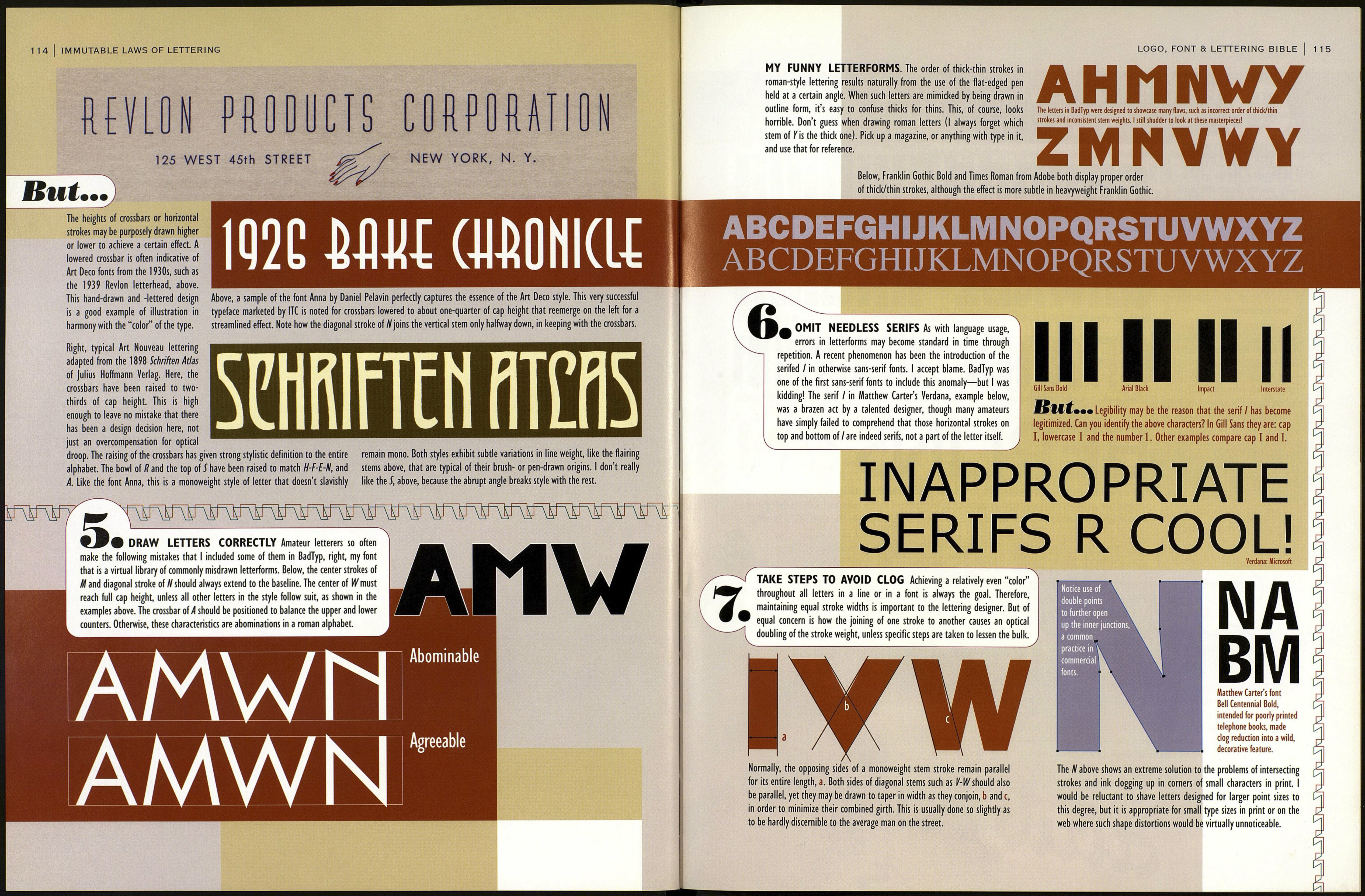
7b ЕВИ Above, analysis of letters from the font Futura Book reveals that HBBB iTMirwirwiFwirwirwwwirwir^
the optical balance is in all cases above dead cente r. Right, in
these letters drawn as examples, the centered crossbar, a,
appears too low. When it's placed above center, b, it looks right.
Crossbars too high or too low, с and d, look weird. But exceptions
to this crossbar rule follow on the next page.
