ULJtv-.
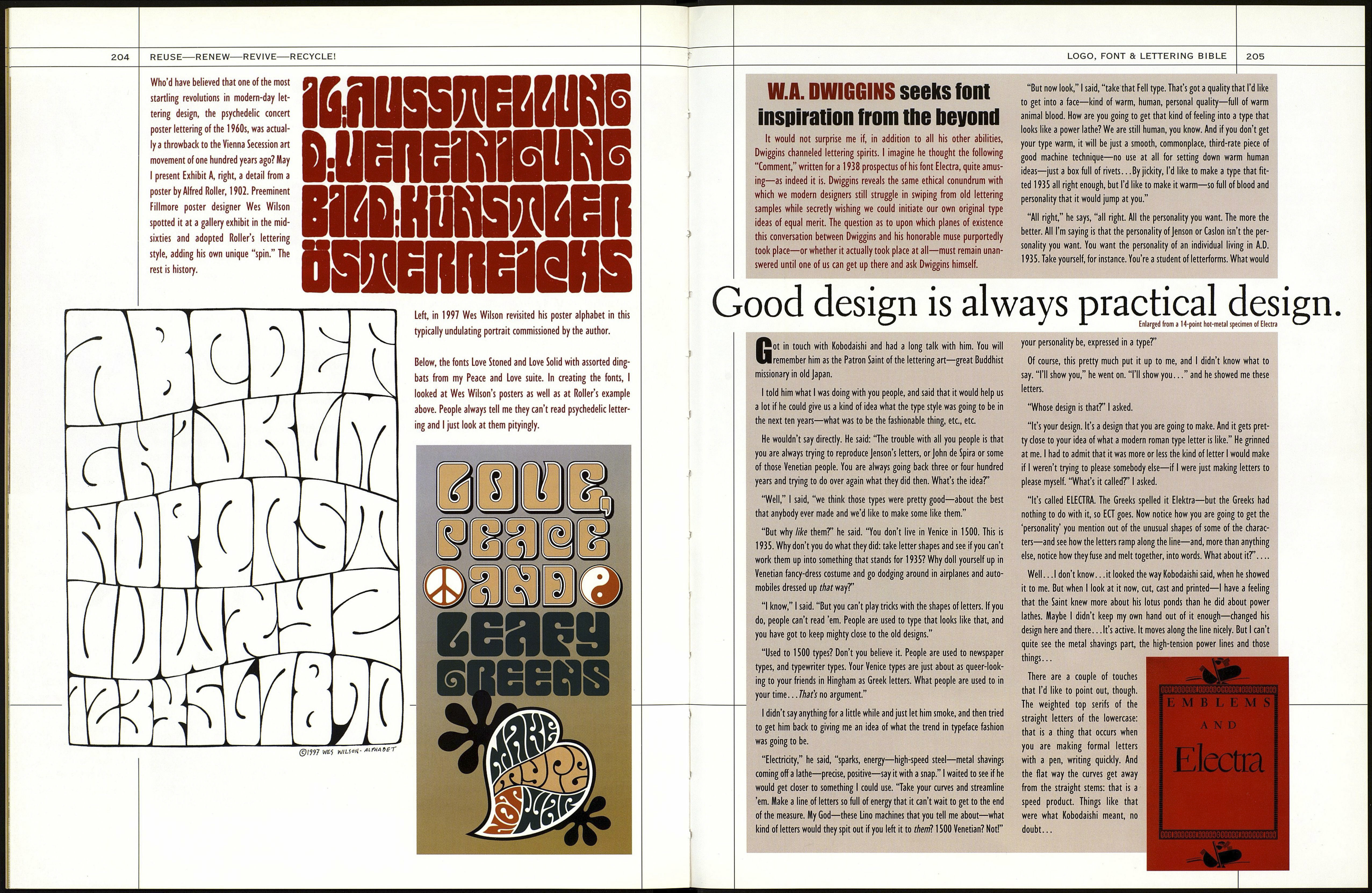
Paul Shaw and Garrett
Boge's font Ghiberti, right,
is "a contemporary inter¬
pretation of the bold
Florentine lettering style of
the fourteenth and fifteenth
centuries." Donatello, below
right, is "a classically pro¬
portioned design inspired
by the lettering on the fif¬
teenth century cantoria by
Luca Della Robbia." Shaw
and Böge don't sit around
browsing through old
Hational Geographies for
inspiration. No, the peri¬
patetic pair spends time in
museums and libraries and
makes photos and rubbings
of period inscriptions.
ARS LONGA VITA
BREVIS EST.COM
LATI NA EX
MANHATTAN EST
LOGO, FONT & LETTERING BIBLE
203
Л
<-
F
SPIRRTIOn
' ew ideas are entirely lacking in antecedents. Looking backwards, whether thousands
of years or to yesterday, becomes the vehicle through which seemingly new ideas spring into
being. Think of it as recycling. When it comes to type design, with its necessary adherence
to conventionalized letterforms and the need for some degree of legibility as its guiding con¬
straint, mining the past for viable models is often seen as a necessary, if not proud tradition.
That's not to say none of us ever come up with entirely original font concepts from out of our
own heads. Absolute originality in all our design work might be the highest goal, providing the
results are commercially viable. The designer's eternal dilemma—whether to adhere to accept¬
ed norms, or to create something so new and different that it might not be accepted—is explored
in the sidebar, next spread, reprinting Will Dwiggins's famous dialogue with his type muse.
Ideas for new fonts, as this section shows, can come from such obvious sources as vintage
signage, mosaic inscriptions, old print matter such as magazine ads and book covers, and even
from automobile and machinery nameplates. But type inspiration can also come from such
intangible sources as a dream, a comment or music.
Whenever we base a font that we intend to sell on someone else's design, we must ask our¬
selves: Is the designer dead and could his heirs sue? The very question reveals why so many
fonts are based on obscure sources in the public domain. Hopefully, we inject our own style and
personalities into every font we, uh, emulate, and this personal spin (which is usually just a fail¬
ure to emulate correctly ) helps us justify the theft: the highest compliment a designer can pay to
a dead one. Designers steal mainly for two reasons: We fear we cannot think up good enough font
ideas on our own, and we can't resist copying great old letterforms that inspire and excite us.
AMNPR
Every book on type must mention ancient Rome's famous inscription (c. A.D. 114) at the base of the Trajan
Column, and this one is no exception. The letters of the Trajan inscription, believed to have been painted
in brush before being incised, have been praised through the years as the finest example of classic Roman
lettering. And after that, the praisers try to fix it. Frederic Goudy fixed its flaws in his font Trajan, and so
did Carol Twombley—though not quite as much—in her digital version for Adobe. That's because the let¬
ters are very inconsistent, and they lean every which way. It's like the stonecutter had his eyes on the sun¬
dial, going chip, chip, "When's it gonna be five o'clock?" Look at the stem widths of H, above, compared
with R. The ? is different again. The late Father Edward M. Catich, noted Catholic typophile who made
extensive tracings of the inscription (from which come the five letters above), pointed out in his 1961
book, The Trajan Inscription in Rome, that few of the fonts based on the Trajan capitals—actually refer¬
enced from a spurious cast of the tablet in the British Museum—accurately reflected the original. But all
my nitpicking aside, the Trajan letterforms are piss-elegant and remain inspirational to this day.
