ORDE OP DE SP MOUW/ ЕП
had on der den arm een ver
sf eten 58 portef euíííetje/ л
waarm de boeken van een
^ of ander teesgezeischap
werden rondgebracht. s*>
André van der Vossen's Houtsneeletter, for Enschedé.
graphic scene from time to time. Even Mistral, perhaps the most
thorough attempt to achieve the illusion of rapid handwriting,
ceases to be convincing after one's first sight of it, in spite of its
numerous alternative characters. (As to alternative forms: they
are a practical possibility in a system of manual composition,
such as 'rub-down' lettering; but in a keyboard-directed film-
setting system a special computer program is needed to call the
alternatives into position - a process which is necessary and ad¬
vantageous in the composition of Arabic but hardly justifiable for
a display roman used only occasionally).
The Neuland type, then, demonstrates that free lettering is
incompatible with the inevitable regularity of type in print. The
intention that brought the design into being was unrealisable. In
the strict sense, the type is a failure. But failure is often more
interesting than success. And after all, it is a matter of degree. The
strength of the illusion of spontaneity varies according to the
number of the 'free' letter forms, and the context. A one or two-
word title in Neuland, in which the letters do not repeat them¬
selves too often, in association with one of Koch's gothic types -
the bold Koch-Schrift, the Jessen or the Wallau - makes a fine and
homogenous effect. But when Neuland is used with a roman text
face it seems to be over-acting - which leads to the thought that
there is a place for a roman with something of the angularity of
the gothic; the quality, in fact, of which we catch a glimpse in
Berthold Wolpe's Pegasus roman and in Warren Chappell's
Trajanus type.
'The task of creating a type with a pair of compasses and a
straight-edge has always attracted me . . .' A curious statement
from Koch who, according to Siegfried Guggenheim, a friend of
many years, was proud of his title 'der Schreiber' and to whom, as
Fritz Kredel said, a handwritten book seemed the pinnacle of
achievement. Yet the words were quoted by Julius Rodenberg in
an article he wrote soon after Koch's death - and Rodenberg was
a careful writer. My guess (it is just that) is that Koch was ration¬
alising what was for him an uncharacteristic piece of work; not
out of conceit - he was reputedly the most modest of men - but to
-168-
Some designers and
their types
help make it clear that he alone was responsible for it and any
defects it might have. He went on: 'People are always saying that I
try to express my own personality in type design, but that is not at
all true; on the contrary, I do my best to avoid such expression¬
ism. Only I am not always successful. Even in this case I have not
succeeded.' (Whether or not that was a bad thing remains to be
seen.) It is my impression that the Kabel sans-serif type - for it
was that that Koch was referring to - was not the outcome of a
long-held personal desire to add ruler and compass to his familiar
lettering pens and woodcutting knives (how could such an artist,
or anyone else, for that matter, develop affection for a ruler or a
compass?). I suspect it was simply his response to an exterior
demand, perhaps from Karl Klingspor himself. And having
accepted the task he applied himself to it with enthusiasm, soon
forgot the commercial origin of the task and remembered only
the new experience it provided.
Klingspor must certainly have been aware of the lively interest
that was being shown in the idea of a modernised Grotesk, and he
may well have seen trial proofs of the faces that Jakob Erbar and
Paul Renner were creating for rival foundries. If so, he would
have told Koch that the new style that they had contrived for the
sans-serif derived from the use of geometric forms. Koch may
have learnt that independently. In any case, he responded to the
idea in his own way. In the designing of Kabel his attitude was
rather different from that of other designers; the geometry was
there, but so was art - the 'personal' features to which Koch
alluded in the statement quoted earlier.
The light version was the first to appear, in 1927. In the follow¬
ing year a thirty-two page booklet (the most handsome type
founder's specimen I know) showed all the sizes of Kabel Light
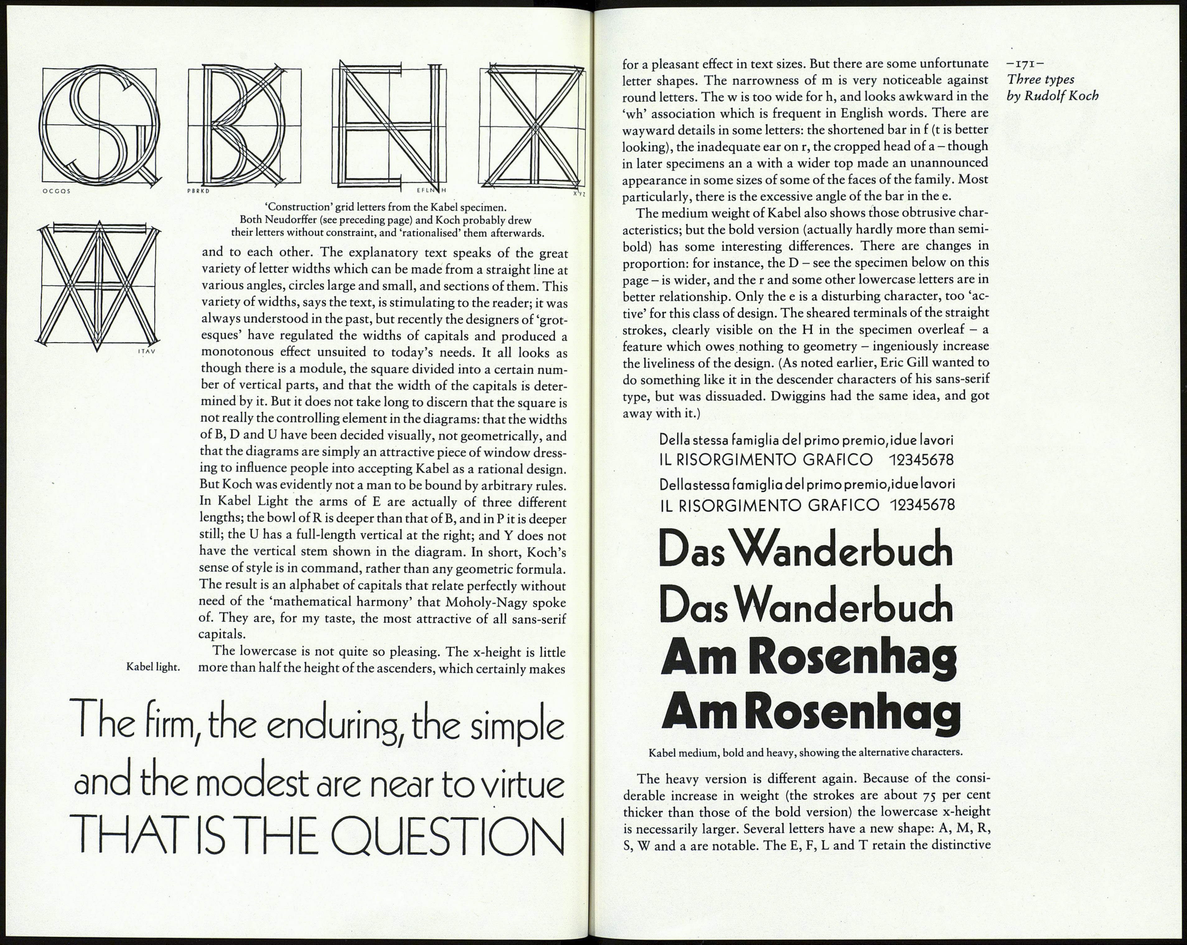
from 6 to 84 point. It included a set of diagrams which are as
interesting for what they do not show as for what they do. They
are reminiscent of the instructions for designing roman letters
published by Fugger of Nuremberg in 1538 and by Dürer before
him. The diagrams show the proportions of capitals to a square,
— 169-
Three types
by Rudolf Koch
A letter from a
manuscript instruction book
by Johann Neudorffer
(1497-C.1560).
