, , -"*: ITU DIUM LITTER ARUM
Some designers and
their types
DER KUNSTKRITIKER
WISSENfúEBIETE
BUCHDRUCK
BREIS6AU
ARBEIT
RHEIN
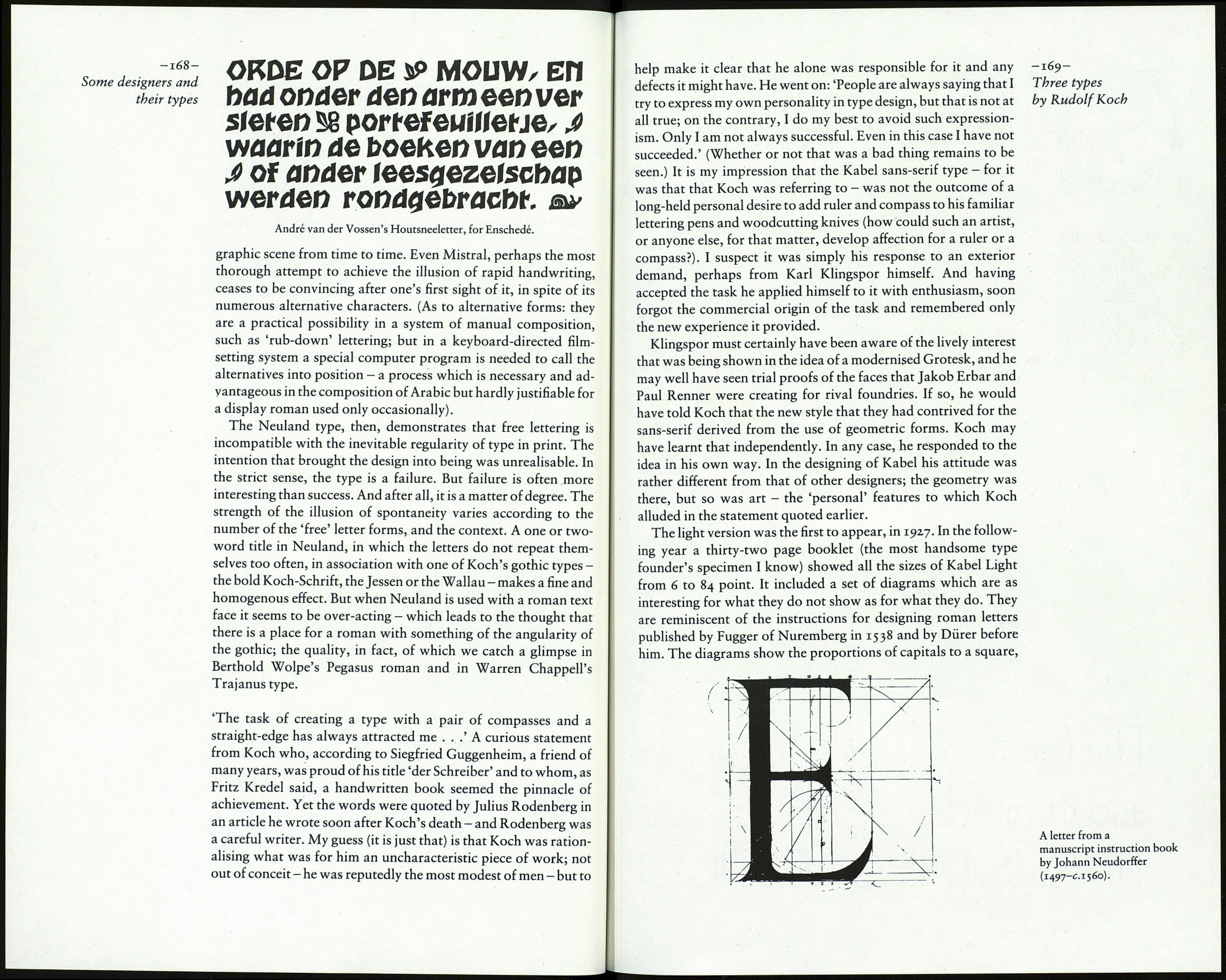
Neuland: note the changes in letter shape from one size to another.
natural result when the letters were cut directly on the metal by
the designer. But was the design as artless and 'natural' as it
seemed?
Some, but not all, of the letters vary in shape from one size to
another. Consider the E, for example: the treatment of the ends of
the horizontal strokes is so different from size to size as to make
one think the difference is contrived, not accidental. By contrast,
the shape of the S hardly changes; if it had done so, it could only
have become ugly or absurd. The thought occurs that some of the
variations are the result of intention, not chance; as if, having cut
the first size, Koch realised that an apparently random result in
the other sizes could only be achieved by deliberately shearing the -167-
strokes in another way, so that the E, for instance, would be Three types
noticeably different in one size from the next. A much greater by Rudolf Koch
illusion of spontaneity would have been gained if several vari¬
ations of each letter had been made in each size, to be used by the
printer at random, as was done much later in Freeman Craw's
Adlib type. That may indeed have been the intention, because
there are variant forms of C, R and U to be seen in the 28 point
(possibly the pilot size), but not in any other.
When in Dossier A-Z 73, Charles Peignot said, 'A clear dis¬
tinction must be made between lettering and type design. In
lettering, fantasy is of the essence; in type design, discipline is the
first requisite', he was stating a truth (though I would prefer
'freedom' to 'fantasy' and 'regularity' to 'discipline'). In the Neu¬
land type Koch seems to have been trying for the unattainable,
the perfect fusion of lettering and type; to put a free style of
lettering into a system - the ordered accumulation of letters in a
text for printing - in which the individual characters are essen¬
tially repetitive, the second and third A in a line being exactly the
same as the first. The more frequent the occurrence of a letter the
more it diminishes the illusion of spontaneity — at least for the
typographically trained eye. For the layman the casual effect may
seem quite convincing - until a line of Neuland is associated with
another type, when the contrast of the 'free' and the formal may
produce in the subconscious a vague sense that something is not
what it purports to be.
Erhebe die Напое,
Anpeikht,
urnamenloi
über mein H au pi,
dal feu Ich |i ürze in blitzende Siunden, rei»e mein Blut hoch in blühende Frauen, uno wiejie dahin in linkende Geigen *~ liehe ^ The Mendelssohn type. The point is made clear by the Mendelssohn type, which was
introduced by the Schriftguss foundry of Dresden in 1921 (two
years before Neuland) and used by the publisher Jakob Hegner
in books with woodcut illustrations. The 'unpremeditated'
appearance of the letters, particularly the e, is negated by the
frequency of their occurrence, especially when there are two of
them in a word. The same is true of the Houtsneeletter cut for the
Enschedé foundry in 1927, a similar exercise in the 'primitive'.
And the point applies equally to those informal script types,
simulating the effect of brush or pen, which appear on the typo-
