-164- Sniffen to design a .close imitation of it, called Rivoli. Koch's
Some designers and design was perfectly suited to express in print the idea of
their types 'elegance' in social and business affairs. The type probably has no
place in the 1980s; the notion of elegance is under-valued now,
even when it is understood. But for the student of type design
Koch-Antiqua is interesting not only as an unusual type in itself
but for the contrast it makes with the next type to be considered -
a type from the same hand, and one of the most remarkable
designs of the twentieth century.
Koch's Neuland type appeared in 1923. It has two obvious char¬
acteristics: it is a sans-serif, and the letter forms seem to be unpre¬
meditated and 'accidental'. In both respects it is not the first of its
kind. Sans-serif lettering of the same blockish style had been used
to powerful effect on posters designed by Oskar Kokoschka in
Vienna before the First World War, the lettering looking as
though it had been rapidly cut from paper; and, as previously
EBS3
From a poster by Oskar Kokoschka, Vienna 1908.
noted, a primitive unregulated effect was the chief characteristic
of the titles in the woodcuts on the covers of Expressionist public¬
ations. The Neuland type is, though, entirely Koch's own in its
handling and realisation. And there is no doubt that it was his
own idea to create the type, not Karl Klingspor's. Klingspor dis¬
liked the face, but he respected Koch so much that he allowed it to
be produced (though he omitted it from his book on type design,
Über Schönheit von Schrift und Druck, published in 1949 shortly
before his death).
Neuland was much admired in its time. Francis Meynell used it
in 1924 for the Nonesuch Press edition of Genesis, where the type
accompanied a set of white-line woodcuts by Paul Nash. Stanley
Morison referred to the type as 'very fine'. The normal and the
inline version of the face were popular with advertisers in Britain.
And Monotype produced an imitation of it called Othello (its
name was the best thing about it). At the present time the face is
included in a catalogue issued by a manufacturer of filmsetting
equipment; but it seems unlikely that the type will regain much of
its former popularity, because of its distinctive and powerful
personality and the absence of a lowercase. Yet the design is well
worth examining, for reasons that will emerge.
In the first specimen of the type issued by Klingspor there is an
introduction signed by Koch himself. He begins by telling us that, -165 -
as was once the custom, the creator of this design and the maker Three types
of the punches is one and the same person. There was no previous by Rudolf Koch
design on paper, he says; the type emerged directly from the
action of the tool on the metal. The file alone produced the letter
forms - first in the shaping of the counter-punches, which were
struck into the face of the punches to make the interior spaces,
and then to fashion the outer edges of the letters. So far, so good.
He then says: 'Since the invention of printing until well into the
nineteenth century punch-cutting was done in exactly that way.'
That is true enough as to the physical operation, at least in some
quarters; but Koch's statement might lead the reader to think that
the punch-cutters of the past produced their punches without any
sort of reference in front of them. No doubt they did not work
from drawings of the modern kind; but the evolution of type
designs during the four centuries since Gutenberg makes it plain
that punch-cutters must have had some sort of model or pattern
at hand - a professionally written manuscript, a printed page, a
font of type, or a previous set of punches; and their shaping of the
letters on the metal, with whatever subtle divergence from the
model was intended, was premeditated and deliberate, and as
accomplished as time and skill allowed.
The final words in Koch's note are interesting. 'This method
allows a measure of freedom in the formation of characters
which could not have been achieved by any other means, and
therein lies the justification for the undertaking.' This is a strong
clue to his motive. I suspect that he wanted to see in type form the
kind of vigorous and untrammelled lettering he had often in¬
cluded in woodcut prints and block books; that he could get the
effect he wanted only by cutting the punches himself; and that by
so doing he was demonstrating his belief that the craftsman and
the artist should be one - a view he held strongly and sincerely, as
Rodenberg records.
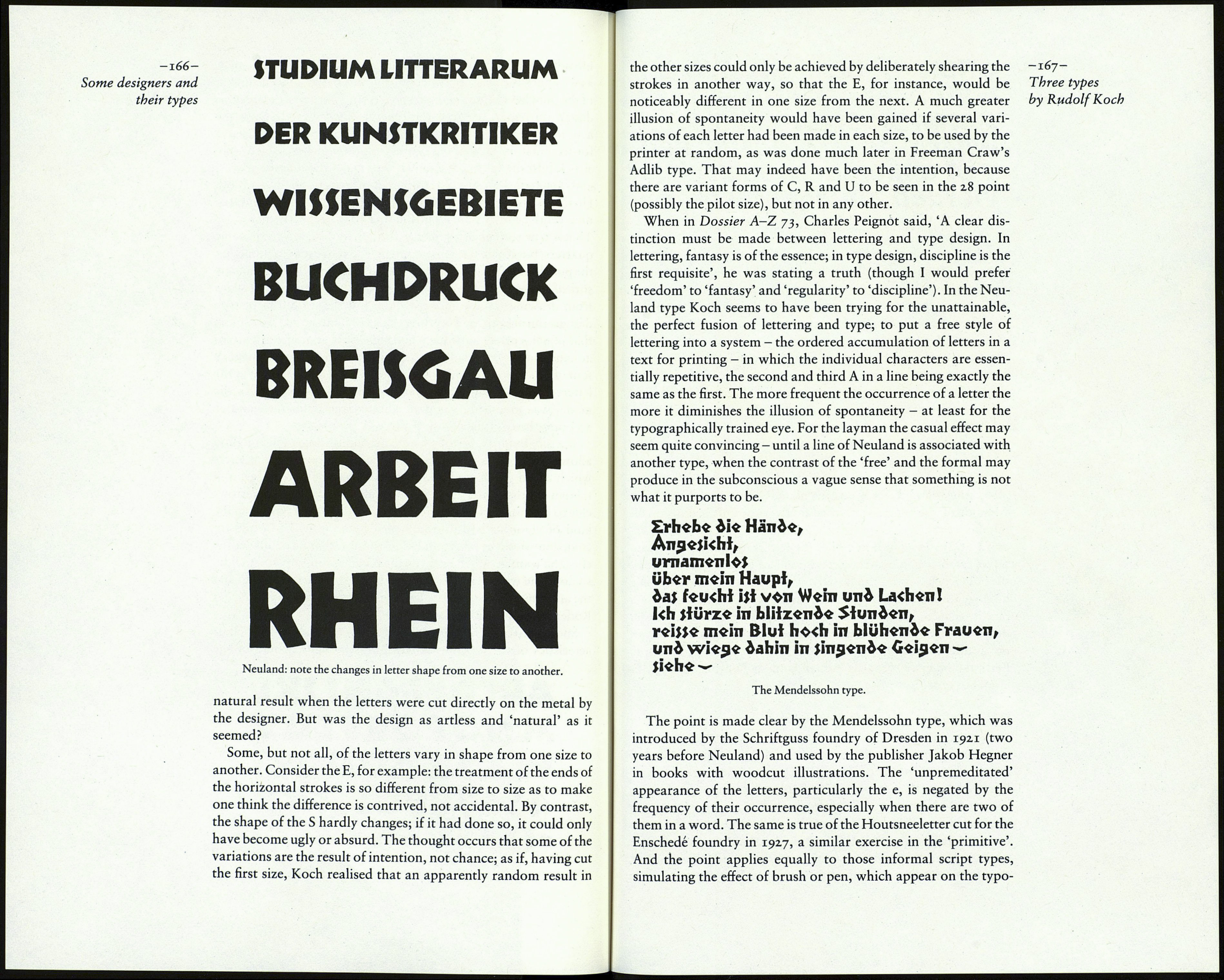
Spontaneity and the fortuitous effect were to be the chief char¬
acteristics of the type; and that, it was thought, would be the
ABCDEF6HIJKL
MNOPQRÍTUV
WXyZAOU 121
4567890*,:*'!!
Neuland.
