-іб2-
Some designers and
their types
bong o\ Home
GRINDER
Kode through the natural
HAIL COLUMBIA
BARGE
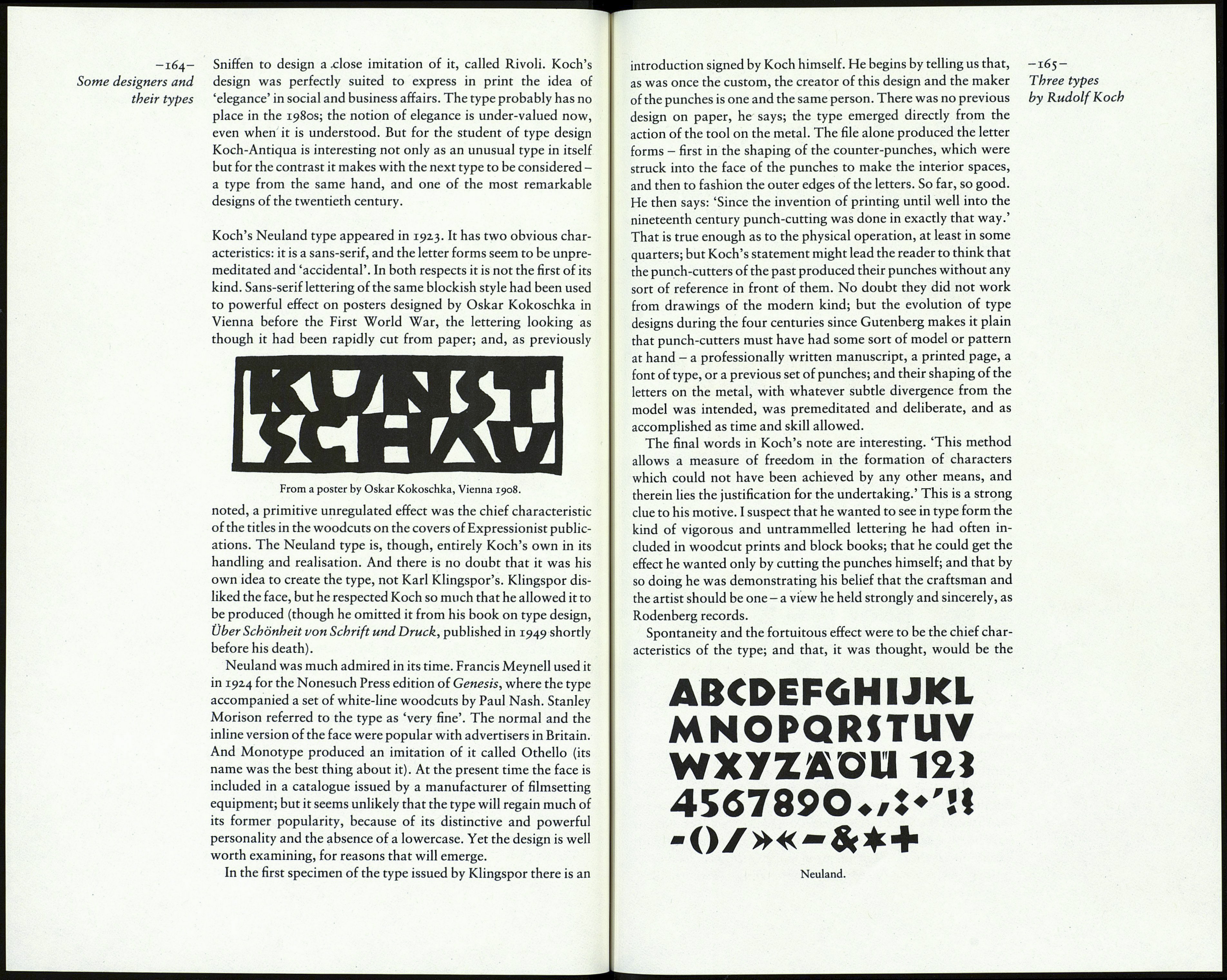
Koch-Antiqua Bold.
Although the bold version of Koch-Antiqua is a close relation
of the roman there are so many differences of detail as to make it
plain that Koch saw the bold version as an opportunity for new
invention. Where the roman E has only a slight glyph on its centre
arm, the bold E has a prominent vertical terminal. The A has a
thick bar; the arches of m are angular; the d has a flat serif at the
base of the stem. These are all distinctly different from the com¬
parable features of the roman characters. Note, too, the dif¬
ferences in t, r and y. In the larger sizes of the bold version the
round letters reveal a singular combination of the effect of the
pen, in the markedly oblique stress of the thick stroke, and of the
knife, in the irregularity of the edges of the curves. This 'carved'
klÍeThe¿ookofÍí, effeCt ÍS alS° Clear t0 See Ín A' K and W; and' ÍnCÍdentally> iC ÍS a
the English version ' characteristic of Koch's drawings: see, for instance, the emblems
of Koch's Das Zeichenbuch. in his Das Zeichenbuch. There was a heavy version of Koch-
Antiqua, with so much weight added to the thick strokes as to
cause the loss of everything that made the other weights attrac¬
tive. It was not exported.
The italic of the light face is less admirable than the roman;
pretty and affected rather than elegant, the angle rather too acute,
though e is almost upright, and the d is a positively ugly letter. In
the 12 point and smaller sizes the capitals are single stroke; but
from 14 point upwards the main strokes in the letters have a thin
line added - an idea which only a designer thoroughly familiar
with the elaborate capitals of some of the older German gothic
When,in the course of human events it he=
comes necessary for one people to dissolve
the bands which have connected them with
another, and to assume, атопз the powers
of the earth, the separate and equal station
to which the laws of nature and of nature's
God entitle them, a decent respect to the
OPINIONS OF MANKIND
¡en in au conditions 01
Lite, the lowest as well as
THE HIGHEST
Koch-Antiqua italic.
Object is photographed twice
the size the plate is to be when
-163-
Three types
by Rudolf Koch
Koch-Antiqua Bold italic.
lettering, and uninhibited by the traditions of roman and italic,
would apply to an italic face. The bold italic is a different case.
The lowercase is a sloped roman and therefore comparatively
plain, though it is not very comfortable to read because the round
letters are too upright. The capitals from 18 point upwards have
the double-line main strokes, and because the capitals are less
fanciful than those in the light italic they make a pleasant effect
when used with each other in titles - better, in fact, than when
they are the initials in lowercase words.
The Koch-Antiqua types, especially the light versions, were
obviously well suited to such ephemeral printing as invitation
stationery and fashion advertising, so swash versions of the
capitals were produced as alternatives. This was gilding an
already decorative lily. And in response to an American fashion
of the 1930s, the founders even offered special tall capitals and
ascenders letters, four times the height of the ordinary lowercase.
It is difficult to believe that any printer would accept such an
unrealistic notion.
The Koch-Antiqua design became very popular in the 1920s;
the American Type Founders Company even engaged Willard
