— ібо—
Some designers and
their types
abcderghijklrnnop
qrstuvwxyz
ABCDEFGHU
KLMN
OPQ
RSTUVWXyZ
12345Ó7890
1 he annual picnic this year will
be bela at the new reservation at
NANTASKET BEACH
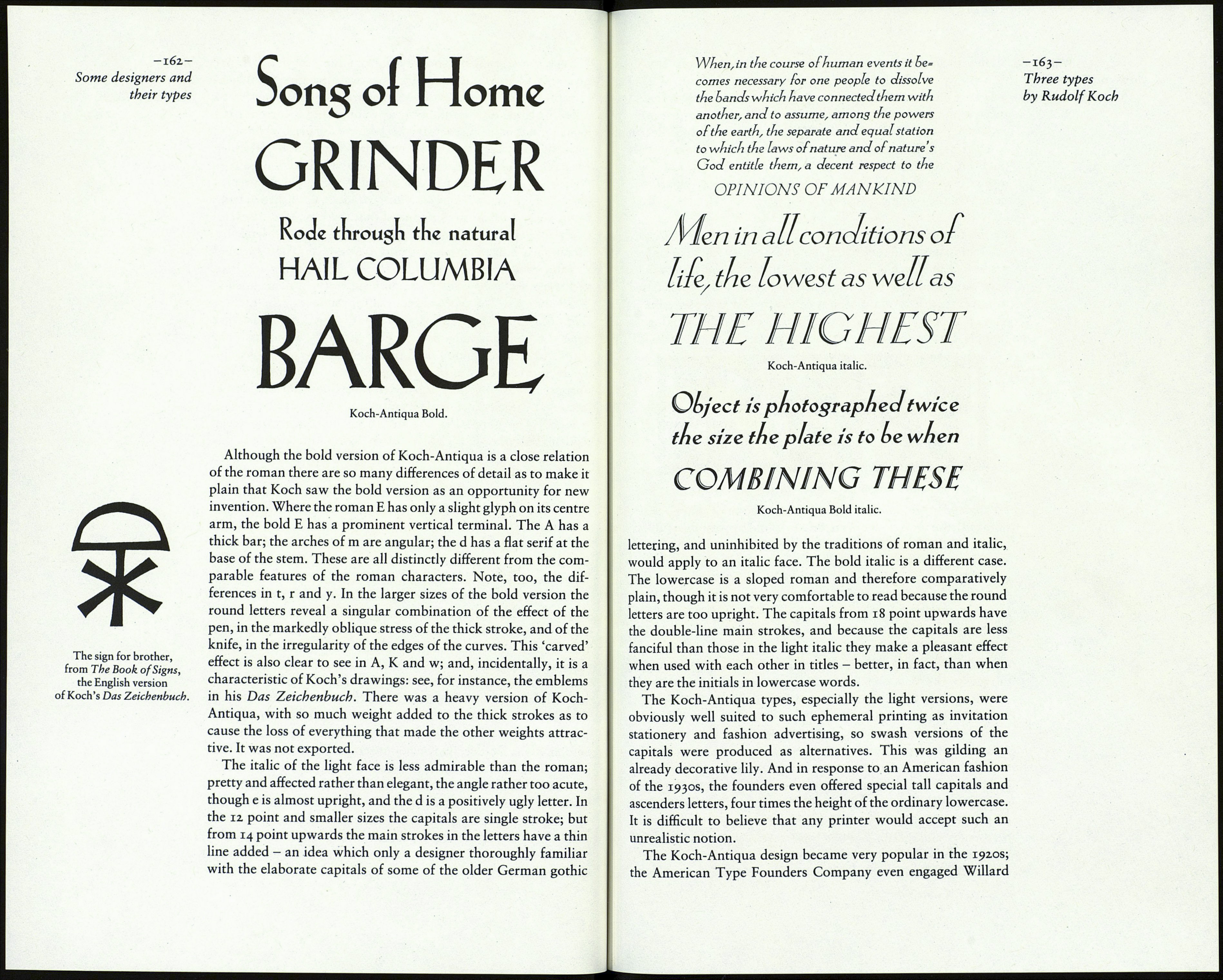
Koch-Antiqua roman.
Koch's first roman type, apart from the set of decorative -161-
capitals called Maximilian Antiqua, was the type known as Three types
Locarno in Europe and as Eve in America. In Germany it was by Rudolf Koch
called Koch-Antiqua; and because it appears in a current cata¬
logue in that name it seems the best one to use here. The roman
was issued in 1922, the italic in the following year and the bold in
1924. The origin of the design can be seen in a lettering exercise
done by Koch at the Offenbach school in 1921, and then repro¬
duced in his Das Schreiben als Kunstfertigkeit, published in Leip¬
zig in 1924. As Rodenberg pointed out, this was one of several
cases where Karl Klingspor, on seeing a piece of Koch's lettering,
encouraged him to develop it into a type face. The Klingspor
private press introduced the type in a special printing of Alfred
Lichtwark's Der Sammler; a sample page of it was included in
The Fleuron v. The type was chosen for the text of the Limited
Editions Club's Grimm's Fairy Tales (1931), where it must have
been the perfect companion to Fritz Kredel's woodcuts. The
Curwen Press in London used the italic for several books. But
Koch-Antiqua is not a book type; it is too mannered for that
purpose. I know of no type more elegant; but it must be said at
once that the elegance is deliberate, not artless; lively, not re¬
strained. The impress of the designer's personality, to recall
Rodenberg's phrase, is clearly visible. Koch-Antiqua is a highly
individual design. It reveals the working of a fastidious mind and
a skilful hand.
Anyone fortunate enough to have access to the type specimens
issued by the Klingspor foundry (the quality of their typography
and printing has never been equalled) should take time to study
this fascinating type letter by letter. The unusual characteristics
of the face are numerous. There is its weight, which is notably
light; the considerable height of the capitals and ascenders com¬
pared with the lowercase; the great difference in width between
B, P, R, S, T and A, C, N, O. There is the tapering of the vertical
strokes in the tall letters, a feature derived from the use of a
flexible pen. And there is Koch's distinctive lowercase g, making
its first appearance. Every letter shows something of interest,
often of an unorthodox kind. Note, for example, that h has two-
way serifs at the top of the stem but a single serif on its right leg;
that i has one serif at its foot but r has two; that the top half of s is
larger than the lower half; that the y is oddly out of character. (A
similar y was included in Koch's Jessen gothic type when it was
supplied to printers outside Germany. With its two oblique
strokes it was out of harmony with the strong verticals of the rest
of the alphabet. The letter y occurs rarely in the German langu¬
age. Perhaps German designers of the time had the same sort of
uncertainty about the correct form of the letter as there some¬
times is when a non-German designer has to draw the German
double-s character.)
