-158 - unfettered attitude of mind. In regard to that it may be said that in
Some designers and Koch's time the designers of lettering and type faces in Germany
their types had a potential advantage over designers in other parts of the
world. They had two species of alphabet to explore and cultivate,
the gothic as well as the roman. Their creative powers must have
been vitalised by the richness of the one and the comparative
simplicity of the other. And because the roman was a fairly new
field of interest for them, designers were not constrained by a
sense of tradition, and one might expect that they would have
produced some fresh and attractive designs in the genre. It must
be said, though, that the roman types designed in Germany up to
1940 were respectable rather than notable, and the italics were
hardly more than serviceable - Wolpe's Hyperion being a distin¬
guished exception. Koch's only 'normal' roman design, the
Marathon, had so many inconsistent features as to make one
think he was not really interested in it.
The remarkable activity in the visual arts in Germany during
the first two decades of this century must have had a stimulating
effect on Koch. No doubt he was aware in 1905 that the desire
of young painters to free themselves from academic realism,
Impressionism and Jugendstil had resulted in the formation in
Dresden of 'Die Brücke', one of the most active groups in the
movement that came to be called Expressionism, whose purpose
was to externalise the inner world of the spirit, and whose means
were the exploitation of a 'primitive' style, unbroken colour and
the dissolution of perspective. Koch must have been particularly
interested in the work of those artists who used the woodcut as a
medium for highly charged effects on the covers of Expressionist
writings. When Koch began to produce illustrative woodcuts in
1919 he employed the same vivid manner of expression - the
violent-seeming tool cuts, the powerful contrast of white and
solid black - as had Heckel, Schmidt-Rottluf and others, though
in the examples I have seen his subjects are the simplicities of his
religious faith and his love of nature, not the manifestations of
emotional intensity so often characteristic of the Expressionists.
As to the harshly vibrant lettering that was sometimes to be seen
in Expressionist woodcuts, I think Koch's Neuland type is
evidence of his awareness of it and also of the value of working
directly into the material, though the type is much more disci¬
plined than was, say, the Mendelssohn type, of which more later.
It is in Koch's calligraphic work rather than his drawn lettering
or his type designs that the full effect of his own kind of ex¬
pressiveness is to be seen.
Another source of creative activity in Germany which must
have interested Koch, though it does not seem to have influenced
him much, was the Bauhaus. It was directed by Walter Gropius,
who had worked in Peter Behrens's architectural office, and
included Kandinsky, Klee and Moholy-Nagy on its staff. Its
troubled progress was brought to an abrupt end in 1933 by polit- -159-
ical power, just as its activities and ideals were beginning to make Three types
an effect. Koch may have had more sympathy for Gropius's state- by Rudolf Koch
ment that 'the sensibility of the artist must be combined with the
knowledge of the technician to create new forms in architecture
and design' than for Moholy-Nagy's belief that 'mathematically
harmonious shapes . . . represent the perfect balance between
feeling and intellect'; but in Koch's workshop in Offenbach he
and his friends took a simpler view: that the craftsman, with the
sensibility of an artist, should create forms which, whether new
or old, expressed the heart and mind of the individual.
Koch's first type was the heavy weight of the Deutsche-Schrift.
It was issued by Klingspor in 1910, and light, bold and con¬
densed versions followed during the next three years. His other
gothic types include the Maximilian, the Frühling, the Wilhelm-
Klingspor, the Jessen and the round gothic Wallau, which Roden-
berg called Koch's most beautiful type face. And there was the
Claudius face, issued after his death. The variety, vigour and
richness of the letter forms in those types are easy to appreciate,
and the texture they present is a visual pleasure of a special kind,
making a page of roman seem, in comparison, noticeably pallid
and formal. A thorough study of the gothics, though, is a task for
more competent hands than mine. In any case, it is better here to
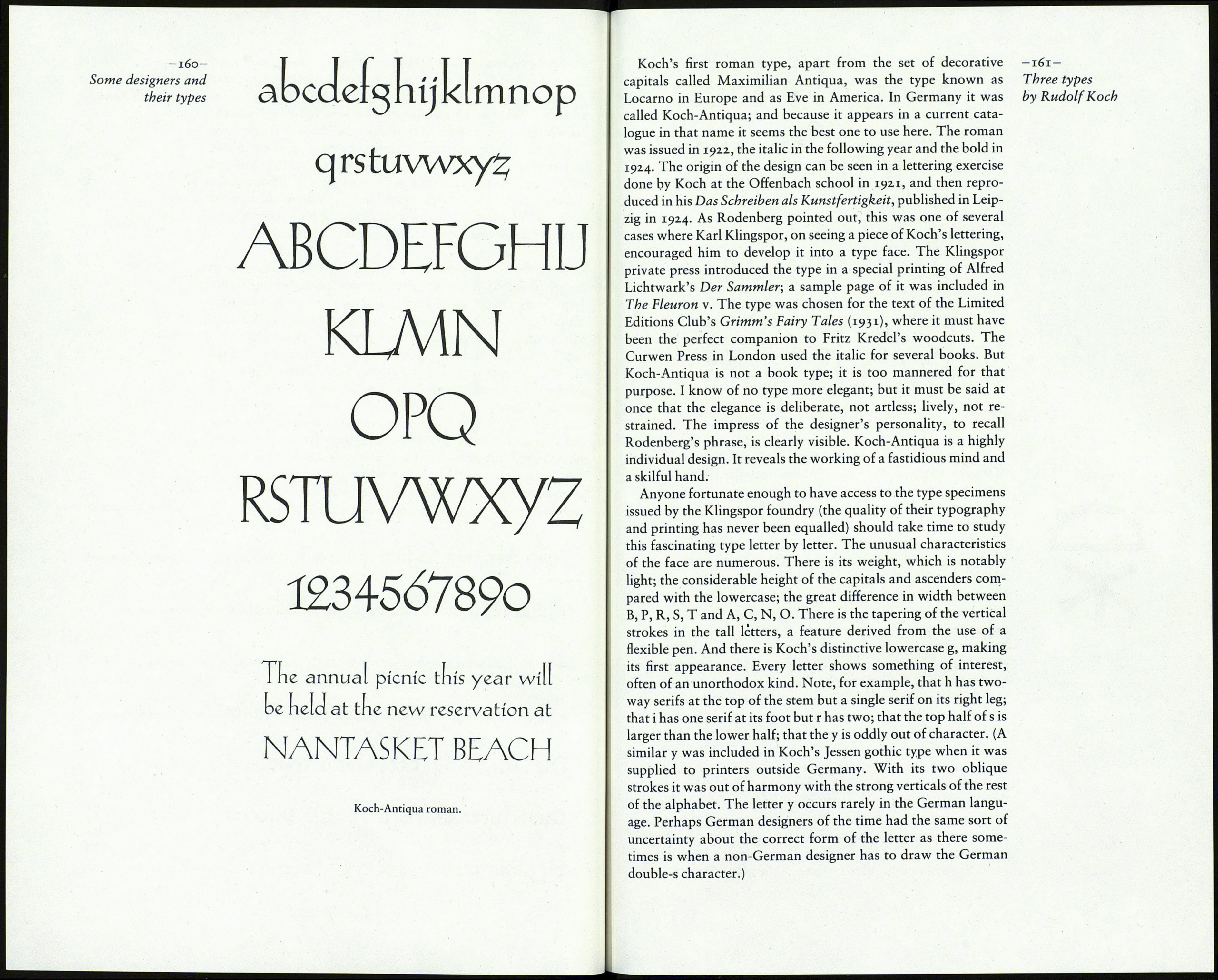
concentrate on three of Koch's roman types which not only
gained international favour when they were introduced but are
available now in at least one electronic typesetting system. Rudolf Koch's gothic types.
Jimtlíájtt Jcemoenfufycec оисф JHlen/hín Deutsche Schrift ыа.
Шс^осй íftagnec: Фес fliegende fjoUcmóec махшшнш.
£)íe jcfyônften 8шіД imbacci) en fur unfetß-^inbßß Frühling.
Síe^ulíutgcfd)ící)fe kl еигорШГфспЗШес
Die Grunòzuge bec gotífdien Maleceí Jessen
Ouvertüren unö Ягіеп сюп б» Puccini waiuu
Öt^äblungen аіш htm ©adjfentualb
Wilhelm-Klingspor.
Claudius.
