-I56-
Some designers and
their types
The g in the Satanick type and the bold version of Koch-Antiqua.
under names of their own choosing: Morris-Gotisch, Archiv, and
Uncial. They even made light, heavy and open versions of it -
clear evidence of its popularity. (Incidentally, it may have been
the lowercase g in that type that took Koch's fancy so much that
he adopted its form for his Antiqua, Wallau and Kabel faces.)
German designers pursued the idea of a type combining the char¬
acteristics of the gothic and the roman. The government printing
office in Berlin produced an unusual calligraphic roman by Georg
Schiller, and Otto Hupp designed an interesting simplified gothic
for the Genzsch & Heyse foundry. In 1900 the Rudhard foundry
nature Poems
of ftenrp Scott
Illustrated bp Jobn Кіфагй Brounb
The Neudeutsch type by Otto Hupp.
WGRV few months, during recenf years, some
'literary or Typographical Knight Adventurous
I has started on the quest of the [lew Cype, - the
. type which is to be perfectly original, or, at the
least, altogether unhackneyed, and yet which is
to be so normal that no one will be able to object
to the form of any of the letters as fantastic or
I unfamiliar. Che quest is no new one, though an
unusual number of people are interested in it lust now. 3t has
The Eckmann face.
Catalogue exhibition
of tbe German empire
The Behrens type.
issued Otto Eckmann's type, an extraordinary design owing -157-
more to art nouveau than to gothic or roman. Rodenberg said it Three types
was a great success. About the same time the foundry issued a by Rudolf Koch
design by the architect Peter Behrens, similar to but rather more
gothic than Schiller's type.
These innovations caused considerable interest and discussion
amongst German printers, and a certain amount of punditry. In
1905 Klingspor published an essay by Gustav Kühl (now more
interesting to look at than to read) called, in the English-language
edition, On the Psychology of Writing. It put the argument for
the gothic as being the proper letter form in which to express
German culture, and for the roman as being easier to read, and
settled for an amalgam of the two,.such as the Behrens design. But
though the Eckmann and Behrens types made the Klingspor
foundry's reputation, they did not last long in favour. A conser¬
vative element continued to regard roman as appropriate only for
'foreign' work; but the majority of publishers and printers came
to see the advantage of allowing gothic and roman equal status
for the expression of the German language and, as time went on,
to recognise that only in the roman was it going to be possible to
create the variety of type faces needed to satisfy the demands of
publicity printing.
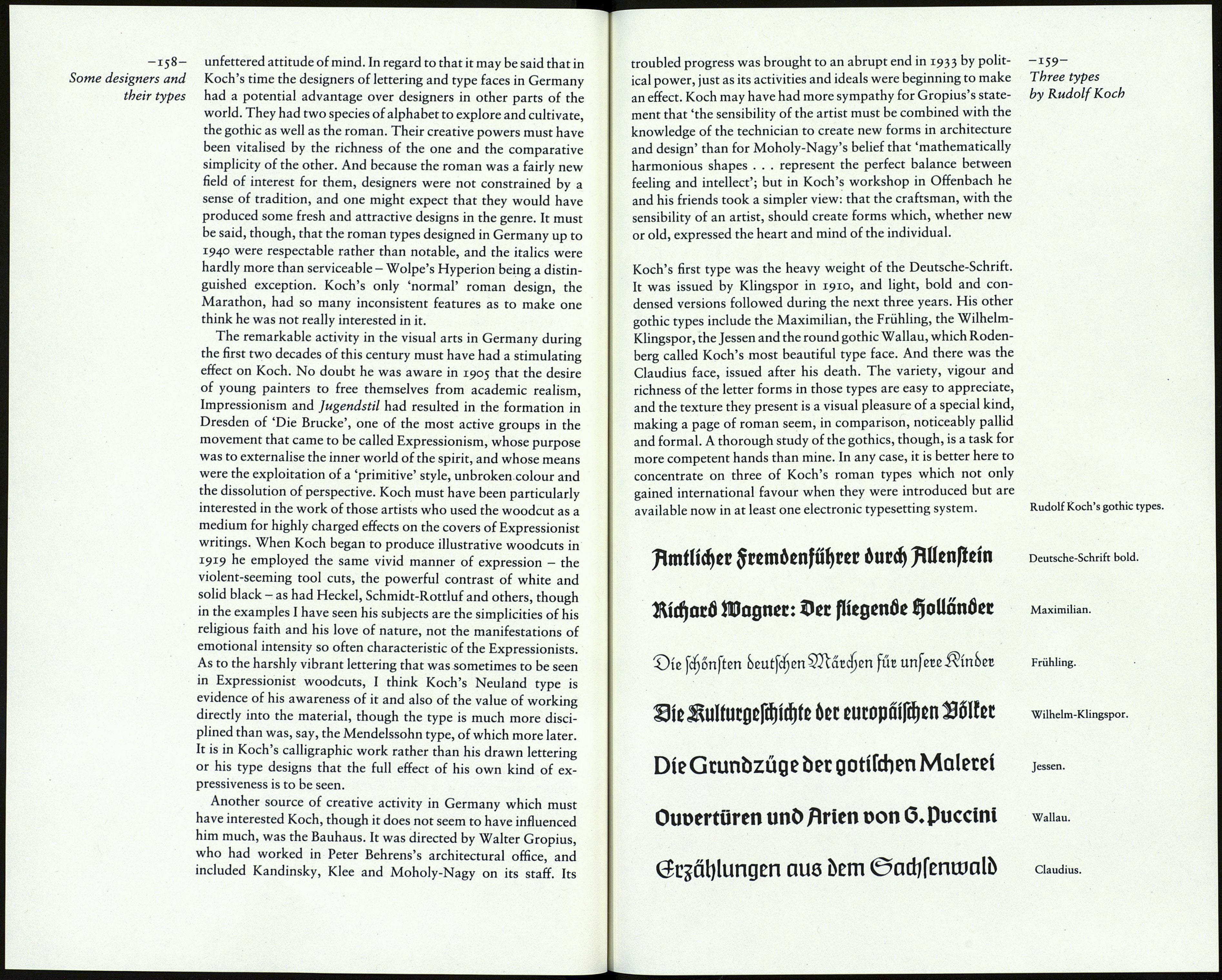
The gothic, then, continued in favour; but there was a general
desire to see it revitalised, a. task in which Koch took a dominant
role. He became the foremost designer of gothic faces. His first,
the Deutsche-Schrift (often called Koch-Schrift) became im¬
mensely popular. Of the forty-five types, including variations,
credited to Koch in the Handbuch der Schriftarten - many of
them, no doubt, drawn by others under his direction - twenty-
four are gothics, and it is on them that Koch's high reputation in
Germany is based.
'Lettering gives me the purest and greatest pleasure,' Koch
wrote. He owned a copy of Edward Johnston's Writing and
Illuminating and Lettering, and, as previously noted, he con¬
tributed to the Beispiele Künstlerischer Schrift, the books of
examples of lettering that Rudolf von Larisch began to edit in
1902 (C. R. Mackintosh, Georges Auriol, Alphons Mucha and
Emil Weiss were amongst those whose work was shown). Koch
probably found Von Larisch far more stimulating than Johnston.
As Alexander Nesbitt has pointed out, Johnston's efforts in re¬
viving historic writing styles and his teaching of the use of the
broad pen were, and are, valuable in the early training of the
student of lettering, but they were limited in their scope and
purpose and had little relevance to practical applications. By
contrast, Von Larisch encouraged inventiveness. His chief inter¬
est was in developing the creative abilities of students by the use
of all sorts of writing tools - brushes, ball-pointed pens and blunt
sticks as well as the traditional broad pen - and by a flexible and
