-I54- perience. For four years he did well enough as a freelance illus-
Some designers and trator and designer for the book trade. 'May God forgive me for
their types the things I produced in those years,' he wrote in 1922. But he was
not a hack. He was probably keenly aware of what was being said
and shown in such stimulating journals as Jugend, Die Insel and
GIULIANO
MANTEäNALMJRNfl!
SLOREMZPDElMEPlClg
RAPHAEL
FRANCESCO DEI RIMINI-Z3
An early lettering exercise by Koch, before he became a master of
the pen and graver.
Fan, in which the work of William Morris was described. It was
an item in Jugend in 1903 which prompted him to take an interest
in calligraphy.
In 1906 he was accepted for a post in the Rudhard type foundry
in Offenbach - possibly on the strength of his gothic lettering
shown in the third volume of Von Larisch's Beispiele Kunst¬
lerische Schrift (Vienna, 1906); the lettering is very similar to the
heavy weight of the Deutsche-Schrift, Koch's first type for Kling¬
spor. The foundry, re-named in that year for the Klingspor
brothers - its owners since 1892 - was achieving a reputation for
adventurous typographic development of notable quality. With
his new-found awareness of printing types as a field of design it is
easy to understand why Koch later wrote, with feeling, 'The
ambitions of my life were coming to fulfilment.'
In 1908 he was asked to teach lettering in the art school
at Offenbach. The First World War, in which he served as an
infantryman, interrupted his career; but in 1918, after some
months in an army hospital, he returned home and resumed his
work at Klingspor and the school. His classes were over-crowded
and, believing in the need for a close relationship between teacher
and student, he asked for a change in his role. He got what he
wanted: his own room, with just a few students to whom he could
be 'helper and guide', to use his own words. In later years some of
the most distinguished designers of this century were to recall
with gratitude the time they spent as Koch's students or asso¬
ciates in the Offenbacher Werkstatt, as it was called: Berthold
Wolpe, the eminent designer of types, books and much else; the —155 —
illustrator Fritz Kredel; the typographers Henry Friedlander, Three types
Gotthard de Beauclair, Warren Chappell, to name a few. Calli- by Rudolf Koch
graphy and lettering were their main interests; but they did not
limit themselves to graphic work. Carved inscriptions, tapestries,
coins, metal work, even church bells - wherever lettering had a
place Koch and his helpers would eagerly devote their minds and
hands to it. Rodenberg says it was from the work done in Koch's
lettering classes that his types were developed.
Koch died in 1934, at the age of fifty-eight. Although the nature
and character of the work produced in the workshop, and its
'Renaissance-like atmosphere' (to quote Warren Chappell), might
have enabled it to escape the harsh attentions of political auth¬
ority with greater success than did the Bauhaus, some of its mem¬
bers were vulnerable, or found the prospect before them inimical
to the tranquillity they needed. So they sought a new life
elsewhere.
In the period of remarkable activity in German creative life which
began about 1900 and extended until 1934 there were a number of
developments which must have interested Koch and helped to
form his ideas and attitudes as a designer.
To begin with, there was the gothic-or-roman argument that
engaged the attention of those publishers and printers who, at the
turn of the century, had become dissatisfied with the lifeless
gothic types which had prevailed for so long. There was a grow¬
ing desire for types of a simpler style, with something of the
openness of the roman. Curiously (as it seems to us now) it was
the printed work of William Morris, and in particular Morris's
Troy type of 1892, which played a part in strengthening that
attitude. The type was copied by the American Type Founders
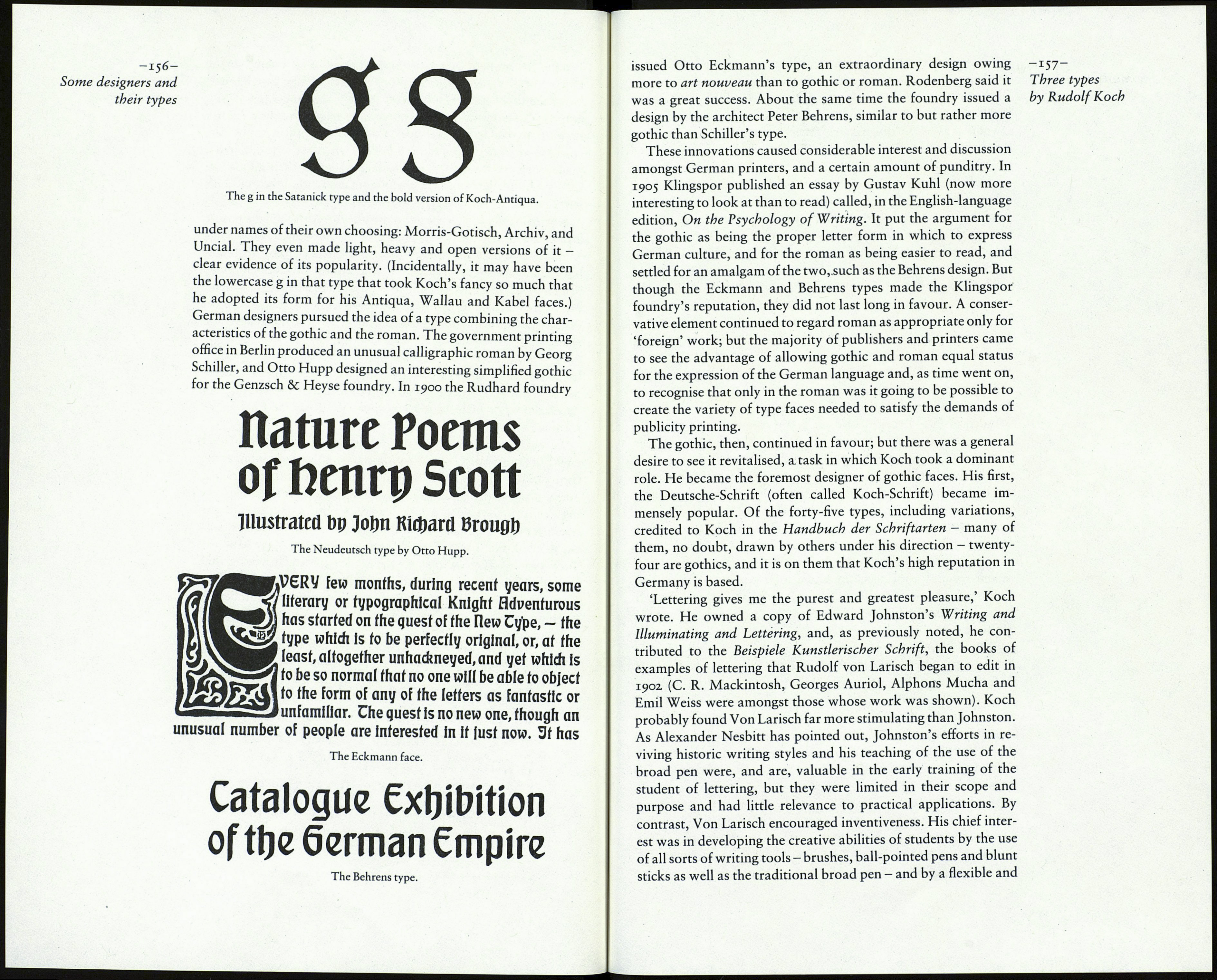
Company and sold under the name Satanick. A number of
German founders imported the type from America and issued it
This T>oy type was the model
of the type on this page,wbicb
is made in the United States
by the Hmerican ТЗуре found¬
ers Co* on many bodies from
6-point to 72-point.^It is a
composite letter—so made by
adding gotbic mannerisms to
a fat-faced and angled roman»
The Satanick type.
Reproduced from De Vinne, The Practice of Typography: Plain Printing Types, 1900.
