— 146— 'the full-bodied vigour of the World Bible page'. And Herbert
Some designers and Johnson, the authority on the work of Goudy and of Rogers, has
their types given his opinion that Newstyle is one of the six great type faces
designed by Americans. An outsider hesitates to disagree with
such distinguished voices. But I am bound to say that I find the
design, even after the Rogers revisions, restless and rough in
texture, due to the over-large capitals and the dolphin-like e; in
short, not at all easy on the eye.
In 1924 Lanston Monotype found themselves in need of a type to
compete with Cloister Old Style, a face which had been popular
ever since Morris Fuller Benton had supervised its creation at the
American Type Founders Company in 1913. Goudy accepted the
task of designing a suitable face. He chose not to work directly
from the late fifteenth-century Jenson type that had been the
source for Cloister, but simply to make a few references to the
types of that period. They do not amount to more than a bar at
the top of A, the two-way serifs on M, the convex leg on R, and
the Jenson style of e. Goudy named his type Italian Old Style. In
the roman the s is ungraceful and the dropped ear on r makes the
letter look oddly small. The type does not compare well with
other faces derived from the Jenson model - the Doves type,
Bruce Rogers's Montaigne, and especially his Centaur. It is sur¬
passed, too, by another type of the kind, the Venezia roman, the
punches of which were cut by Edward Prince, last of the English
punch-cutters, for George W. Jones. In 1925 Jones commissioned
Goudy to design an italic to accompany the Venezia roman. It
turned out to be much better than his italic for Italian Old Style -
so much so that one wonders if Jones privately improved
Goudy's design when it was put into manufacture by the English
Linotype company.
It must be said that the opinion of Italian Old Style just ex¬
pressed is a personal one. In the United States the face is well
regarded. It was used for the text of Goudy's Half-Century. It
sometimes appears in advertisements in the British press, includ¬
ing a recent series for Jack Daniel's Tennessee sipping whiskey.
The Marlborough face was designed in 1925 for a particular
book - a large one, evidently, because the type size was 16
point. By Goudy's account the printer-publisher went ahead and
composed the book in another type without waiting for the
Marlborough; but it may be that the type was actually ready in
time but both Goudy and the printer realised that it needed revis¬
ion, the serifs and other details being too delicate, as Goudy
admitted in his account of the face. He revised the drawings but
never re-cut the patterns. The drawings perished in the 1939 fire.
All this is sad, because to judge from the roman alphabets and
numerals shown in the Half-Century the face would have been a
ABCDEFGHIJKLM -**-
•* Some types
NOPQRSTUVWXY by Frederic Goudy
Z6i.,';:!?-fifffiflIdA(f
abcdefghijklmnopqrs
tuvwxyz$i2345 67890
Fourscore and seven years ago
our fathers brought forth on this
continent a new nation, con¬
ceived in liberty, and dedicated
to the proposition that all men
ABCCDESFQHIJKLCM
NOPQQKSTtGVVVWX
Yzer.;;:!?-fiffffiflffl6tst
abed efghijh^lmnop qrs
tuvwxyz$12-345^7^9°
Fourscore and seüen years ago
our fathers brought forth on this
continent anew nation, conceived
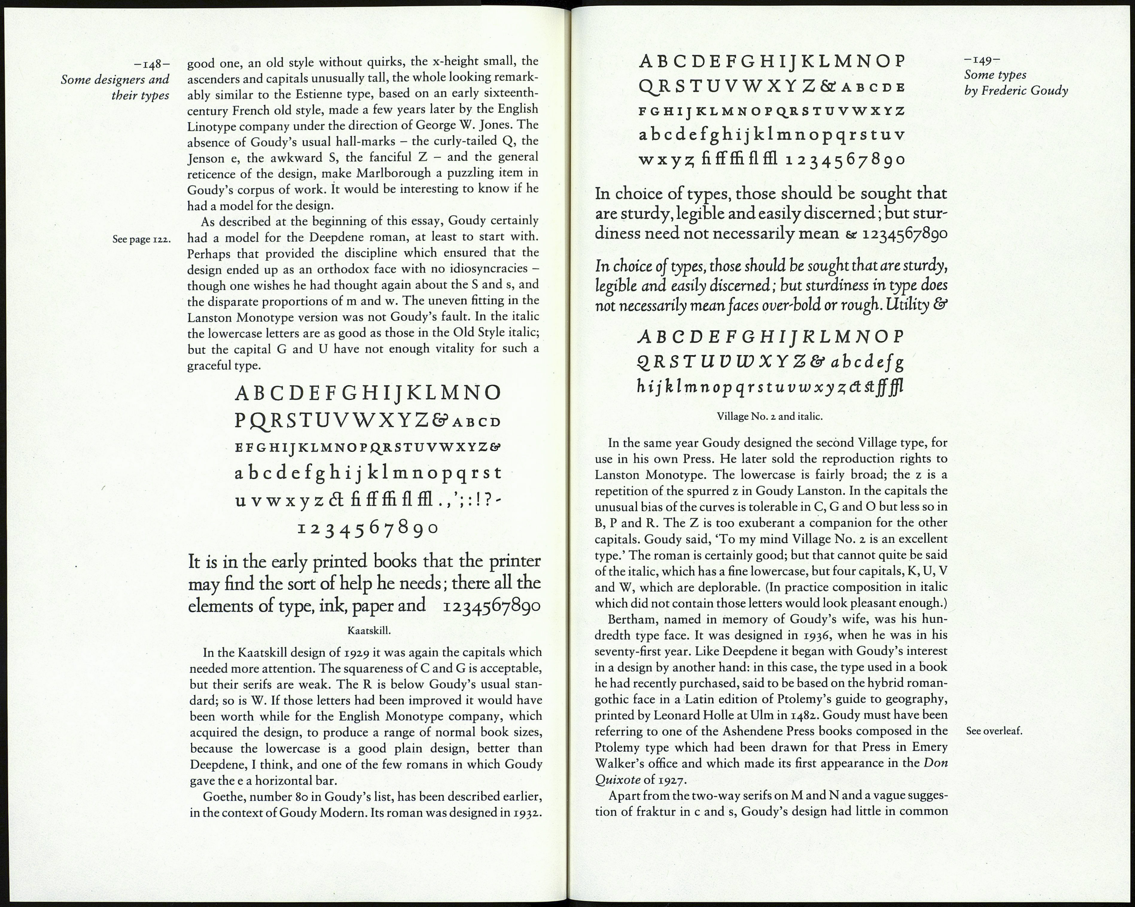
Italian Old Style and italic.
ABCDEFGHIJKLMNOPQRSTUVWXYZ ÔC
abedef ghi jklmnopqrstu vwxy z 1234567890
ABCDEFGHI]KLMNOPQRSTUVWXYZ &
abedefghijklmnopqrstuvwxyz
Venezia roman, George W. Jones's version of the Jenson type,
and Goudy's italic for it.
ABCDEFGHIJKLMNOP
QRSTUVWXYZ&., ';:!?-
abcdefghijklmnopqrstuvwx
yzaeœfiffffiflffld$ 12345678 9 о
Marlborough.
