-144- presented by someone else and developing it in his own way. In
Some designers and the early years of this century Robert Bridges, the English poet,
their types advocated the use of augmented alphabets containing a number
of phonetic characters, for the better representation of English
pronunciation. This scheme of 'phonotypes', the basis of which
was the Elstob Saxon type cut in 1715 and later acquired by the
university press at Oxford, was described by Bridges in his Tract
on the present state of English pronunciation (1913). That was
probably the 'little book' that Goudy said he acquired in 1920
and that inspired him to create an alphabet less comprehensive
and less radical than Bridges' 'that could be read by anyone but
which at the same time would make pronunciation more easy'.
He drew the capitals and lowercase, and added twenty or so extra
characters to differentiate between long and short vowels, hard
and soft g, and so on. (Readers may think of the Pitman Initial
Teaching Alphabet which has been used recently in some British
and American junior schools.) In his designing Goudy may have
borrowed a few characteristics from the Elstob Saxon type - the
bent top of the stem of m, n, and p, and the calligraphic x - but
most of the letter forms are Goudy's own, including the archaic S,
the strange Q, the fancy Z. The E and F are wide, and the middle
bar is higher than is customary - a frequent characteristic in
Goudy's book types. He wrote that he 'never got around to ma¬
king any general use of the added quaint characters'. It was the
regular alphabet characters in the design that achieved a repu¬
tation. The Grabhorn Press used the face for their folio edition of
Whitman's Leaves of Grass, and other books. Bruce Rogers
thought well of the type; in 1929 he actually considered it for his
famous Oxford lectern Bible, until he decided that 'even with
occasional modifications this type, much as I admire it, was too
striking in effect and had too strong an appeal as "typography"
to suit my purpose . . .' (That reference to modifications will
become significant.)
In 1942 Goudy sold the design to Lanston Monotype, who
evidently held it in abeyance until November 1945, when they
learnt that the World Publishing Company had engaged Rogers
to design a folio Bible for them; that Rogers wanted to use the
Newstyle face, with certain modifications, and that Goudy had
given Rogers a free hand to make any alterations he thought
necessary. Monotype willingly agreed to put the face into pro¬
duction, and in December ofthat year they supplied Rogers with
enlarged drawings of Goudy's characters. Two kinds of alter¬
ation were put in hand: the reduction in the width of certain
letters (Rogers knew from experience that there are 4,631,056
letters in the Bible with the Apocrypha, so making the type fairly
compact could have a useful effect on the economy of the work);
and the alteration of the shape of some characters, presumably
because of Rogers's earlier opinion that the type as designed was
'too striking' - by which I suppose he meant that the type would -145 -
assert its personality to the detriment of the text. Six or seven Some types
capitals and about the same number of lowercase letters were by Frederic Goudy
ABCDEFGHIJKLMN
OPQRSTUVWXYZ&
abcdefghijklmnopqrst
uvwxyzffflffla.,';:!?-
1234567890
Fourscore ôc seven years ago our
fathers brought forth on this con¬
tinent a new nation, conceived in
liberty, and dedicated to the prop-
Newstyle,
The original design, and below, the face as it appeared
in the World Bible. The ampersand was omitted
in the revised font, so a Plantin ampersand has been used
in the first line of text.
ABCDEFGHIJKLMN
OPQRSTUVWXYZ
abcdefghijklmnopqrst
uvwxyzffflffi^Y*. ,';:!?-
1234567890
Fourscore & seven years ago our
fathers brought forth on this con¬
tinent a new nation, conceived in
liberty, and dedicated to the prop-
modified. The S,W, g, q and y were distinctly improved, and the
R, r, s and t slightly; but the b suffered in the change. The
numerals were replaced by a new set, smaller than the originals,
and closely based on the Monotype Plantin face. The modific¬
ations eliminated most of the really idiosyncratic characters in
the original design, but did not radically alter the texture of the
type on the page.
As well as Bruce Rogers, other eminent people have expressed
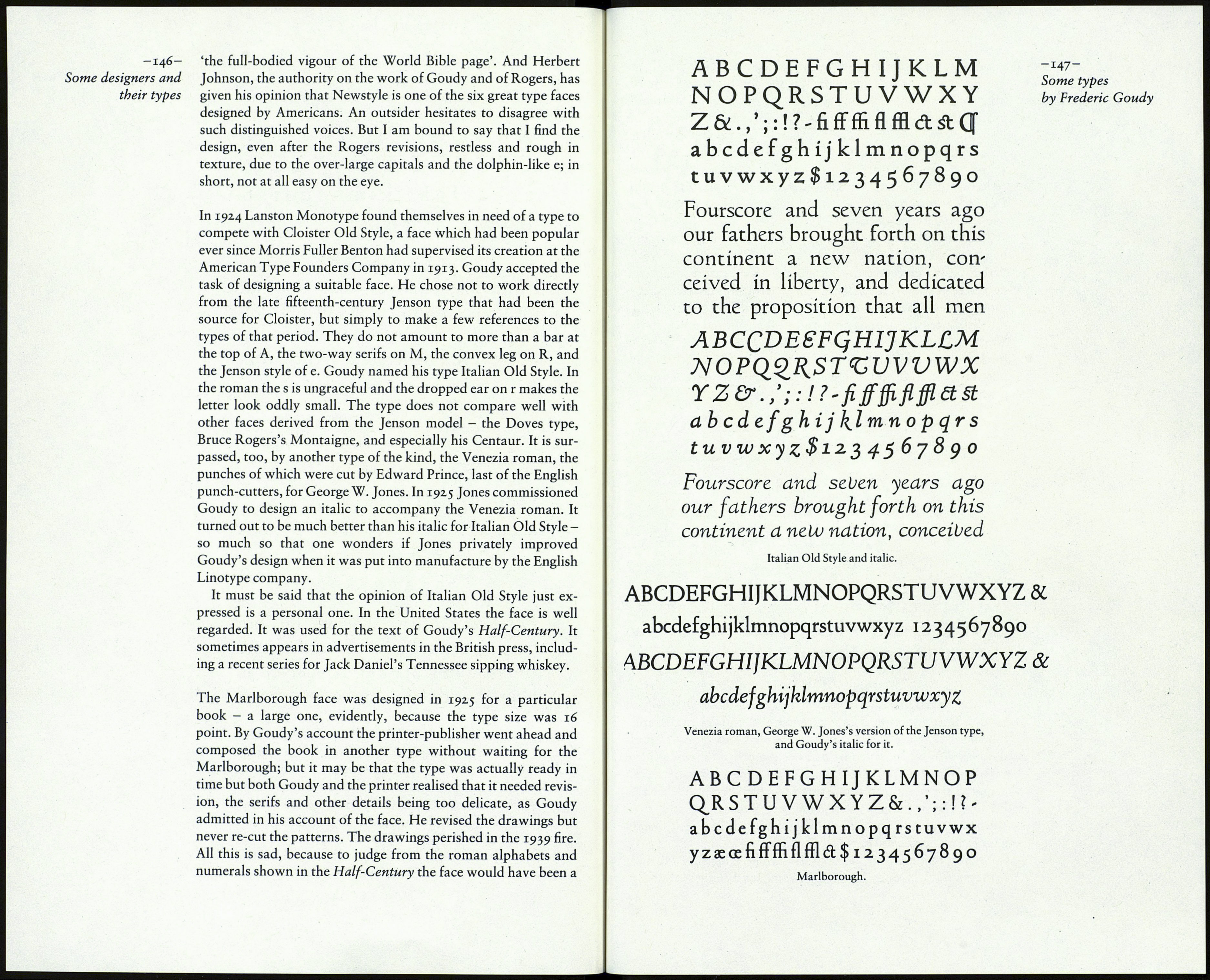
admiration of the Newstyle design. Abe Lerner has spoken of
