-136- harmony as to details with those that followed more completely
Some designers and my own conception of a new face.' It is not clear what he meant
their types by 'movement'; but it is clear that the only characters in the
Kennerley face which show any resemblance to the Fell type are
C, S, W and 5. Not only are many other letters noticeably differ¬
ent from those in the Fell type; the contrast between the thick and
thin strokes, whjch is considerable in Fell, is much less in Ken¬
nerley, and the edges are softened (this may partly be due to the
design being realised in the form of engraved matrices rather than
punches). There is so little of the character of the Fell type in
Kennerley that one cannot help thinking that Bullen's reference
to the Jenson model has some truth in it, and that Goudy had
confused two of the many potential sources he had studied in his
lifetime. Not that there is much of a resemblance to the Jenson
type in Kennerley, apart from the e with the sloping bar (which he
had already used in the Monotype 38-E). Bullen's remark to Nash
that 'Kennerley is a spoilt Jenson' is unjust. There is so much of
Goudy's own mind and eye in the face that it can certainly be
called an original design. It is not one of Goudy's greatest; but it
was a remarkable achievement for its time. In 1913 the Caslon
foundry acquired the English and European rights to it, and in
1920 Lanston Monotype bought from Goudy the reproduction
rights for the United States - though some other manufacturers
had already produced the face under another name. Kennerley
became very popular in the 1920s and 30s, and at the present time
is in frequent use in film-set advertising.
The creation of Kennerley Old Style was an important event in
Goudy's life, not only for its beneficial effect on his reputation but
because it was the cause of his setting up as a type founder, first as
a supplier and later as a designer-producer - and that had a
facilitating effect on the amount of work he was able to do.
In 1912 Goudy received a commission to design a type for a
book on Abraham Lincoln. The type was cast and the pages
composed; and then the sponsor died. Goudy put the type on the
market and named it Goudy Old Style. He changed the name to
Goudy Antique when the other and ultimately famous Old Style
was designed for the American Type Founders Company, and it
was renamed again as Goudy Lanston when Monotype, years
later, acquired the American rights in it.
The design is not perfect: the capitals are a little too tall, the
hyphen is eccentric, and there are a few other idiosyncrasies. But
it is a strong and expressive old style face, the letters well proport¬
ioned and balanced. Its vitality is largely due to the vertical
strokes having baseline terminals which are slightly angled - a
device which would come more readily to the mind of a lettering
artist than to one concerned only with the characteristics of
traditional printing types. In my opinion the face makes a
better effect than Kennerley or the Goudy Old Style that followed
ABCDEFGHIJKLMNOP
QRSTUVWXYZ&. /;:!?<
abcdefghijklmnopqrstuvwx
y^fiiFfiiflfflrtaeœ$i234567890
Fourscore and seven years ago our fathers
brought forth on this continent a new na'
tion, conceived in liberty, and dedicated to
the proposition that all men are created
equal. We are now engaged in a civil war
testing whether this nation, or any nation
Goudy Lanston.
ABCDEFGHIJKLMN
OPQRSTUVWXYZ&
ABCDEFGHIJKLMNOPQ.RS
TUVWXYZ&fiffffiflffl.,';:!?-
abcdefghijklmnopqrst
uvwxyz$1234567890
Fourscore and seven years ago our fa¬
thers brought forth on this continent a
new nation, conceived in liberty, and
dedicated to the proposition that all
men are created equal. Now we are en¬
gaged in a great civil war testing whether
Goudy Old Style.
it- and, indeed, any of the later book types which gained so much
esteem.
In England the design was ill-treated; the descenders were
shortened and the face was issued under the inappropriate and
unattractive name of Ratdolt.
The Goudy Old Style design, commissioned by the American
Type Founders Company in 1915, is visibly related to the Ken¬
nerley face, but it is far superior to it. In the roman the bar in A, E,
F, H is lower, R, S, W, Z are better shapes, and h, m, n have
rounder arches. The bias in the curves of b, c, d, p, q is quite
marked, which may be the reason why the design makes a rather
bland appearance, though that is chiefly due to the general light¬
ness of the face. Goudy's protest at the shortening of the
descenders, with an unfortunate effect on the g, was justified but
unavailing.
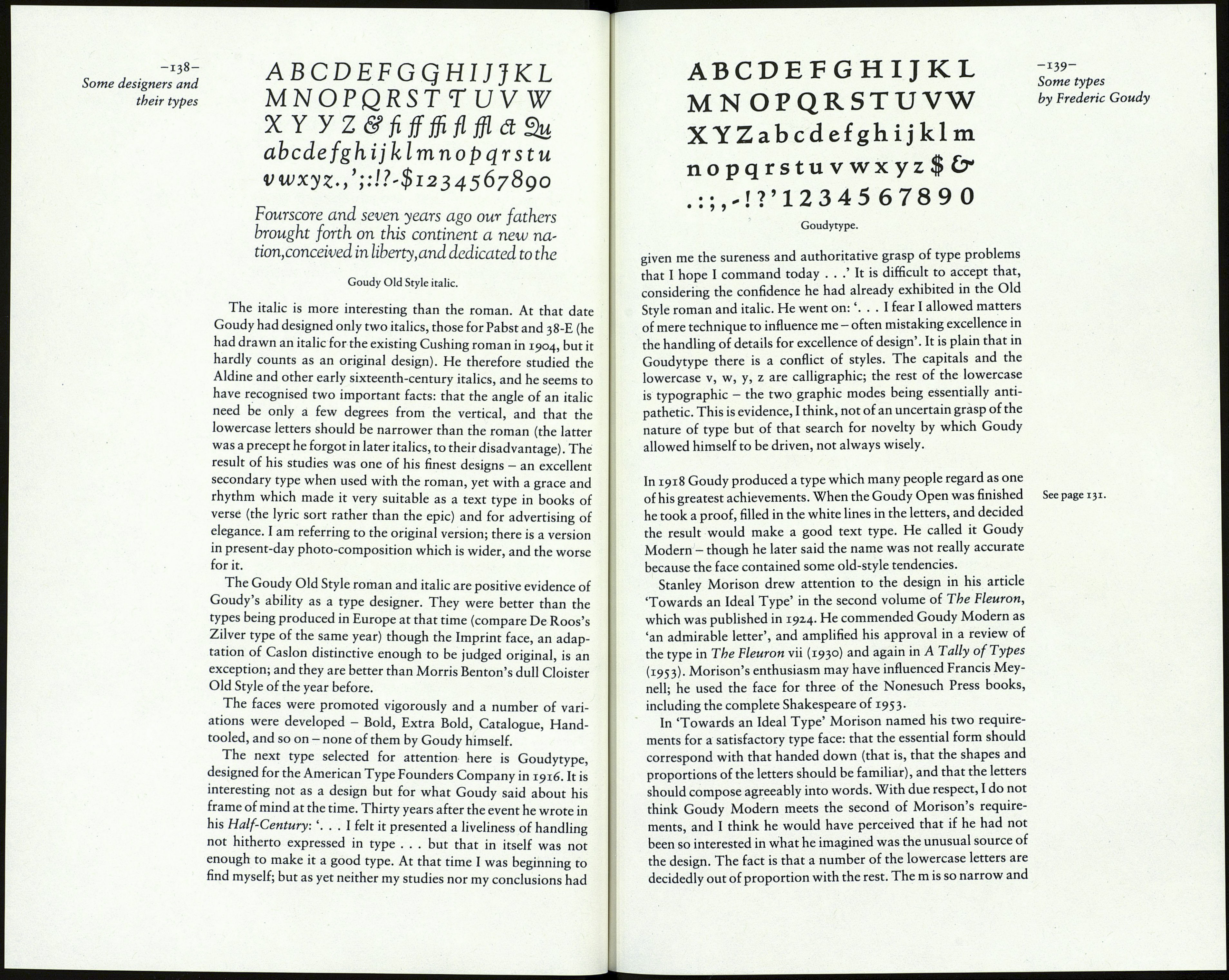
-137-
Some types
by Frederic Goudy
