-130- seems unlikely. The design has almost nothing in common with
Some designers and the first three and only a little similarity to the last. In fact, it is
their types much nearer to Goudy's Pabst design. The letters are less random
in their proportions and their profiles are more regular; but the
®IT WAS THE TERRACE OF
God's bouse
That she was standing on,—
By God built over the sheer depth
In which Space is begun;
So high, that looking downward
The first Village type.
design shows the advertising lettering artist rather than the
student of type revivals and is none the worse for that. No doubt
the Village type is, by present taste in book types, too assertive in
'personality'; but it is much better than Ricketts's Vale Press type
and Pisarro's Brook type, and at least as good as Goodhue's
Merrymount design. (Bruce Roger's Montaigne type is in a differ¬
ent class, both of style and of merit.)
^»In pinacothecamperveni, vario genere tabu-
larum mirabilem : nam et Zeuxidos manus vidi,
nondum vetustatis injuria victas ; et Protogenis
rudimenta, cum ipsius naturae ventate certantia,
non sine quodam horrore tractavi. Jam vero
On, still on, I wandered on,
And the sun above me shone;
And the birds around me winging
With their everlasting singing
Made me feel not quite alone.
The Vale type, 1896, and the Brook type, 1902.
The Copperplate Gothic which Goudy drew for the American
Type Founders Company in 1905 became one of their most suc¬
cessful types, in the commercial sense, when it was developed
into a family of several weights and widths. It was imitated by
other makers under such names as Lining Gothic and (in Britain)
Spartan, and is still in demand. But it can hardly have been
an original design. Goudy had probably simply been asked to
smarten up one of the existing monoline faces which possessed
vestigial serifs. He undertook a number of humdrum tasks of that
sort at this early stage in his career.
The Forum Title of 1911 and the Hadriano Title of 1918 are
mentioned at this point because though not intended as advertis¬
ing types they are essentially titling faces, for use on title pages
and formal announcements. Both designs were adapted from
FOURSCORE &
SEVEN YEARS A
ABCDEFGHITKLMN
OPQRSTUVWXYZ&
1234567890
AbCDEFGHIJKLMN
OPQRSTUVWXYZ&
1234567890er
FOURSCORE AND
Forum Title and Hadriano Title.
rubbings of Roman carved inscriptions which Goudy made dur¬
ing his visit to Europe in 1910. Francis Meynell took pride in
offering Forum to the customers of the Pelican Press in 192.3, and
Bruce Rogers employed both types in his typographic work. But
to my eyes they are too much of a good thing — especially the
Hadriano, which simulates the effect of weather-worn stone car¬
ving to such an extent that the design is a piece of pseudo-random
lettering rather than a true type face.
Goudy Open, which was designed in 1918, was a display type
based on the caption to an eighteenth-century engraving. The
engraved letters looked too 'modern' to Goudy, so he strength¬
ened the thin strokes, bracketed the serifs and increased the
curvature. The application of a white line to the surface of letters
almost always makes them attractive; but it is in every sense a
superficial charm, which may obscure defects in the basic letter
-131-
Some types
by Frederic Goudy
Fourscore & Seven
Fathers brou
Goudy Open.
structure. The chief significance of Goudy Open now is that it
was the foundation of one of Goudy's best-known types, his
Goudy Modern, which will be examined on a later page.
The last of the advertising types selected for notice here is one
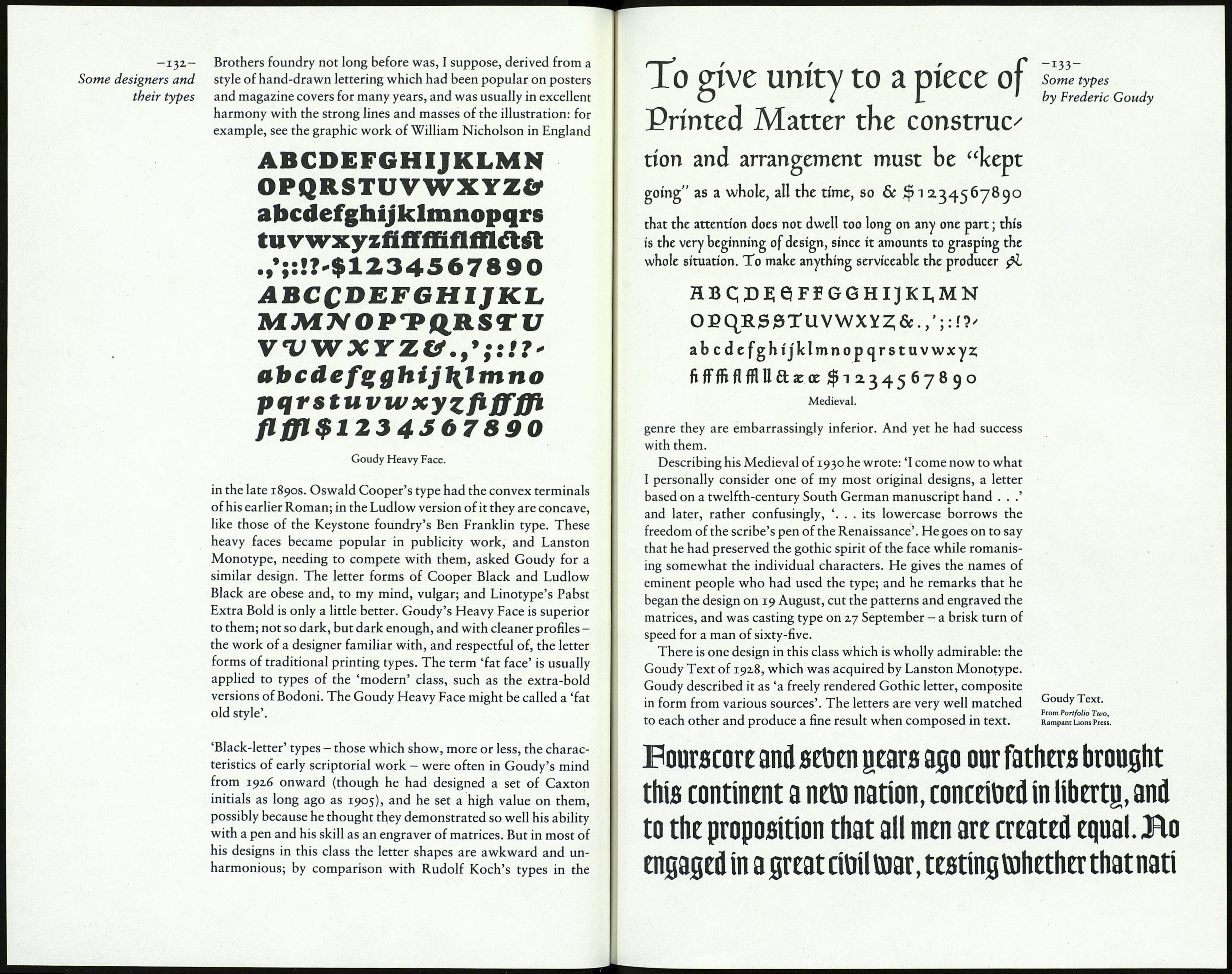
of Goudy's best designs: the Goudy Heavy Face of 1925. The
Cooper Black which had been introduced by the Barnhart
