-I20- unusually limited: his four roman text types, Lutetia, Romanee,
Some designers and Romulus and Spectrum, are remarkably similar in style. It is
their types as though he carried in his mind an image of a single perfect
alphabet, the quintessence of letters, and could do no other than
produce a representation of it on each occasion - even when, as in
Romanee, a particular model was in view and the task was speci¬
fied. Only in the Spectrum roman, a late work, is there any sign
that Van Krimpen had added to his vision an awareness of typo¬
graphic characteristics; but the awareness is not very obvious.
The hypothesis holds good for his italic types, too. His ideal
was evidently the written chancery hand of Arrighi and other
masters of calligraphy of the early sixteenth century, to the exclu¬
sion of later typographic models. If this were not so, if he had
shown equal willingness to take the italic types of, say, Granjon
or Fournier as exemplars, he would have worked as they did,
from a practical standpoint, fully aware of the need to make his
italics true secondary faces, subservient to and thoroughly har¬
monious with his romans. But the italics for Lutetia, Romanee
and Spectrum, and the Cancelleresca Bastarda that was intended
to work with Romulus, show that, whatever he thought he was
doing, he was actually concentrating single-mindedly on the
design of a perfect alphabet in the chancery mode, and was
probably oblivious to external considerations.
In short, Van Krimpen thought like an artist, not like a de¬
signer. He worked from an inner vision, not from a broad view of
practical realities and requirements. That is not the best frame of
mind (indeed, it is not the right one) in which to create something
which is to function in a variety of texts to the full satisfaction
of publisher and reader. In Van Krimpen's case the attitude
produced, in my opinion, type faces that, though not wholly
adequate in the functional sense, are, as letter designs per se
(especially the capitals), unequalled as representations of classic
letter forms in print. That is their significance in the history of
type design. And it is also the reason why a close study of them is
essential for anyone who aspires to a clear understanding of
something that Van Krimpen seems not to have appreciated: the
crucial difference between art, visual expression as an end in
itself, and design, the creation of something to serve a practical
function.
14: Some types by Frederic Goudy
'Van Krimpen's work as a book designer was more influential
than his work as a type designer.' Thus the obituary in The Times
of 21 October 1958, the day after Van Krimpen's death. True, no
doubt; but it seems that one of his types had once had an influence
on another worker in the field.
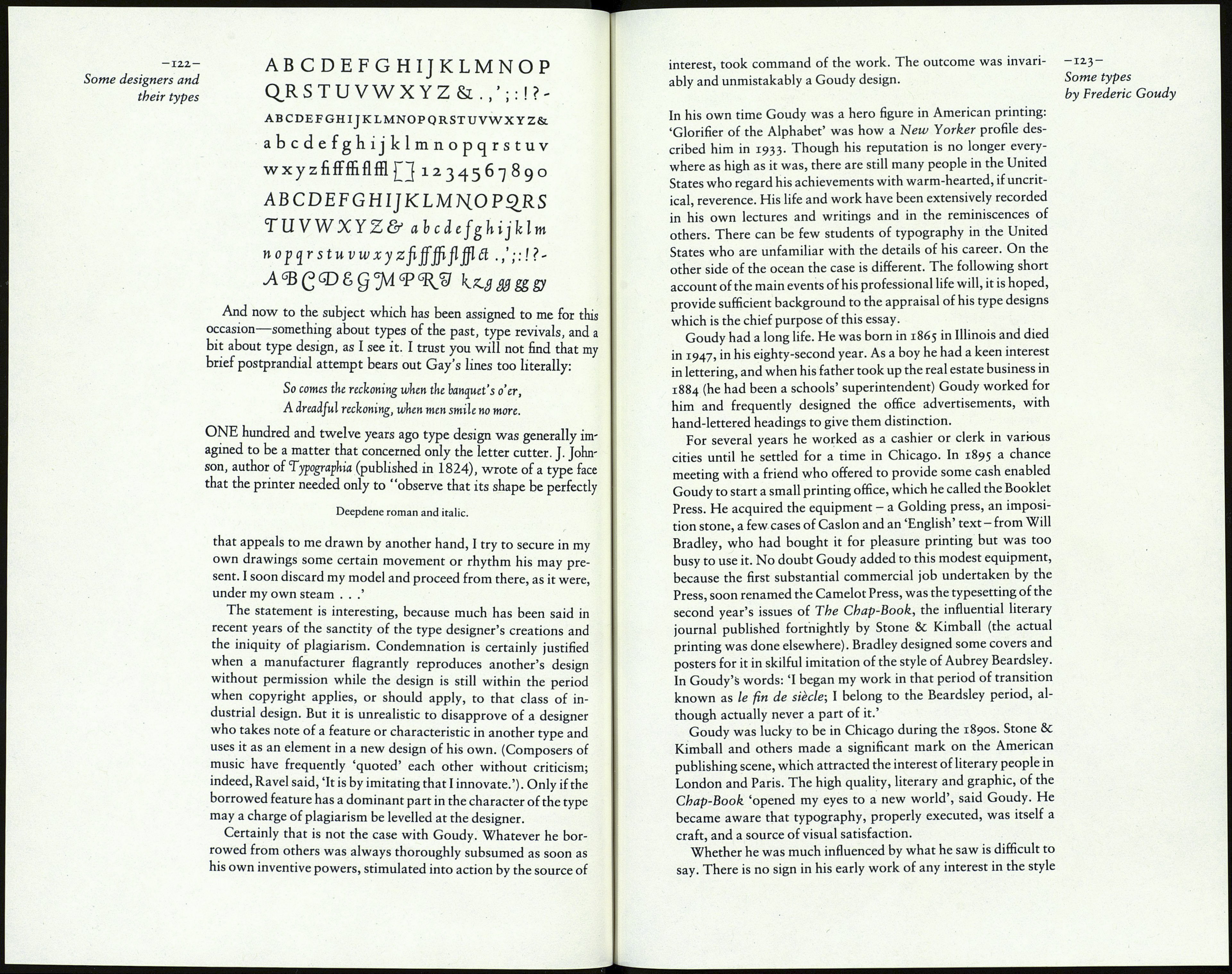
In Frederic Goudy's A Half-Century of Type Design and
Typography, he says of his Deepdene type: 'This year (1927) was
a prolific one for me. I find that I was working on six different
designs. For one of them I began drawings of a type suggested by
a Dutch type which had just been introduced into this country;
but as with some of my previous designs, I soon got away from
my exemplar to follow a line of my own.'
That passage was quoted in one of Paul Bennett's contri¬
butions to Books and Printing, with the phrase 'the Lutetia of
Van Krimpen' interpolated after 'Dutch type'. No doubt Bennett
had good reason to know that Goudy was indeed referring to
Lutetia and not, say, to De Roos's Erasmus Medieval, which had
been introduced in Holland three years before Lutetia, and may
have been known in America.
There are a few similarities between the romans of Lutetia and See overleaf
Deepdene: for example, in the shapes of C, R, c, g, r, y, z. The dots and PaBe Io:
of i and j are small and distanced from the stem of the letter in
both faces. The E and F are quite similar; but Goudy had used the
high middle bar in his Kennerley Old Style of 1911, and the broad
form of those letters can be seen in his Goudy Modern and Italian
Old Style, both earlier than Lutetia. However, the texture and
colour of Deepdene are quite different from those of Lutetia,
because the serifs and thin strokes in it are stronger than those in
Van Krimpen's type, and the serifs are unbracketed.
Deepdene Italic, which was designed in the spring of 1928,
bears no resemblance to the italic of Lutetia; in fact, Goudy wrote
of it that he 'drew each character without reference to any other
craftsman's work'. It is noticeably 'upright'; the angle can only be
about four or five degrees. Curiously, the lowercase of the italic is
remarkably similar to Van Krimpen's Romanee Italic, designed See page 10
twenty years after Deepdene.
Goudy explained his interest in the work of other designers in a
speech at Syracuse University in 1936. 'Once in a while a type face
by some other designer seems to present an interesting movement
or quality that I like. I take an early opportunity to make it mine,
frankly and openly, in the same way that a writer might use
exactly the same words as another, but by a new arrangement of
them present a new thought, a new idea, or a new subtlety of
expression ... By copying carefully a few characters of the type
