-112- hardly be used as a mate for any other member of the family; and
Some designers and that, after all, was the object of the scheme - as was emphasised
their types in the rationale of the Romulus Greek. Van Krimpen thought
highly of the principles that governed the design of this Greek,
Irascimini, et nolite peccare : quae dicitis
in cordibus vestris, in cubilibus vestris
compungimini. Sacrificate sacrificium
iustitiae, et sperate in Domino. Multi di-
cunt : Quis ostendit nobis bona PSignatum
est super nos lumen vultus tui Domine:
ABCDEFGHIJKLMN OP
QRSTUVWXYZ
abcdefghijklmnopqrstuvwxyz
12345 ffffifflfifl 67890
Romulus Semi-bold.
In finem in carminibus; PsalmusDavid: Cum invo-
carem exaudivit me Deus iustitiíe теж: in tribu-
latione dilatasti mihi: Miserere mei, et exaudí
orationem meam: Filii hominum usquequo gravi
corde? ut quid diligitis vanitatem, et qusritis
mendacium? Et scitote quoniam mirificavit Do¬
minus sanctum suum : Dominus exaudiet me cum
ABCDEFGHIJKLMNOPQR
STUVWXYZ
abcdefghijklmnopqrstuvwxyz
12345 ffffifflfifl 67890
Romulus Semi-bold Condensed.
even if he was not finally satisfied with some of the character
shapes. His ruling principle was that between the roman and the
Greek there should be as little differentiation as possible. (An
echo of the sloped-roman fallacy.) He decided that not only
should the Greek be upright and the lowercase equipped with
serifs, but letters such as lowercase zeta, kappa and nu should be
similar to or even identical with letter shapes in the roman. It is a
fallacy. In the very book in which Van Krimpen is explaining this
- the account of his types that he wrote for The Typophiles - the
occasional phrases in French and Latin are in italic, in accordance
with the traditional and sensible custom of providing the reader
with a visual signal of the sudden change of language. And the
same should apply to Greek. To make Greek letters look like
roman, and to give the lowercase zeta and ksi unfamiliar forms
on the ground that all calligraphic characteristics must be -113-
elimihated, is to assume that letters can be reformed by 'logic'; in The types
short, it is to allow theory to overset practical sense. (Eric Gill of Jan van Krimpen
had followed the same cul-de-sac in designing his own Greek
ABTAEZHeiKAMNtEOnPX
T Y Ф X Ч> fi
ABCDEFGHIJKLMNOPQR
STUVWXYZ
сфуог-гпѲікХрѵіопростифхшш
abcdefghijklmnopqrstuvwxyz
mffmfflfhfifkfl
1234567890
ou ßpaouvu кирше, rqç спаууг.Хіас,, шс xivcç ßpa-
Non tardât Dominus promissionem suam, sicut
òuxqxa qyouvxai, a^a ракроѲирп eiç upaç, pq
quidam existimant : sed patienter agit propter vos,
BouXopevoç xivaç апоХгоѲш аХХа паѵхас nç рсха-
nolens aliquos perire, sed omnes ad pœnitentiam
ѵоіаѵ хшргіоаі- Hi« òr qpcpa кирюи шс KXcnxqç,
revertí. Adveniet autem dies Domini ut fur: in quo
cv q 01 oupavoi poizqòov парсХсиооѵхаі, охо^сих
caeli magno ímpetu transient, dementa vero calore
oc каиооирсѵа Xu6qoexou, каі yq каі xa cv аитг1
solventur, terra autem et quae in ipsa sunt opera,
еруа cupcOqocxai.
exurentur.
Romulus Greek with roman.
type.) It would have been much more in accord with Van
Krimpen's original plan if he had designed an upright Greek, in
familiar style, with an italic Greek as a companion. The printer
would have been well served. For a Greek phrase interpolated
into a text in, say, English, he would use the italic Greek. For a
Greek text book the upright version would be used, with the italic
in a secondary role; and the other-language commentary, which
is usually in a separate paragraph, would be set in roman or italic
as required by clarity or emphasis. As it is, Romulus Greek mixed
with Romulus roman does not harmonise with it; it becomes
confused with it.
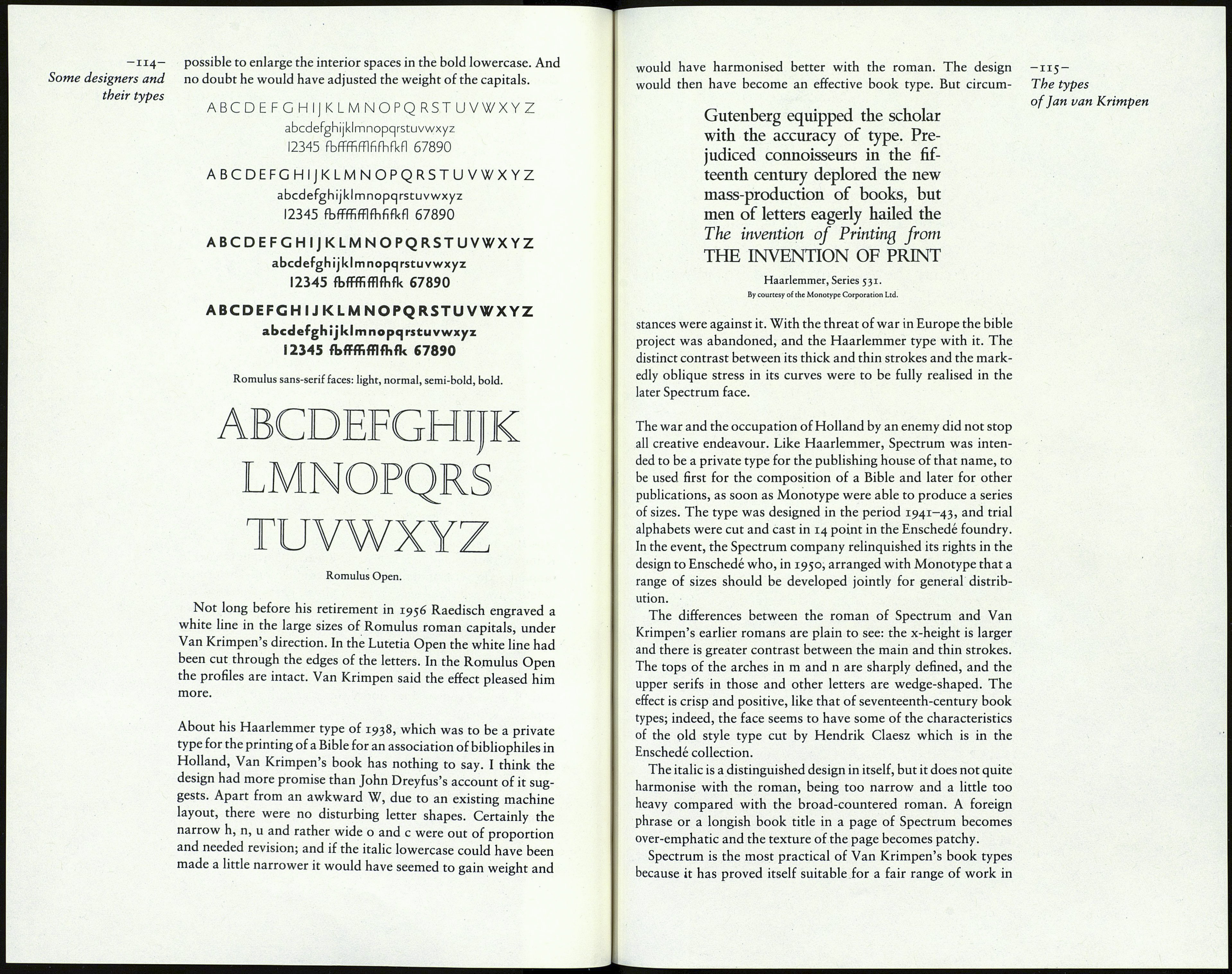
There remain the sans-serif members of the family. Punches See overleaf,
and matrices were made in 12 point in the Enschedé foundry.
Specimen settings of the four weights make it clear that the work
was terminated at an early stage of experiment. The light face
made a better effect than the others; but criticism now would be
unjust. If the work had proceeded Van Krimpen might have seen
the need to increase the height of the lowercase in all the versions
- slightly in the light weight, considerably in the heaviest, and
proportionately in the middle weights. This would have made it
