-no- 'italic' of Perpetua but had evidently thought that a traditional
Some designers and italic was the only kind that would be tolerated in the Times
their types Roman newspaper type made under his supervision in 1931-2.
Van Krimpen began to draw the Romulus sloped roman in the
autumn of 1932, though the face was not made until late in 1936.
The width of the letters is very similar to that of the roman, and
all the letters without exception follow the roman shape - though
the t lost most of its crossbar. After it was introduced, reviewed
and tested in the field Morison and Van Krimpen decided that the
doctrine of the sloped roman was not valid. But there is no
evidence of any later attempt to modify the monotony of the
Romulus sloped roman by substituting an informal form of a, e
and g, as had been done in the Perpetua italic - though there is an
alternative italic-style f in the Monotype version. Van Krimpen
would probably not have agreed to such a compromise with
principle. In any case, he was much occupied with, and no doubt
investing great hope in, the script type that, according to plan,
was to be the third member of the Romulus family.
Van Krimpen had evidently discussed the script in correspon¬
dence with Morison, who, in August 1932, offered the suggestion
that the scriptorial quality ought to manifest itself in the first and
last letters of the words (that is, in swash letters), and in the
capitals; and the script should possess both cursive and formal
qualities. In fact, it should be a cancelleresca bastarda - and that
was the name adopted for the type.
In the full Cancelleresca font there are indeed swash and other
alternative characters - more than a hundred of them; and a
number of the regular capitals do have an informal, though not
particularly calligraphic, treatment of the serifs. It is the lower¬
case that contains most interest. The curves are much rounder
than those in the Lutetia italic and so they bring the characters
nearer to the kind of italic letter forms which work best with
roman. The ascenders and descenders, though, are another thing:
noticeably long and, in the case of the f, obtrusive and distracting.
The type has been described as 'beautiful' and 'entrancingly
graceful', and it has been favoured by a number of eminent prin¬
ters for books intended for collectors. Used as Vicentino did with
a similar type in the early part of the sixteenth century, in select
books of verse designed as objects of beauty, the type makes a
stylish effect; but for my taste it is mannered and pretty rather
than beautiful, lacking the vigour of the Biado chancery italic
revived by Monotype in 1923 - and, for that matter, Van
Krimpen's own handwriting. Twenty years after its introduction
Van Krimpen expressed disapproval of the exercise - not of the
principle of cancelleresca as the third companion to a roman,
but to the technical basis he had devised for its design and
manufacture.
To furnish the script with the extra-long ascender and des-
cender strokes he thought desirable he decided to place the face -ili¬
on a body one-quarter larger than that of the corresponding face The types
size of the Romulus roman. Thus for 16 point roman the appro- of Jan van Krimpen
priate size of Cancelleresca would be 20 point, and for 8 point
roman it would be 10 point. A one-quarter increase of 12 point
would result in 15 point, an 'unnatural' size, so the Cancelleresca
to work with 12 point would be cast on 16 point body. Those
three sizes were therefore produced in the Enschedé foundry
Л ABCDEFGHIJKLMN 0 P Q
R S T I) V W X Y Z Ж Œ Sl eZT Ç Z^
(MSCCDU £"£ ZtfCf §(ftálQüJ.]
x J{j^ £ С D\í ъС j\ gyj? f QJUJR
t^JS'i'tv TJ Т/Ун/ ~WJC Xjï ÍZ
abcdejjahhiikimnoparstuvwxyyzijœœçèl
ufljJßßfißfiß8ß8J8ytty>sföiiitßttCuC& Ljt-'iLj'\'-vr\vr-\vx^y-'^ji2^Ai;6l8ao Cancelleresca Bastarda. according to that plan. But the plan would not work for the It is not possible to say much in favour of the other members of
iL>(fT&TaIi^Sl:f^LL(Lni^n^p£
important 10 point size, the one-quarter increase of which results
in i2§ point. Since 13 point was out of the question and 14 point
was not a popular size in Holland at that time, the 10 point
Romulus could not be given a Cancelleresca companion. Van
Krimpen came to regard this as a serious flaw in the plan, in
which-he and Morison (who had presumably approved it) were
culpable. And he also expressed doubts about the rectitude of
such a wealth of swash and ligatured items, which gave the type
too 'playful' and personal a character. Perhaps he had realised
too that to set Romulus roman and Cancelleresca in the same line
the compositor would have had to add compensating spacing
material above and below the roman words - a tiresome business
for more than a few lines. Alternatively, a font of roman would
have to be cast on the Cancelleresca body size, at due expense. In
fact, as designed the Cancelleresca could only function as an
individual face, not as a fully versatile member of the Romulus
family. The practicalities of metal typesetting defeated an artistic
ideal.
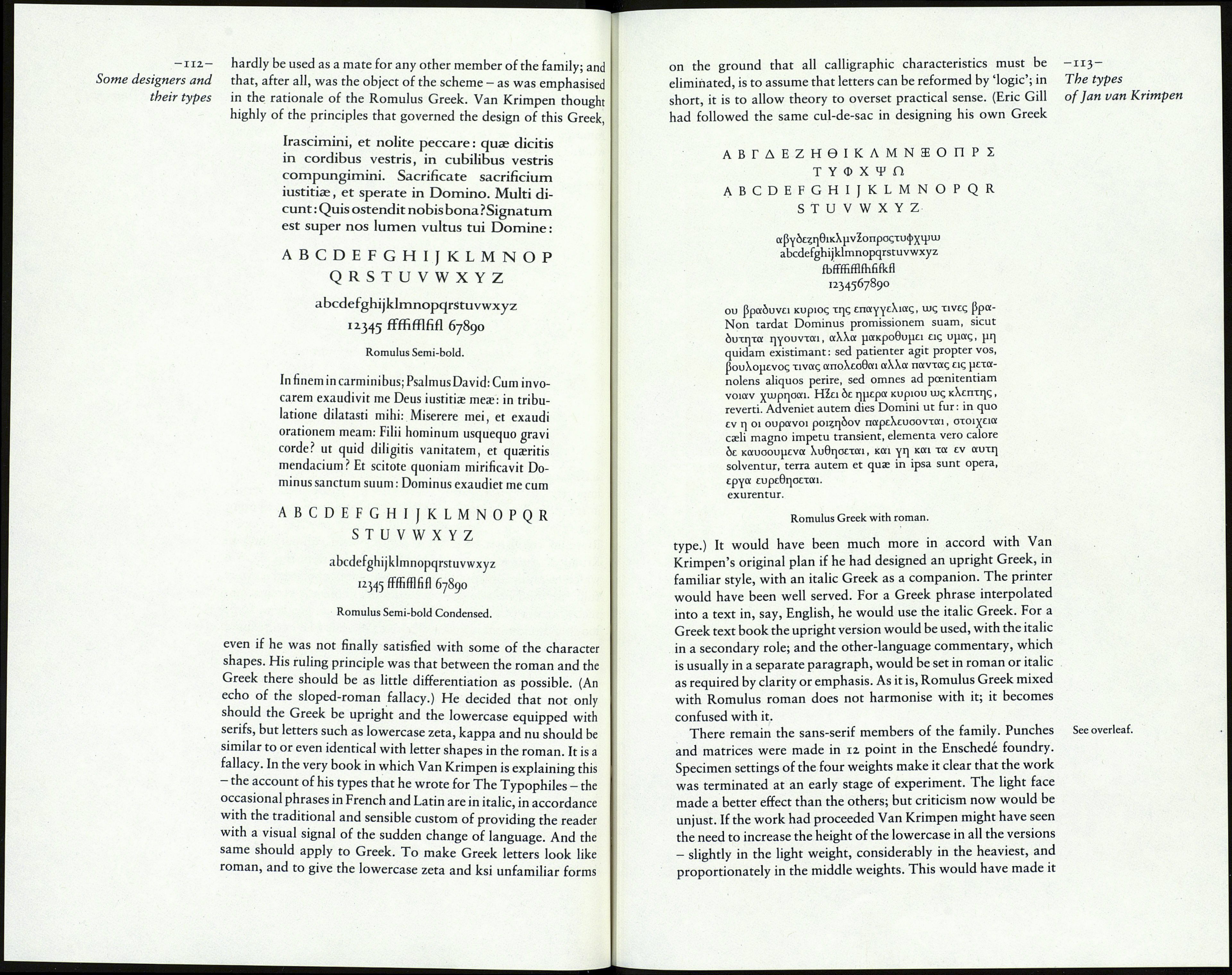
the family. The Semi-bold sprawls in a most ungainly way. The
Semi-bold Condensed is a better design; the letters balance well
with each other, and the fitting is correctly related to the charac¬
ter widths. But it is difficult to understand its purpose. It could
