In August 1861 I wrote another novel for
the Cornhill Magazine. It was a short story,
about one volume in length, and was called
The Struggles of Brown, Jones; and Robinson. In
this I attempted a style for which I certain¬
ly was not qualified, and to which I never
had again recourse. It was meant to be fun¬
ny, was full of slang, and was intended as
a satire on the ways of trade. Still I think
that there is some good fun in it, but I have
heard no one else express such an opinion.
A BCD E FG H I J К LM N
О P Q^R STUVWXYZ
abcdefghijklmnopqrstuvwxyz
12545 fffiflffiffl 67890
ABCDEFGHIJKLMN
OPqRSTUVWX YZ
abcdejßhijkimnopqrstuvwxyz
Lutetia roman and italic. The original version.
sample, and Van Krimpen then proceeded to design the full set of
roman characters. His letter drawings were ready by the middle
of 1924, and he went on to draw the italic. The type was made
first in the 16 point size and was used in a book produced for an
exhibition in Paris in 1925: hence its name, Lutetia (the Roman
name for Paris).
In Britain the roman was reviewed in The Fleuron v in 1926 by
Stanley Morison. He observed that the type was not derived from
any historic predecessor or school, that the designer 'has kept
himself free from current English, German or American fashions'
(were there any?) and that the 'design is an exceedingly handsome
one, its proportions . . . most agreeable'. He did not care for the
e with the sloping bar, and would be pleased if the E could be
reduced a little in width. But he clearly regarded it as a remark¬
ably fine design. During the next two years the Enschedé foundry
completed seven sizes of roman capitals and lowercase, three of
titling capitals, and five sizes of italic (some of the punches being
— 102—
Some designers and
their types
cut in Germany). They were shown in an inset in The Fleuron vi -103-
in 1928, and this time the italic was reviewed. It was noted to be a The types
true 'chancery' letter, and the most legible of its kind so far; but of Jan van Krimpen
the reviewer made the comment that it is 'so good in itself that it
cannot combine, with the proper self-effacement, with its
roman'. (Presumably by 'good' he meant 'distinctive' or 'expres¬
sive'.) The Fleuron inset shows some of the swash alternative
letters made for the italic; and it must be said that they prettify the
text only at the expense of comfortable reading. Swash letters
were made for the roman, too; they can be seen in the Enschedé
specimen books of 1930 and 1932. Many years later, when Van
Krimpen wrote a survey of his type designs for The Typophiles,
he had changed his mind, and expressed disapproval of such
extraneous aids to elegance.
There was wide but not unqualified admiration for the Lutetia
design. Oliver Simon, who visited Holland in 1928 and met Van
Krimpen, ordered Lutetia for the Curwen Press. In America the
Grabhorn Press installed the type and used it frequently, though
when they tried the 18 point size for an edition of Leaves of Grass
they found the face (not surprisingly) unsuitable for Whitman's
reverberant verse. Another distinguished printer who changed
his mind was Alexander Stols of Maastricht. The Book Col¬
lector's Quarterly for July-September 1934 noted that having
composed Holbrook Jackson's Maxims on Reading in Lutetia,
Stols disliked the result and re-set the book in De Roos's Erasmus
Medieval - a type whose 'system of ornamentation' had been
criticised by Van Krimpen in The Fleuron vii as 'rather tiresome'.
The Merrymount Press had Lutetia but used it sparingly; Updike
preferred a limited typographic palette. Bruce Rogers used the 18
point for Frederic Kenyon's Ancient Books and Modern Discov¬
eries in 1927; but he did not care for the lowercase e, m and n, and
substituted for them the letters from a font of Caslon, as noted by
William Glick. This 'improving' of Lutetia was carried further by
another hand.
Porter Garnett, an expert in printing, had been in charge of the
Laboratory Press at the Carnegie Institute of Technology in
Pittsburg since 1923. The Press was awarded the task of designing
the catalogue of the Frick art collection, a monumental work of
great prestige. In 1928 Garnett visited Van Krimpen to say that he
wanted to use Lutetia for the work, but would Van Krimpen
agree to certain characters being redesigned? His published
reason was 'to amend such characters as seem to fall short of
perfection'. He may have had another reason: to tell the govern¬
ing body of the Frick collection that the type to be used in the
printing of the catalogue would be, in a sense, original. Van
Krimpen willingly agreed to the changes because, as he wrote
nearly thirty years later, they accorded with the changes he would
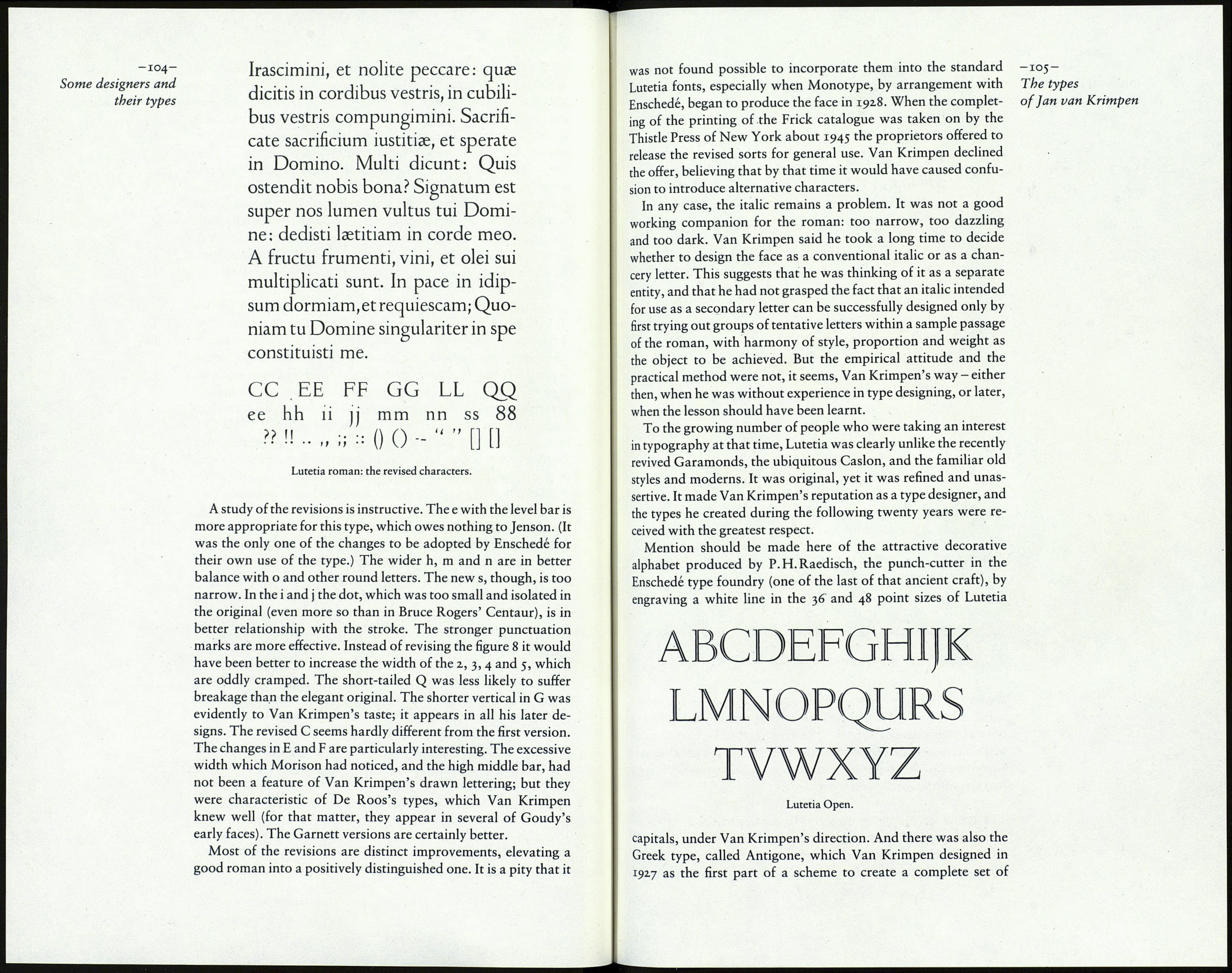
have made himself if it had been possible to do so.
