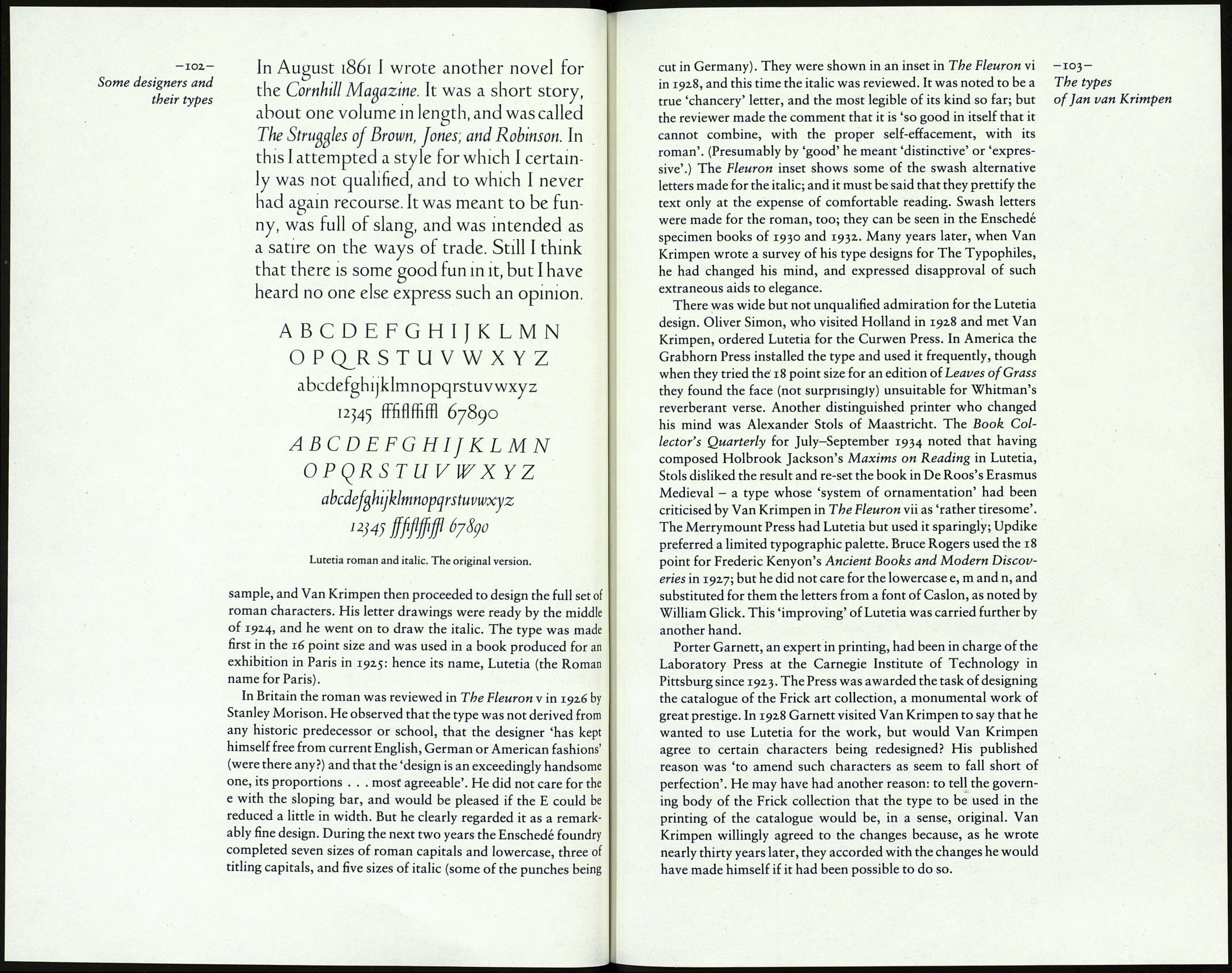
13 : The types of Jan van Krimpen
In his lifetime Jan van Krimpen was one of the most distinguished
figures in the world of typography. His designs for books were
notable exercises in symmetry and scale, with every detail of
type, spacing and choice of material fastidiously organised. He
designed a number of books for the Limited Editions Club of
New York, and in Europe the classic style and impeccable quality
of his typographic work had considerable influence. He was even
better known as the designer of the types to be discussed here.
In a thorough evaluation of twentieth-century type designs
(should such a thing ever be attempted) the book types designed
by Van Krimpen will be difficult to place. All of them display a
degree of refinement hardly matched elsewhere, not excluding
Gill's Perpetua; and they were much esteemed at their introduc¬
tion. Yet none of them has achieved full admittance to that select
list of types that are known to be effective in the practicalities of
everyday printing. The reason is this. Each of the types, when
closely examined, has a feature - amounting, in my opinion, to a
defect - which has diminished its chance of unqualified welcome
into the printer's typographic resources.
The circumstances of Van Krimpen's working life (except for the
war years) could hardly have been better. In his youth he had
studied art, and he became particularly interested in lettering.
From that it was a natural step to typography and the designing
of books. In 1923, when he was thirty-one, the firm of Enschedé
in Haarlem printed a series of commemorative stamps for which
he had drawn the lettering. Impressed by the quality of his work
the firm invited him to design a type for them, to be cut and cast in
their own foundry. Pleased with the result, Enschedé persuaded
Van Krimpen to join their staff, to supervise the design and print¬
ing of fine books, to design specimens to demonstrate the firm's
remarkable collection of historic types and, in time, to create
further new types for them. This was wholly excellent for both of
them. Enschedé acquired a person of knowledge, ability and
taste. Van Krimpen had a secure and privileged future in one of
the oldest and most eminent printing houses in Europe, with an
expert punch-cutter in a working type foundry to co-operate
with him in the realisation of his type designs. Enschedé benefit¬
ted from Van Krimpen's influence on the quality of their work.
He had the benefit of their appreciation and encouragement for
the thirty-five years he worked for them.
For his first type Van Krimpen began by drawing the text of a
poem in roman capitals and lowercase. Enschedé admired the
