ODBEFHIJKLMN
'' и. '■ i.
PQURSTVWCG
L.
QU WA &YXZJ
NW r tfaf З^СЮюЬсоЛоййЬ^-івг^іи^^ІйСГЬп fu.) [ К .tram К» VVarovV, frfl ¿frfafr btW »Prò*
WITH CARE, INK MOT wat^roo*'.
obdcepqoyg as
aahijklmnrsek
tvwxyz ga
1234567890
oypqjyg
Edward Johnston's drawings of the type for the London public
transport system. Note the three versions of a and g, and the
lowered centre of w.
By permission of the Victoria & Albert Museum.
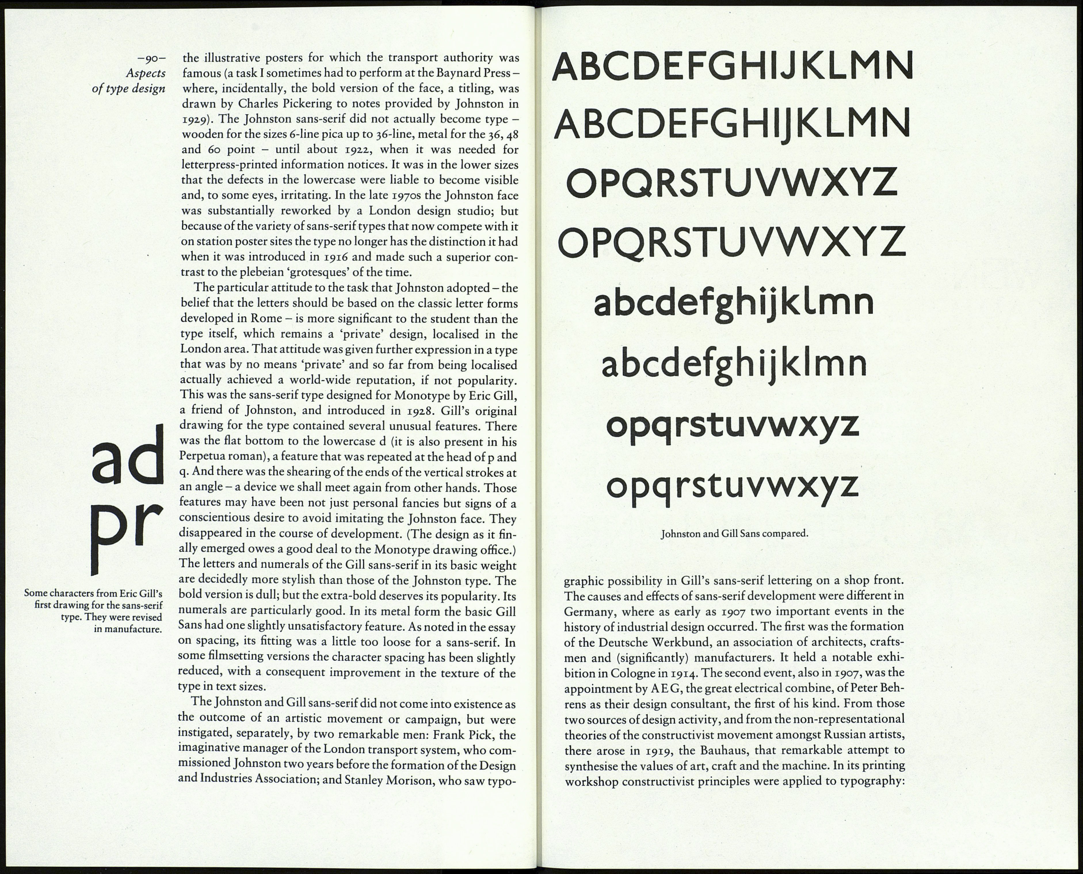
He said that his 'block' letter was based on classical Roman
capital proportions. Certainly his capitals avoid the squareness
of earlier sans-serif faces, though E and F are wider than classical
models and the short-centred M and the meat-hook S are hardly
traditional. The lowercase is a different matter. Johnston started
by deciding that the V must be circular, and he evidently thought
that the bowls of the other letters should be a section of the same
circle. (There was a good deal of 'geometry' in the capitals, too.)
The idea is reasonable, though a circle is always duller than an
oval. The widths of all the other lowercase letters related to the o.
The x-height was moderate. These proportions resulted in an
open face of ample width. (P.M.Handover was wrong to call it
'exceptionally economical'. What Johnston was given to under¬
stand was that his type was so much more legible than earlier
faces that it could be used in a smaller size with equal effect.)
Johnston established the stroke weight of the face by a method
that is natural to the professional calligrapher, for whom the size
of letters derives from the breadth of the pen. As the note on his
drawing shows, the relation of stroke thickness to capital height
was to be strictly i to 7. (Ibn Muqlah, the great calligrapher who
lived in Baghdad in the tenth century, used the same ratio in his
development and regulation of the Arabic script.) If Johnston
had studied type founders' specimen books, as he had said he
intended to do, he would probably have realised that unlike his
scriptorial work, which was an end in itself, his drawing for the
sans-serif was the means to a particular end - the manufacture of
type for printing, which meant that he was at liberty to establish
the stroke weight independently of the capital height. More im¬
portantly, Johnston should have learnt from observation of
examples of type that where curves flow into stems, in sans-serif
as well as seriffed types, the curves have to be made thinner if the
illusion of evenness is to be maintained and a clotted effect at the
joint is to be avoided. If he had been aware of that fact he might
have made his b, d, p and q better integrated, the g more graceful,
and the crotch of n and other letters more incisive.
It has been said that he took great care of the spacing of the
letters, but his tests for that purpose have not been described. If
he had tested his lowercase characters in word combinations,
with due attention to their appearance when doubled, he would
surely not have been satisfied with the gappy effect of his letter 1
(el) with its over-wide curved foot. The foot itself was a good
invention to differentiate the letter from the capital I; but it was
so broad that the letter stood aloof from the one that followed.
It might be argued that those features of the design are really
the idiosyncracies which give the type its distinctive character,
and that they had no ill effect in the large sizes in which the type
was used for its first five years or so, on station sign plates and as
litho-printed letters on paper to be pasted on to the art work of
-89-
The sans-serif
Ibn Muqlah's letter alif, to
the height of seven rhombic dots
From Y.H.Safadi,
Islamic Calligraphy (1978).
