-52- noticeably less than the height of the ascenders - though it could
Aspects be argued that the capitals are normal and it is the ascenders that
of type design are unusually tall.
Shortening the capitals helps to prevent them from becom¬
ing obtrusive and disturbing the texture of the page. That was
not always thought necessary. Some of the heavy versions of
the modern face popular in Europe in the second half of the
nineteenth century had capitals so emphatic that they must have
been intentional. Those types were extreme, in every sense; but
the same characteristic was present in some of the normal Scotch
Roman faces, and when in time there was a change in taste and
the disparity in the capitals and lowercase was thought to be
undesirable those faces had to be modified - which is one of the
reasons why some suppliers had a second version of Scotch
Roman. By contrast with the imbalance of weight still to be seen
in some current type faces the stems of the capitals in Eric Gill's
Bunyan type (known as Pilgrim in the Linotype list) have exactly
the same weight as those of the lowercase letters. Occasionally, in
under-nourished printing on smooth paper, the capitals look a
little weak. To produce the appearance of balance the strokes of
capitals have to be slightly heavier than those of the lowercase,
because of the greater area of the interior spaces. Again, it is a
matter of proportion, and one that is decided by the eye and not
by a calculator or computer.
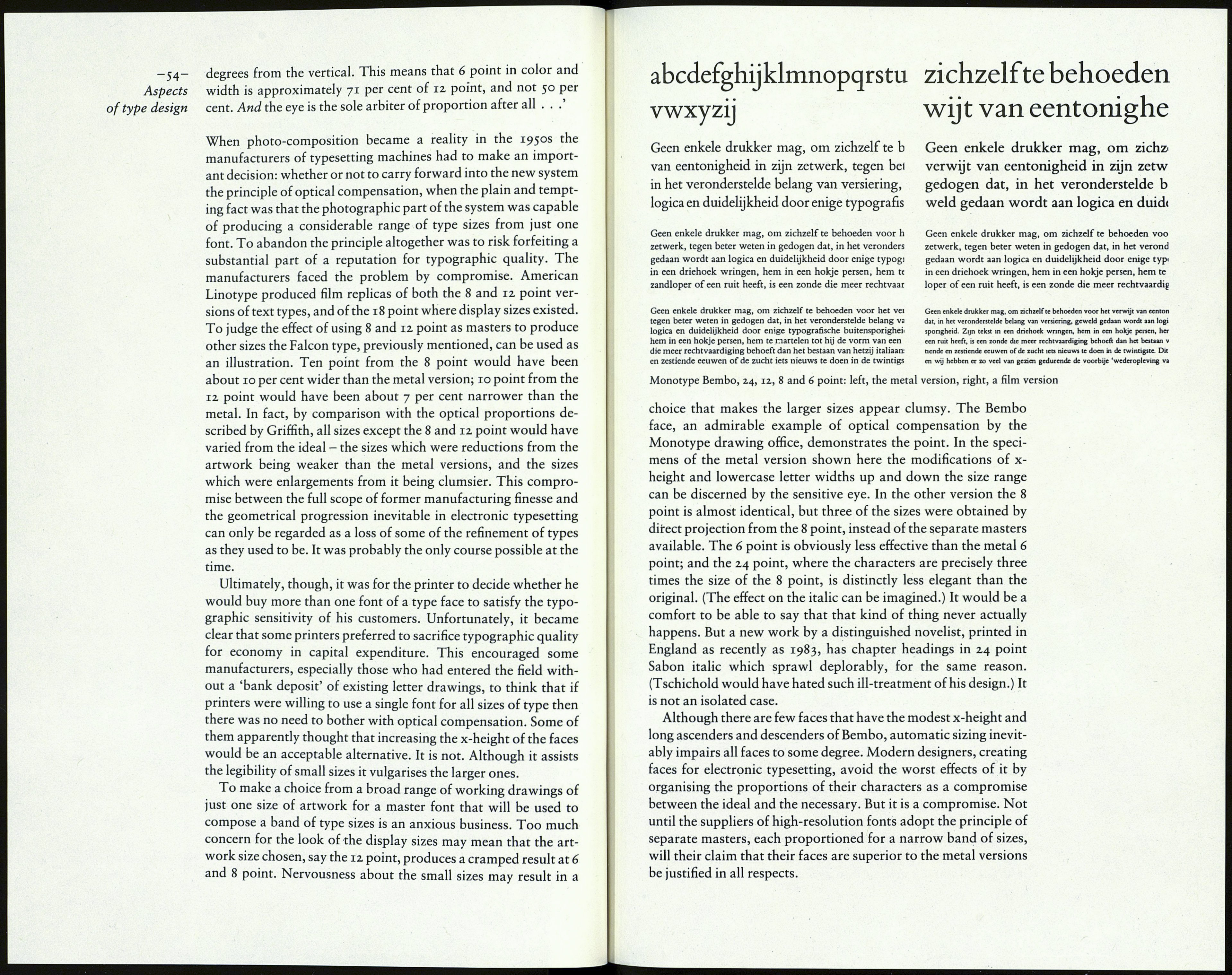
The proportions of letters one to another within a font is one
thing; the modulating of those proportions through a range of
sizes is another. It is the process of 'optical compensation', of
being aware that the ratio of lowercase size to type size that is
satisfactory at one place in the range will not be so at others, and
making the necessary adjustments accordingly.
It was recognised long ago that though the human eye finds it
easy to read type of 12 point size, 8 point needs more effort and 6
point is often difficult. Type founders learnt to help the reader by
adjusting the proportions of letters according to size. The 'pilot
size' of a text type would usually be the 12 point or 10 point. For
the 8 point size the baseline would be a little lower on the body, so
the capitals could be slightly taller at the expense of the lowercase
descenders. The lowercase x-height would be increased in rel¬
ation to the capitals, and the characters would all be made a little
wider and the space between them increased. For the 7 and 6
point the process would be carried still further. The motive was a
functional one: to make the characters of the small sizes as legible
as possible. The process was reversed for the display sizes, 18
point and larger, where legibility was not a problem and an
aesthetic motive could apply. By refining the serifs, reducing the
stroke weight, character widths and spacing, and increasing the
length of the descenders, the elegance of the design would be
enhanced.
This sensitive modulation of the proportions of characters
according to type size was adopted by the makers of mechanical
composing machines, as is shown by a letter of 28 April 1947
from С. H. Griffith, who was responsible for type face develop¬
ment at Mergenthaler Linotype, to W. A.Dwiggins, on the sub¬
ject of the latter's Falcon type. 'The proportional scale of Falcon,
6 to 10 point, has puzzled me for the past year or so, and parti¬
cularly the 6 and 7 point sizes. They simply did not seem to range
smoothly. Repeated checking . . . disclosed no optical errors in
-53-
Proportion
Comparison Proof of 6, 7, 8, 9, ІІЦі and îsfpolnt Revised Falcon Experimental No. 266
phone mofom -poem oj'om phenomenon
phone mofom poem ojom phenbmenon\
phone mofom poem ojom phenomenon
phone mofom poem ojom рЬепотецоПч
phone mofom poem ojom phenomemm^
phone mofom poem ojom phénomène
phone mofom poem QJPF1 рЬ^Ртепо'
The graduations of the proportions in the Falcon type.
basic dimensions of height, width, stem, hairline, etc. Still, the 6
point appeared small and cramped and a feeling of looseness was
indicated in several of the other sizes under certain conditions.'
After describing the exhaustive re-checking of letter drawings
and proofs of trial characters, to no avail, Griffith says he ordered
the factory to make new matrices. 'The root of the trouble was a
slight error by the factory in shaving the side bearing to drawing
figures at a time when several new inspectors were being broken
in.' He then graphically demonstrates the extent to which the
proportions of the 12 point pilot size had been adjusted through
the smaller sizes. 'While in a "mathematical" mood and with the
feeling that the Falcon series presents an almost perfect propor¬
tional curve to the eye I thought I would find out just how our
"eye" curve compares with the geometric curve which these
"blowers up" and "blowers down" will probably have to use in
their photo-composition machines that employ one master size
of pattern. I am enclosing a proof of the series all cast on 12 point
body as required by the rules of geometry. You will observe the
curve of geometrical proportion produces an angle of 50 degrees,
while the curve of our optical proportion has an angle of 403
