-204- and then in October 1933 the makers were free to offer the face
Some designers and for general sale. Until about 1950 Monotype called the face 'The
their types Times New Roman'. Since then they have called it 'Times New
Roman' - though after half a century the word 'New' has no
significance. Linotype always named the face Times Roman, and
that is how most people refer to it.
Times Roman has gained its universal popularity not in news¬
paper work but in the larger area of printing: book work, espe¬
cially non-fiction (the Encyclopaedia Britannica is a notable
example), and magazine and general printing in all its variety.
There is no doubt that when printed to a decent standard on
unsurfaced paper Times Roman and its italic are effective enough
- at least, up to the 10 point size. The bold is less satisfactory. In
display sizes, where the professional eye becomes aware of indiv¬
idual characters, some unfortunate features in both the roman
and bold obtrude themselves. (It is the original types, those made
by Monotype and Linotype for the introduction of the design in
1932, that will be considered here; not the many replications,
which vary in details of design and proportion, particularly the
versions of limited typographic quality offered by some word
processors.)
In the roman the capitals are slightly too wide for the
lowercase, though that is not too noticeable. They are also a little
heavy. Proof of this is that because all nouns in the German
language have to be set with an initial capital some German
printers found the capitals of Times Roman objectionable, and
Monotype were obliged to produce Series 727, a set of alternative
lighter capitals for use with the standard lowercase. In the roman
the u, v, w, x, y and z are too tall in comparison with i, j, m, n, p
and r, which have a steeply inclined serif at the top of the stem.
The same applies to the crossbar of f and t and the arm of k. Thé
fault, which becomes obvious in words like 'divide' and 'jump' in
24 point and upward, may be due to the original draughtsman
contenting himself with drawing the letters in alphabetical
sequence and leaving it at that, instead of making tests of various
letter combinations in word formation. The feet of v and w are
sharply pointed and do not extend sufficiently far below the base¬
line; the two letters sometimes look oddly diminished, especially
in electronic typesetting.
The italic looks well, in spite of some ill-proportioned capitals.
The lowercase y is ungraceful. The z was originally designed in
the curled form to be seen in Garamond, Baskerville and other
book types. It is still present in the Linotype version; but
Monotype changed the design to a severe straight-stroke form -
though the curled style lived on in their later semi-bold and bold
italics.
The bold companion face is a puzzle. The requirement of du-
omxiennx
omxiennx
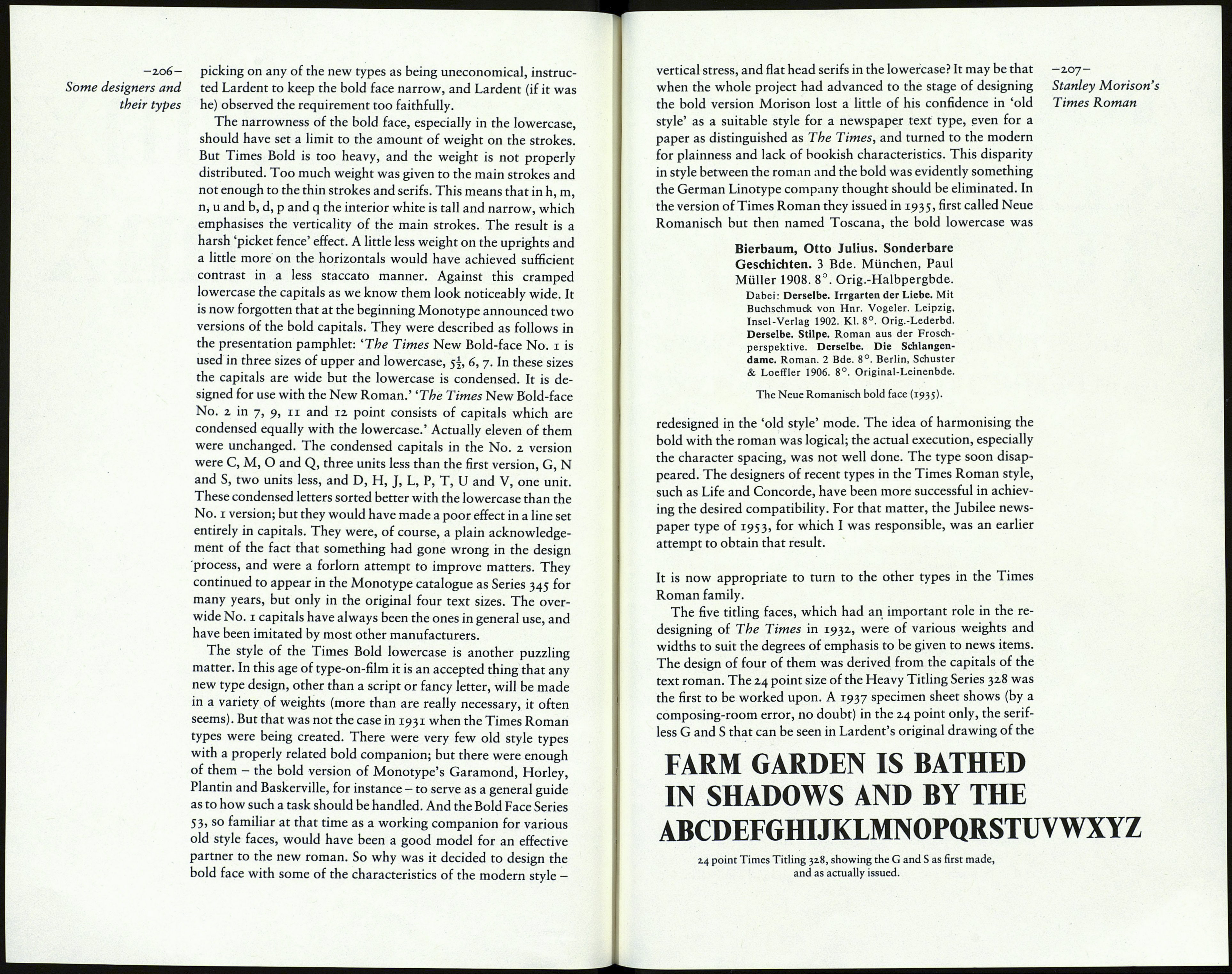
Compare the heights of x and i; the difference in the serifs of
roman and bold; and note the very narrow counters in the bold.
ABCDEFGHIJKLMNOPQ
RSTUVWXYZ
abcdefghijklmnopqrstuvwxyz
ABCDEFGHIJKLMNOPQ
RSTUVWXYZ
abcdefghijklmnopqrstuvwxyz
plexing with the roman, which was probably a factor in the
designing of the italic, did not apply to the bold face. The Times
was going to use it for occasional lines, not for text matter, and
needed only the 5I and 7 point sizes for its line-casting machines;
they were supplied as single-letter matrices. In the designing of
the bold face, then, there was freedom to allow the letters to
become a little wider than those of the roman, as the balancing of
the interior spaces with the thicker vertical strokes demanded.
That would have been the natural course; but quite the reverse
occurred. The unit arrangement table No. 324 for Times Bold
shows that in the lowercase only the x is wider than the roman, by
one unit. Eleven other letters, b, d, h, m, n, o, p, q, u, v and w are
one unit narrower. (And remember, the roman lowercase was
itself an intentionally narrow type.) In the capitals, J is two units
wider than the roman and O, P, Q and Z are one unit wider, but
A, D, F, G, K, N, R, S, U, X and Y are one unit narrower. The
only explanation I can suggest for this unusual procedure is that
Morison was anxious to prevent critics within The Times from
