-196- was found to be not crisp enough after repeated stereotyping. I
Some designers and quote: 'It was decided therefore to modify the normal Plantin' by
their types sharpening its serifs and reducing its thin strokes. This can only
refer to Monotype Plantin no, the type used for the trial setting.
But in the first edition of A Tally of Types, also issued in 1953, he
said: 'Finally it was decided to put in hand a new design to be
excogitated by Morison . . . He pencilled the original set of
drawings and handed them to Victor Lardent, a draughtsman in
the publicity department of Printing House Square [The Times]
whom he considered capable of producing an unusually firm and
clean line. Lardent made a first-class set of finished drawings of
the capitals and lowercase out of the pencilled patterns given
him.' That seems to be saying that the design emerged from
Morison's mind as a wholly original creation which he himself
drew on paper in a manner sufficiently explicit for the draughts¬
man to follow without difficulty.
Victor Lardent's particular forte was the drawing of lettering
for advertisers who did not employ an agency. In 1965, when he
drew an experimental heading type for me on behalf of The
Times (it was a failure; my fault, not his) he was unable to tell me
anything of the creative process of the Times Roman types -
perhaps because in 1931 it had seemed to him to be no more than
a lettering job, not greatly different from others. James Moran
had a similar experience in 1968; but he did elicit the information
that Morison did not give Lardent any patterns, but did give him
a photograph of a page of a book printed by Plantin 'to use as a
basis'. This phrase of Moran's has been taken literally in eminent
places to mean that the Times Roman type was developed dir¬
ectly from an ancient original - the Gros Cicero cut by Robert
Granjon. A note to that effect was included in the new edition of
A Tally of Types in 1973.
Morison may well have given Lardent a specimen ofthat type;
but I think it more probable that it was a photograph of a page, or
pages, from Dr Rooses's edition of the Index Characterum pub¬
lished by the Plantin-Moretus Museum in 1905. Rooses's intro¬
duction is set in the Gros Cicero type (including some wrong
fonts). Morison certainly knew the book; the St Bride Library
copy has a pencilled note in his hand on a page of ornamental
borders. Whatever the source of the specimen I think it was inten¬
ded only as a reference for particular details, not as the actual
basis for the new type. To make drawings from a sixteenth-
century book type — the letters inevitably rough-edged because
printed on unsurfaced paper, the alphabets incomplete, the serifs
not nearly so sharp as had been specified for the new type - would
have been a difficult task, which anyway had already been done
in the creating of Plantin no, as no doubt Morison knew. And it
would probably have taken a good deal longer than the nine
weeks that elapsed from 28 January 1931, when Morison was
BCDEFGHIJKLMNOPQ.RSTUV
WXYZabcdefghijklnqrfs tvwx
y z ^sa&ffffifflfiflœlbfinffffiftiyi
iàââçéèêëëeiiîïin ó ò ô ö p d ,p
qqçgqiiùùiiui 2 3 4. 5 ó 7 8 9 о ,
.'>:■!?([-*«•§ a i m о pu
immopprfuuuíi
The Gros Cicero type.
Copyright, Plantin-Moretus Museum, Antwerp.
instructed to proceed, and 8 April, when Monotype put the 9
point in hand for punch-cutting. On the other hand, Plantin no
and Times Roman show dimensional similarities that can hardly See overleaf
be coincidental. The first thing to compare is the character
widths in each face. This can be done with precision by taking
note of two features in the Monotype system: the 'set', which
provides the basic factor for calculation, and the 'unit arrange¬
ment' table, which shows the number of units allocated to each
letter. As to the set: in both types the 7 point size was j\ set and the
9 point was 9I set - at least at the beginning, though 9 point Times
Roman was afterwards changed to 9 set to tighten the fitting. The
basic unit of width measurement was therefore the same in each
type. The unit arrangement of Plantin was No. 4 in Monotype's
list and for Times Roman it was No. 325. The differences are
slight. Only three lowercase letters vary: a is 8 units and к and о
are 9 units in Plantin; in Times Roman they are one unit wider.
The other twenty-three lowercase letters have the same values in
each face, and since the set was the same it follows that the letters
had the same actual width. In the capital alphabet, A, R, S and Y
are one unit wider in Times Roman, but I and L are one unit and
T is two units narrower than in Plantin. The remaining nineteen
capitals have the same widths in each face.
For the vertical dimensions of the two types we should look at
the alignment and the lowercase x-height. In 7 point Plantin the
'line' (the distance between the top of the matrix and the baseline
of the face) was .1257 inch; in Times Roman it was .1268 inch, a
difference of .0011 inch (.027 mm). In the 9 point faces the dif¬
ference was .0013 inch (.032 mm). These differences of just over a
thousandth of an inch are so small that they could have been
unintentional (Monotype did not work to standard alignments).
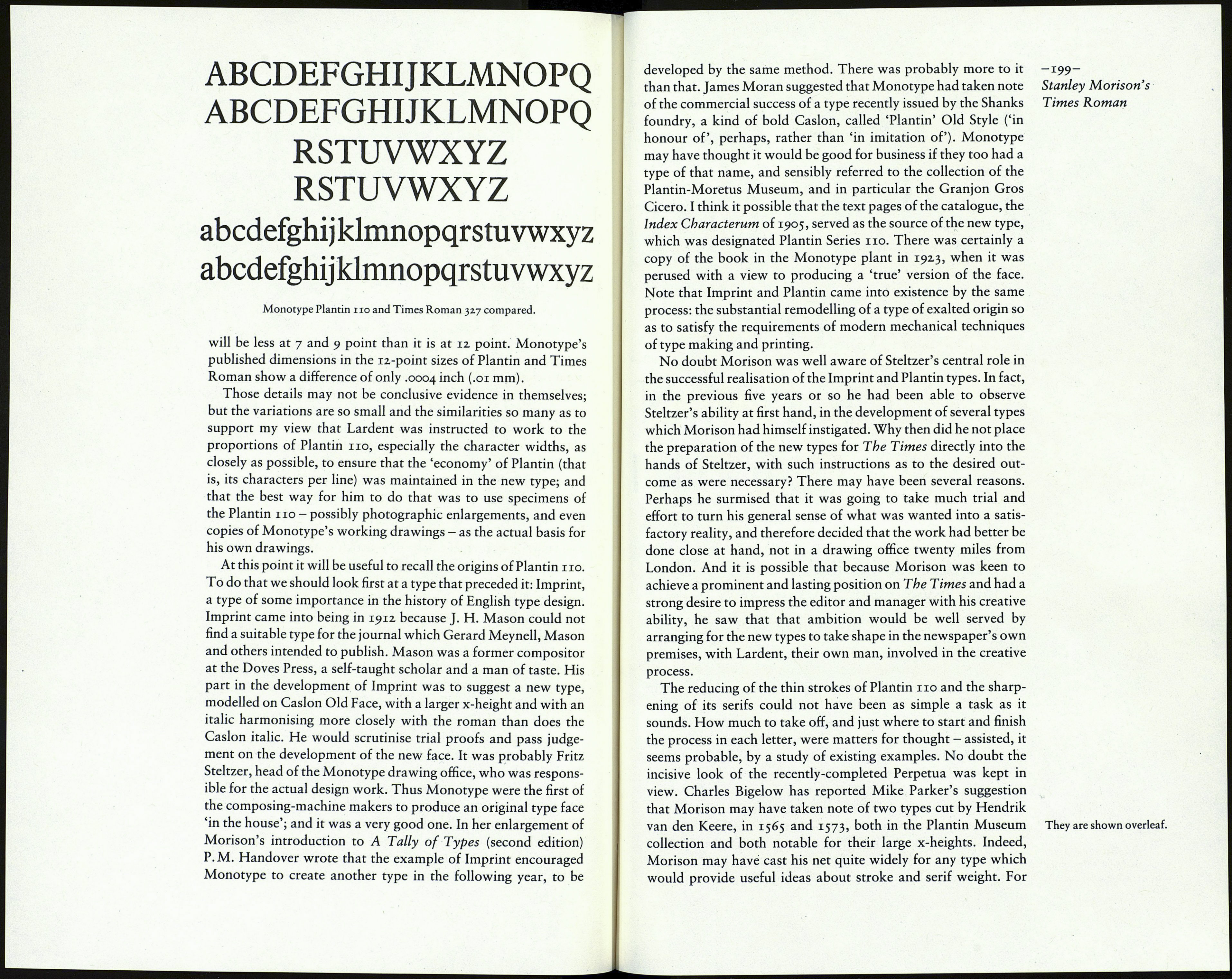
As for the x-heights it can be assumed that if there is a difference it
