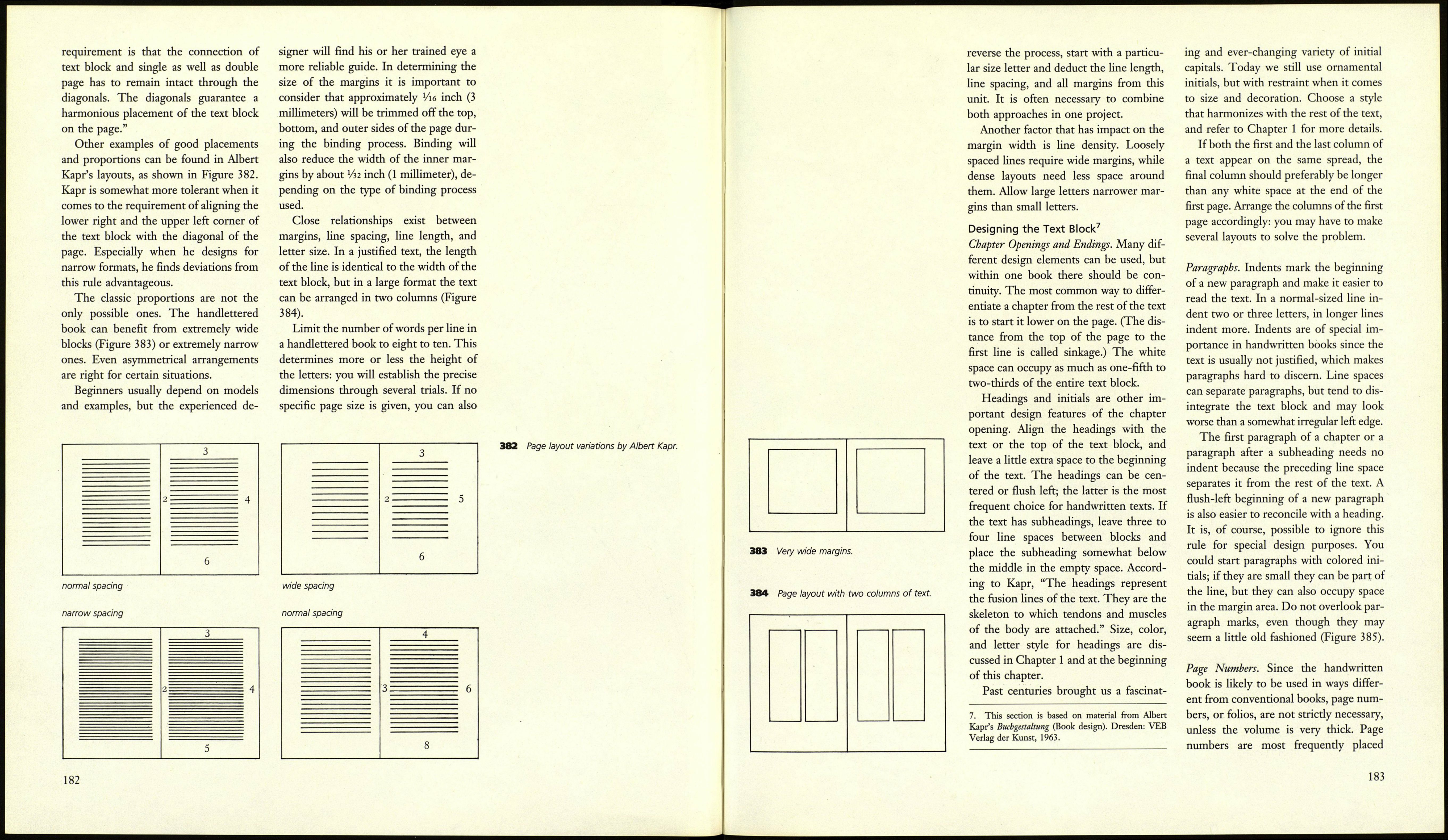
shown in Figures 473 and 474, page 221.
The earliest printed books were im¬
itations of handwritten ones. Today the
handlettered book should not seek to
emulate the printed book, but it is useful
to take into account the rich experiences
of typesetters, not just where the stricdy
technical aspects are concerned but
especially the considerations of logic and
aesthetics. For a handwritten book issues
such as format, decoration, letter size,
and arrangement of text blocks are less
constrained by the demands of produc¬
tion techniques than for a typeset book.
The designer has much more influence
on the final product and can express his
or her personality in many ways, freely
and unencumbered by many restrictions.
Different occasions — festive speeches,
works of poetry or prose, and so on-
demand specific forms appropriate to
their content. Legibility is an issue of
varying importance, as expressive poetry
may be better served by a lettering style
of comparable emotional value at the ex¬
pense of clear presentation of each letter.
Such variations and decisions are impos¬
sible to make in a typeset volume. Calli¬
graphy can be used to interpret and vis¬
ualize text in a way similar to illustration.
A series of planning steps is necessary
for the production of a handlettered
book, and these will be discussed in the
following sections.
Format and Page Layout
If you are planning to use paper for your
book, you need to determine the grain
direction and the size of your sheet be¬
fore you decide on a format (see the sec¬
tion on Paper Structure, page 187).
There is an important difference be¬
tween layout for a single loose page and
for a book: the single sheet stands alone,
but a book opens to a spread — a pair of
facing pages that have to function as a
unit.
Every page layout has to be related to
the layout of the facing page. If the text
block were placed exacdy in the middle
of a page, surrounded by margins of
equal width, the spread would optically
fall apart in the middle. Jan Tschichold
wrote, "Harmony between page format
and page layout comes from equal pro¬
portions between both of them. If a
union is achieved between layout and
format, margin proportions become a
function of page format and the con¬
struction process. The elements are in¬
terdependent. The margins do not
dominate the page, they develop natur¬
ally from the page format according to a
form canon."6 Tschichold has recon¬
structed such a canon, which is the basis
of many documents and incunabula of
the late Middle Ages (Figure 375).
Tschichold found other ways to create
the same proportions. One is to divide
width and length of the page into nine
equal parts (Figure 376); another to ar¬
rive at the nine parts with the help of
Villard's Figure (Figure 377).
The nine-part division gives good re¬
sults even with other page formats.
Examples are 1:1.732 (the golden sec¬
tion—21:34), 1:1.414 (the international
A format), 3:4, 1:1, and 4:3 (Figure 379).
Tschichold considers the nine-part
system the most beautiful, but not the
only possible one. Referring to some of
the illustrations in his essay, which are
reproduced here, he further wrote, "A
twelve-part system creates a larger text
block, as we can see in Figure 16, ...
Figure 17 shows pages with the side pro¬
portions of 2:3 divided into six equal
parts. Along its length the paper may be
separated into any number of parts if
necessary. Margins even narrower than
those in Figure 16 are possible; the only
6. Jan Tschichold, "Papier und Druck" (Paper and
printing), in Typografie, Vol. 3, 1966.
I1
*------->
:
у
374 Раде formats, showing grain direction of
the paper: folio, quarto, octavo.
375 Jan Tschichold identified the plan of many
medieval handwritten texts and incunabula: the
proportions of the page as well as of the text
block are 2:3. The height of the text block
equals the width of the page. (Figure 5 of
Tschichold's essay, "Willkürfreie Massverhältnisse
der Buchseite und des Satzspiegels".)
\__s
\ y/
}\ _
У \ -
/ \
/ \
/ :: ::_s
/ \
376 Rosarvio's construction. Like Tschichold's,
it assumes page proportions of 2:3 but uses a
system of nine basic units. The result is the
same. (Tschichold, Figure 6.)
180
377 Villard's figure. The heavy lines make it 378 It is possible to use Villard's system to 380 Villard's system used to divide the page
possible to divide any other line into any number arrive at the nine-unit plan; page proportions into twelve parts. The proportions are still 2:3.
of segments. No rulers are necessary. remain 2:3. (Tschichold, Figure 8.) (Tschichold, Figure 16.)
(Tschichold, Figure 9.) jyg He¡gnt anc¡ w¡c¡tfi are divided into nine 381 Division of the page into six parts, with
parts. The proportions are 4:3. (Tschichold, the same proportions. (Tschichold, Figure 17.)
Figure 15.)
181
