3. Within a historic style: mixtures of
a. Renaissance roman and fraktur
b. Schwabacher and textura
c. Modern variations of Renais¬
sance roman such as Tschörtner
and modern modifications of
textura
d. Egyptian or sans serif and En¬
glish scripts
e. Historical fraktur and
Schwabacher
f. Neoclassical roman and neoclas¬
sical forms of fraktur.
4. In a combination of condensed sans
serifs, Egyptian, or modern styles that
are written with a brush, and certain
modern roman, sans serif, and neoclassi¬
cal styles.
It is also possible to create a mixture
of contrasts, as in the combination of
sans serif and Garamond or English
script and sans serif.
For decorative capitals consider the
style of the alphabet. Ornamental crea¬
tions that are based on neoclassical form
match neoclassical types.
The following combinations are to be
avoided:
1. Historical alphabets and their mod¬
ern variations, such as Akzidenz-Grotesk
and Helvetica or Garamond and
Tschörtner.
2. Different types of fraktur.
3. Neoclassical and Renaissance al¬
phabets.
Calligraphy
General Remarks
Good lettering can be more than just
beautiful or effective. It can be filled
with motion, vitality, and the spirit and
wit of the topic, but the designer needs
to be in command of a wide arsenal of
forms and shapes and sensitive in their
applications. There is no substitute for
"SkruHstaélkke ambisdteDidtîer
ншКаШеуарН-
vAm'l-lyassatt,
îoaiuusérer г- шж' **
Hastdwemntal
das Ziel deines
•nserlattat,
ertSkvstduvjeL
ö Freude und
-j§ manckeLust.
*з
s
Ѵ^э
í ш i.
*ч Sis §N * ь
I«
V
ístdasbesteJAítteldas^íeL ew* nickt über die Häßlichkeit deiuer
wckdemdustrebst' scknfizuge,dieduaJsAnfängerbeim fe
Щ0Р
Jauge zuerst aufeinem- Bord
^u-sätraben aiTdazu^ieke
uydsckwiiige das sät wert
е^иижашшгііскен Willens
Лоск окне jede< Übereilung. ^5e
*<ЬикеЪ
Uak
******
W 0a«kbayelt-
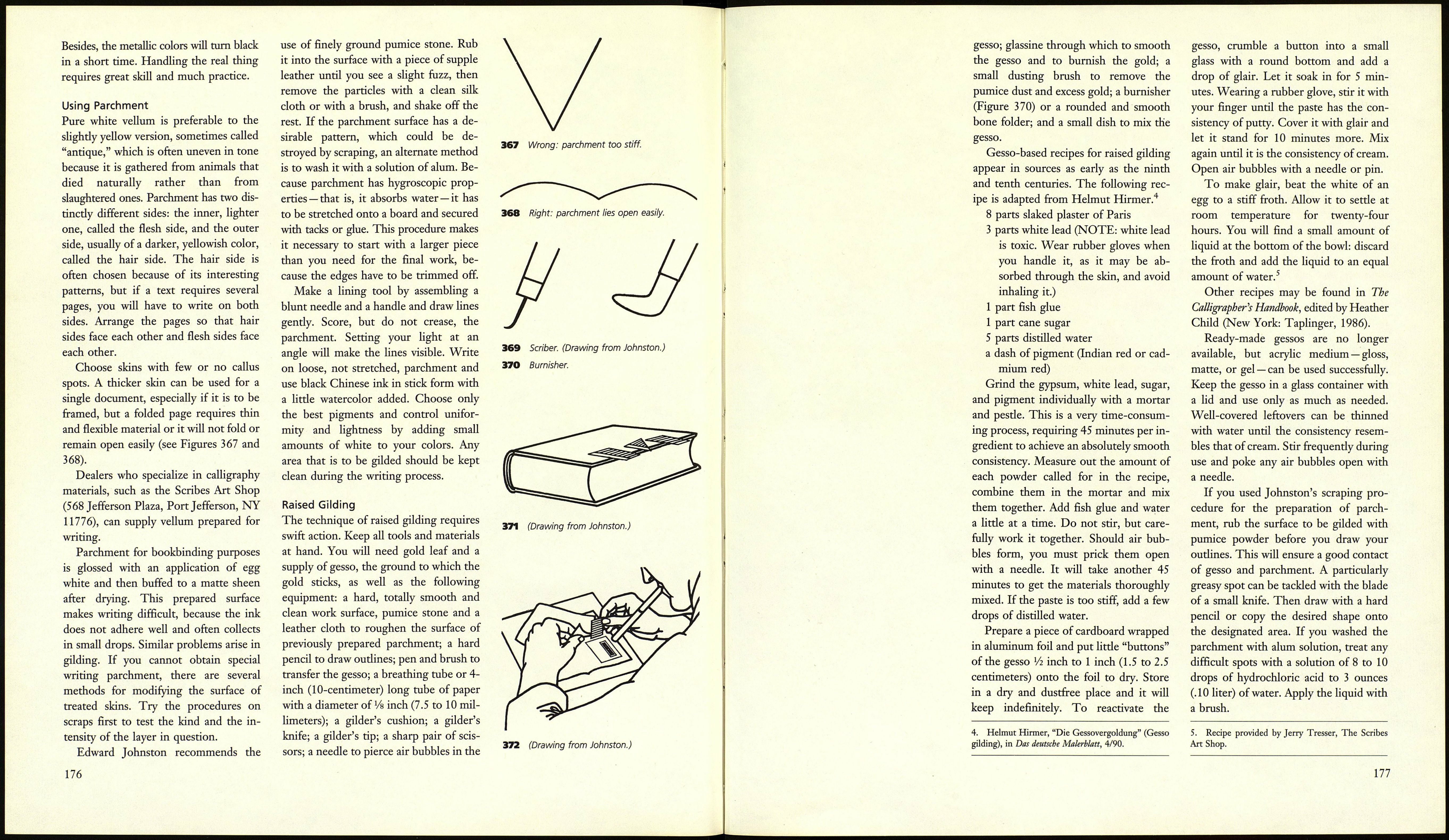
366 Calligraphic study by Albert Карг.
174
the serious work that a composition re¬
quires. The outline, contrasting thick
and thin lines, large and small, straight
and round, simple and complex struc¬
tures, horizontals and verticals — all
these elements give life to the written
word and help create the impression of
a balanced whole. The shapes within the
x-height carry the ascenders and descend¬
ers in an organic process. Quick strokes
create interesting accidents and every
writing material has inherently different
possibilities. Use brushes, steel pens,
reeds, chalk, and paper to their best ad¬
vantage. Unplanned but pleasing effects
can be combined by cutting and gluing,
but the result should always look as if it
was produced by one stroke.
Documents and Short Texts3
General Remarks
Documents such as diplomas and certifi¬
cates and short texts such as speeches are
frequent subjects for calligraphic work,
and many techniques are available. You
can write on just one side of a single
sheet and frame it or store it in its own
portfolio. You can present it as a scroll,
or fold and box it. Works of larger scope
are best bound in book form. In each
case text and surround should be in uni¬
son, and binding techniques should be
taken into account from the earliest
planning stages on (see pages 187-190).
The grain direction of the paper is im¬
portant if the paper is to be folded or
scored later on. A professional book¬
binder can be of help if the project re¬
quires specific materials, but get advice
before you start your work.
It seems redundant to point out how
3. Much of the information in this section comes
from Edward Johnston's book Writing and Illuminat¬
ing and Lettering. New York: Taplinger, 1977.
important it is to plan carefully. Choose
several appropriate letter styles and
write the entire text in each one. Letter
special sections such as headings, initials,
or other important parts in more than
one size and color to create a pool of im¬
ages from which you can later choose.
Most purposes are served well with a
more or less representative selection of
roman capitals and lowercase letters and
cautious use of italics and decorative ele¬
ments. Forms with strong historical as¬
sociations such as fraktur or uncials have
a tendency to seem antiquated, even
when used as accents, but this effect
could be balanced by a decisively mod¬
ern layout. Use color only to accent the
most important word or line of your
text, or for initials. The most beautiful
effects are often created with black and
gold, but red and turquoise can produce
excellent results. Mix your red from ver¬
milion and carmine red, add some white,
and vary the proportions to achieve a
cool hue for use on a bluish paper and a
warm one for yellowish paper and
parchment. Coats of arms and other in¬
signia look best when they are embossed
and gilded.
When all the words have been writ¬
ten, cut them out and rearrange them on
your format. Whether you choose a
symmetrical or nonsymmetrical layout
depends on the requirements of the text.
Longer sequences are best served by
flush-left text. When you like the ar¬
rangement, glue the pieces in place.
Parchment is the material of choice
for very important occasions or when
durability is a concern. If the additional
work is justified, consider the use of gold
for especially valuable pieces. Do not
take any short cuts, however — imitation
parchment and fake metals in paste and
powder are bad taste, even if they are
used to make nothing more than a di¬
ploma for the local ballet-dancing club.
175
