Nineteenth-Century Display Styles
One of the side effects of the industrial
revolution in England was the advertis¬
ing industry. Advertisements, posters,
and other printed matter created a de¬
mand for eye-catching and effective
typefaces, some of them larger than ever
before. European firms were quick to
adopt and further develop the new Eng¬
lish typefaces. First came the bold
roman of neoclassical style, followed by
Egyptian, Italian, and Tuscan faces in
many variations. Their names allow in¬
ferences to the original purpose. Egyp¬
tian, one assumes, was created to satisfy
the interest in all things Egyptian that
arose in England after Napoleon's ill-
fated campaign, Kapr says. Type pro¬
duction became the domain of industry.
Foundries were engaged in competition
with each other, which was beneficial in
the beginning, but catastrophic in terms
of artistic quality soon afterwards.
Catalogs hawked well-designed and ques¬
tionable alphabets side by side; type
design degenerated into mere technique.
Display typefaces are of great impor¬
tance again today. The following sec¬
tion presents an overview of the most
useful display types. Basic forms can
easily be varied and adapted to specific
applications.
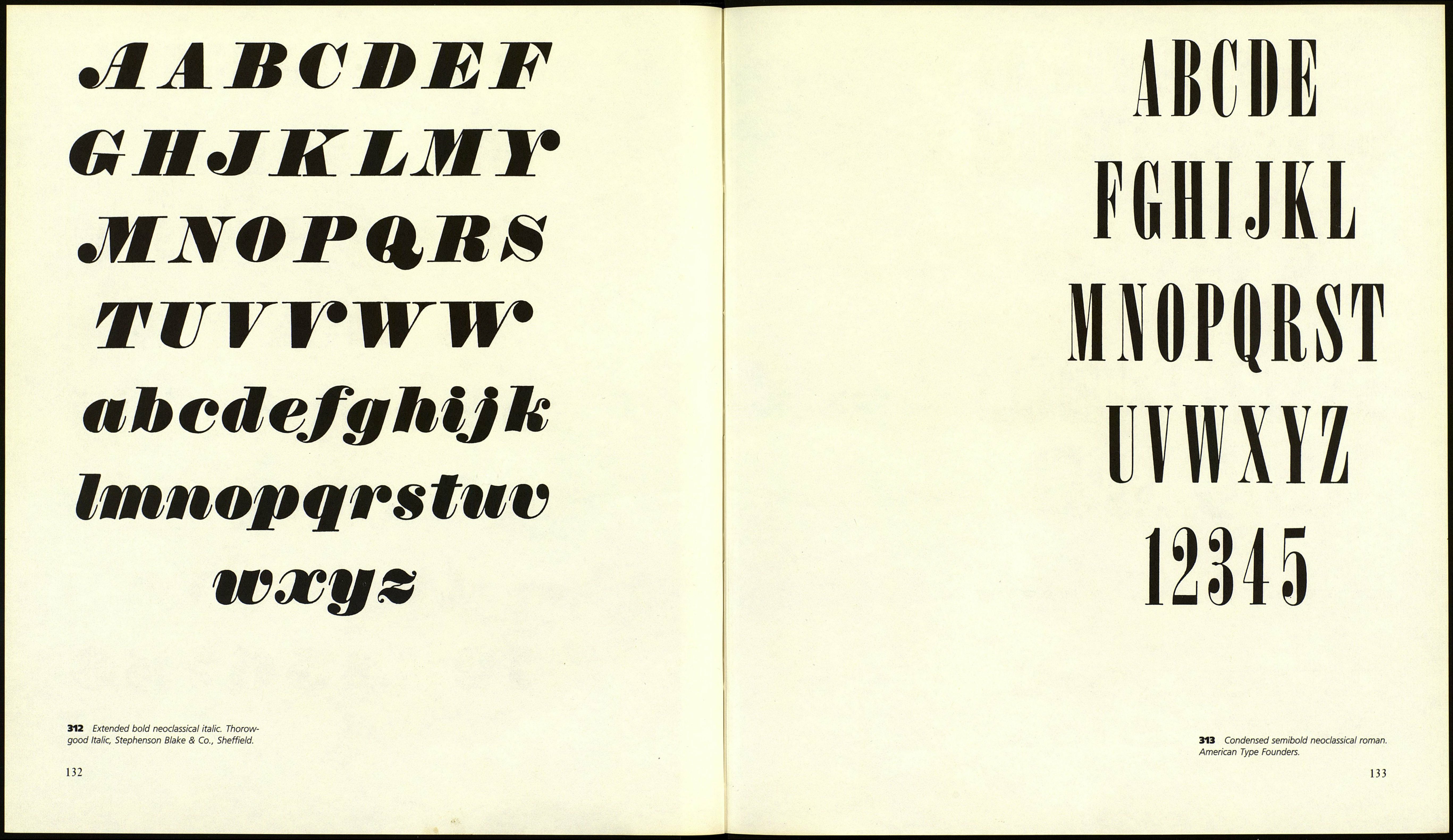
Bold Roman Neoclassical
An extreme contrast between thick and
thin distinguishes bold roman neoclas¬
sical types, also called fat faces, from
the neoclassical roman. It can be quite
elegant, nevertheless. Keep the interior
spaces narrower than the stroke width.
Variations are shown in Figures 314
through 325.
Egyptian and Italienne
The first of these types were probably
created before 1806 in the foundry of
Robert Thorne (according to Muzika).
The thick/thin contrast is reduced to a
minimum. The stress of the round forms
is vertical, the capitals are matched to
each other in width. The serifs are rect¬
angular in shape (slab serifs) and the
same width as the crossbars. Earlier ver¬
sions have straight serifs, later ones are
bracketed. A common name for these
was Clarendon, after the type of that
name. Both basic forms in various
weights and excellent new copies have
been produced during the last few years
by several foundries: Volta by Bauer,
Neutra by Typoart, Clarendon by Haas,
Egizio by Nebiolo, as well as some faces
for typewriters. The illustrations show
that Egyptian is a good starting point for
a variety of decorative variations. Only
some later Italienne types are worth
mentioning. They differ from Egyptian
in the horizontals, which are bolder than
the verticals.
Tuscan
In 1815 Tuscan type was introduced in
England by Vincent Figgins. Its pecu¬
liarity is bifurcated stems and serifs, a
device already popular during antiquity,
the Renaissance, and the baroque era.
Tuscan faces can be developed from
Egyptian or from Italienne.
Sans Serif
There are different opinions about the
first cut of sans serif, or grotesque, type.
Albert Kapr quotes the year 1803 in
his Klassifizierung der Satzschriften' and
the company as Thorne, while Frantisek
Muzika credits the Caslon foundry in
the year 1834 as the creator of the first
sans serif alphabets, which were cut as
4. Albert Kapr, "Die Klassifikation der
Druckschriften" (The classification of printing
types), in Schriftmusterkartei. Leipzig: VEB
Fachbuchverlag, 1967.
"Egyptian without serifs" (Muzika).
(The first known example of a sans serif
was from William Caslon IVs 1816
specimen book.) The horizontals are
only slightly narrower than the verticals,
the stress is vertical, the width of the
capitals is almost equal. Many variations
are possible through changes in stroke
width and letter width. The condensed
medium sans serif is the most useful
of them.
Historic sans serif typefaces are
graced with a certain liveliness and
charm, and it should not surprise us that
type designers try to approach the his¬
torical wellspring of type yet again with
creations such as Folio, Helvetica, and
Univers, after they exploited all the pos¬
sibilities of constructivism during the
twenties and thirties. Univers is of spe¬
cial interest, because it contains vertical
and diagonal bars that are differentiated
in accordance with the principle of
changing stroke width in the roman,
a characteristic that has influenced the
way we all see type. The width of the
capitals is less uniform than in other sans
serif styles.
130
ABCDEFG
ІІІ.ІІІЬтІЛ
OPQRSTU
VWXYZ
abcdefghij
klmnopqrs
tuvwxyz
311 Extended bold neoclassical roman.
Thorowgood, Stephenson Blake & Co.
.
