Sttclibaelarfangc Çlariff- pmtëa &
fmDememplto:t)tnon Qlföem ©uteriDet>a
Figure 258
Figure 259
Шйтштт mât раШ
тмщт,%шітщр<фп* вт
tmmt фтщт$ хтЬт,ЬйЬмщШ$ шиит
хп(^$\тщ.Ю<* wmtwnbaoüm ftotüim toait
Figure 260
9° ?
^a$í9tt«§t firmerfi^mmfoÍ° ,
gn an fcptpm auf baeföaflfr
Figure 261
Figure 262
258 Type from the prayerbook of Emperor
Maximilian, 1515. From Albert Kapr, Johann
Neudörffer the Elder. Leipzig, 1956.
259 Type from Dürer's Proportionslehre, 7534.
From Albert Kapr, Johann Neudörffer the Elder.
260 Fraktur, detail of "Clipanicana maior, "
from the sixteenth-century pattern book Proba
centum scripturarum by Leonhard Wagner.
Facsimile edition. Leipzig: Insel Verlag, 1963.
261 Type from the Theuerdank, 1517. From
Albert Kapr, Johann Neudörffer the Elder.
262 Ductus.
On page 101:
263 Fraktur. Study by the author.
264 Fraktur. Study by the author.
265 Fraktur. Study by the author.
266 Upper Rhine style. Study by the author.
267 Upper Rhine style (the capitals do not
match). Study by the author.
268 Variation of a fraktur. Study by the au¬
thor.
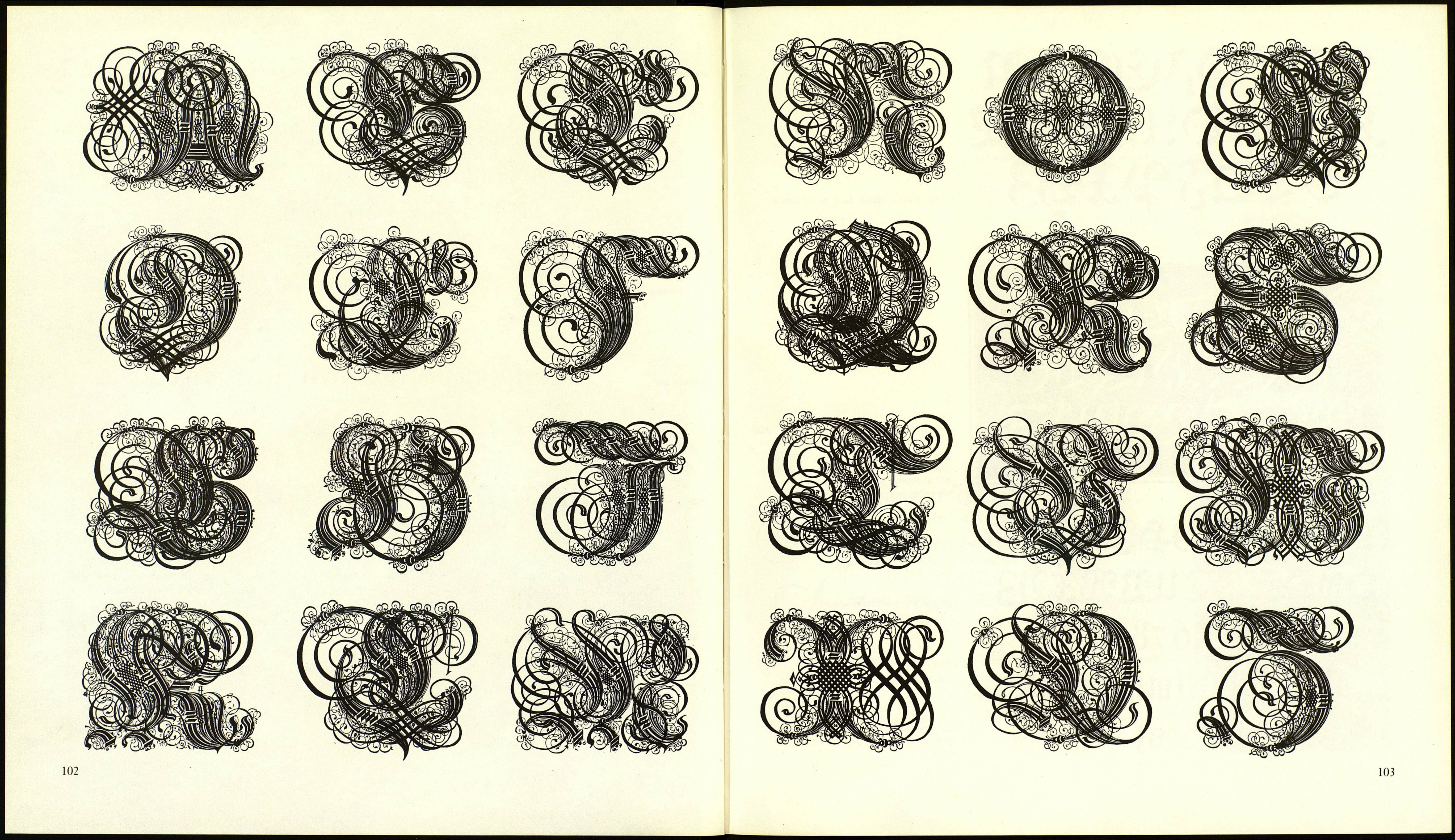
On pages 102 and 103:
269 Renaissance fraktur initials by Paul Frank,
Nuremberg, 1601. From Petzendorfer, Schriften-
Atlas (Type atlas). Stuttgart: Verlag Julius
Hoffmann, n.d.
100
Figure 263
Figure 264
Figure 265
Figure 266
Figure 267
Figure 268
Зшп 93cftm tor (jcfmmtn 9Kmfiftl)rir
farm mmtmtb beirrten,
ber mrf)t «us ftcf) jelbfr гпафс
ШЛО (TUS tl)ttt
werben taïuiib fol
aövt>tfy$ijftnnfopc\wcf\шѵ ющ
o4fte (Сапзе
abcbcf$\)íjklmnopqrf$mvTv?yz
Fraktur was used for the Book of
Hours of Emperor Maximilian, 1513, by
Schönsperger. Its forms were probably
influenced by Leonhard Wagner and
Vincenz Rockner (Figure 258). Also by
Schönsperger is the type for the Theuer¬
dank, 1517 (Figure 261). Neudörffer
created the model for the types used in
Dürer's Proportionskhre (1522 and 1534).
The cutter was Hieronymus Andrea
(Figure 259).
During the baroque era fraktur type
moved further from its calligraphic roots
and became increasingly flourished and
elaborate.
Neoclassicism, under the influence
of engravings on copperplates, favored
forms that to us seem fragile, colorless,
and artificial. Up to the nineteenth cen¬
tury fraktur type were the staple of Ger¬
man printers; today they are barely in
use any more, displaced by classical
roman letters. Among the typefaces still
in use are the Alt Fraktur of Luther
(1708), that of Breitkopf (eighteenth
century), and Ernst Schneidler's Zente-
nar (1936).
When you draw these letters, pay spe¬
cial attention to the ligatures between
the letters m, n, u, and h. Emphasize the
differences between narrow lowercase
and wide uppercase letters, and try to
create a field of tension within capitals
that contain large and small units.
101