which served as the model for the
type used in Gutenberg's Bible.
which served as the model for the On page 91 :
.____________1 ;_ /^__.___i______j_ t>íi_i_
GOTHIC LETTERS AND
THE RENAISSANCE
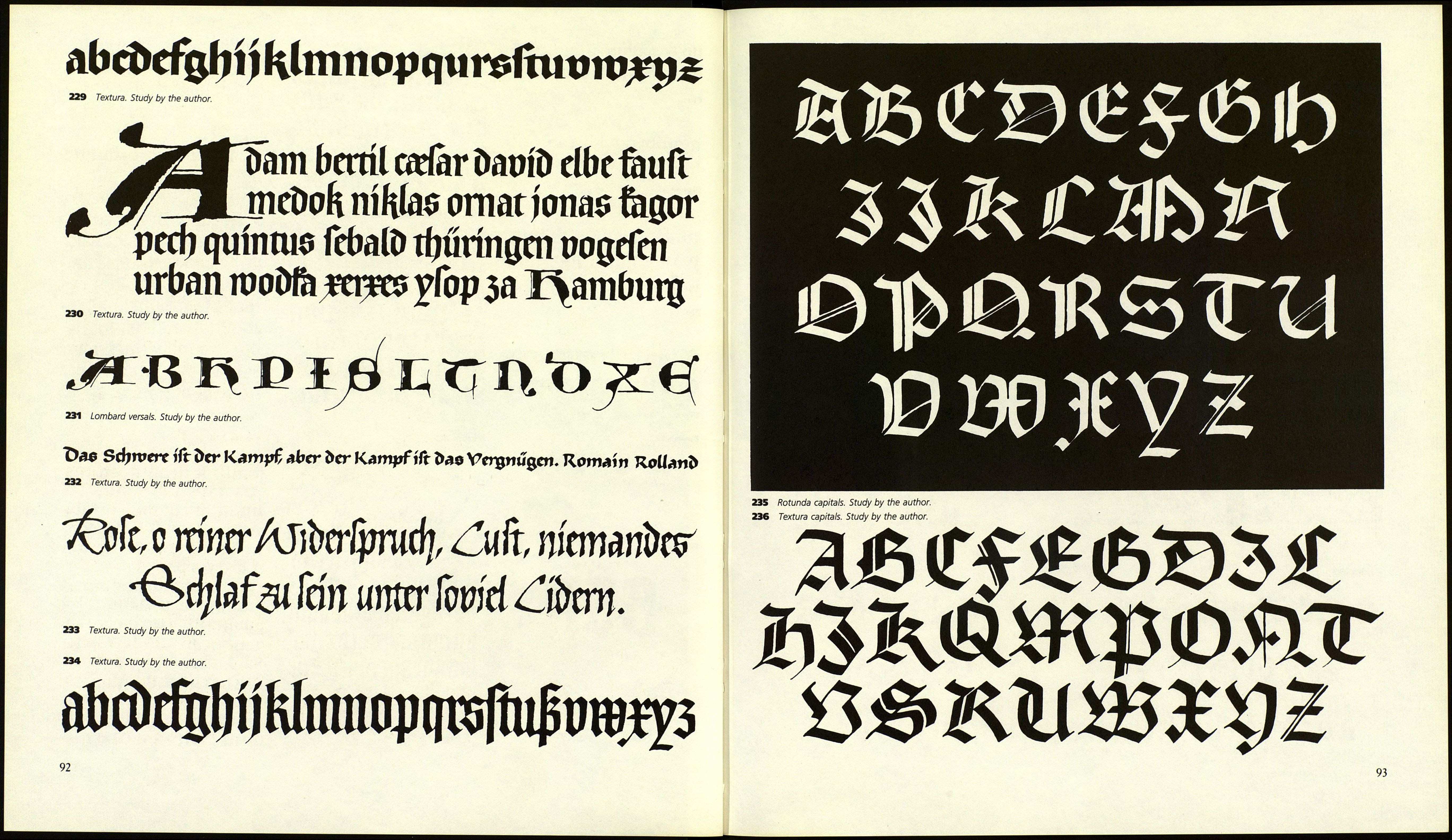
Textura
Under the influence of the Gothic style
in the twelfth century the x-height forms
of the Carolingian minuscule grew nar¬
rower and taller. The arches, entries,
and exits of letters started showing a ten¬
dency to "fracture." From these early
Gothic bookhands all later textura, or
blackletter, styles were generated, by re¬
placing all rounded forms with broken
lines. The form canon was established in
northern French monasteries at the end
of the twelfth century and was gradually
accepted by all other western European
monasteries. In the German realm tex¬
tura found an important expression in
missals.
Textura letterforms are narrow and
written with a broad flat-edged nib for a
strong contrast between thick and thin.
Verticals are connected to each other
with rhomboid forms, and these interior
spaces are frequently narrower than the
stroke width. Distances between lines
and words are very small. The letter a
consists of two parts, and a broken un¬
cial form serves as d. The f and the long
version of s reach only to the baseline.
Legibility is hindered by the dense let¬
tering, by relatively few ascenders and
descenders, and by the multitude of
ligatures.
Referring to different stem shapes, the
following groups can be distinguished:
1. Textura with rounded ends (four¬
teenth century)
2. Textura with broken ends (four¬
teenth century)
3. Textura with straight ends (four¬
teenth to fifteenth centuries)
4. Textura with rhomboid-shaped
ends. This is a late development,
The third form of blackletter appears
in French manuscripts. A skillful twist of
the pen in the lower part of the stem
creates horizontal ends. Since fractured
forms appear only at the upper but not
at the lower ends of letters, a very attrac¬
tive contrast results.
A fourth variation is the execution of
textura in stone, bronze, or wood. Here
the letters are not engraved but raised.
Some inscriptions were painted or cut
into wood for printing purposes. The
latter technique furthered ever pointier
entrance and exit strokes, an effect that
was later mimicked in some typefaces.
For special occasions, forms of roman
capitals and uncials as well as rustic cap¬
itals with elements of Gothic script were
used. An original and very ornamental
set of capital letters was developed from
Gothic elements and the addition of
minuscule forms. These so called Lom¬
bard versais were drawn with a brush in
attractive contrast to the common style.
Rotunda
Textura could not hold its own for long
in Italy and Spain. At the end of the
fourteenth century it was fused with
Latin traditions into rotunda. Like tex¬
tura, rotunda is characterized by thick
vertical strokes and short ascenders and
descenders, but it appears wider, roun¬
der, and lighter in spite of many liga¬
tures and the frequent contraction of
letters. Intermediate forms came from
encounters with humanist minuscules.
Many typefaces were created in the
image of rotunda and a later form of it,
the Gothic. They were very legible and
popular even outside of Italy. Only one
form of it is still in use, in German-
speaking countries — Koch's Wallau.
219 Early Gothic bookhand (historic form).
From Hermann Degering, Die Schrift (Lettering).
Berlin, 1929.
220 Textura (historic form). From Hermann
Degering, Die Schrift.
221 Textura (historic form).
222 Textura. The bars have horizontal ends at
the baseline (historic form). From Albert Kapr,
Deutsche Schriftkunst (The art of German letter¬
ing). Dresden, 1955.
223 Textura (historic form).
224 Type from the forty-two line Gutenberg
Bible. Mainz, 1455.
225 Stroke endings.
226 Ductus.
227 Woodcut for the title page of Hartmann
Schedel's Chronik. Nuremberg: A. Koberger,
1493. From Hermann Degering, Die Schrift.
228 Italian rotunda, fourteenth century. From
Ernst Crous/Joachim Kirchner, Die gotischen
SchriftartenfThe art of Gothic lettering). Leipzig,
1928.
218 Medieval initial. From Graphik, repro¬
duced by kind permission of Karl Thiemig KG,
Munich.
90
utf9AtmnitCAÍu|iiiqum
Figure 219
Figure 220
ttrnip2(flifflgQuimmcJ
p#uttnfiapimutëituu
teto -JUmaítet jjtaii£
Figure 221
qtlumammtratratt
qtic:uf(padanima
Figure 222
Figure 225
1 2 3-4
Figure 226
mmtmûttfiïm&ai
mutmmtttë ofimv
tlüWOVflßttttffiWt
Figure 223
Figure 227
utófltt ваиШ:йстйй in
^іШдп antan omimtea
;tmuailtraptfaïm.Jftt5*
tû опт tórma Ai afrenta
ìm-ttfiimbia mat mann
ját una au ШшШ. jMmtòe:
ìmbo pijíüffijm in mann
ecgoiianmaöfaaalpifara^
[flit ma ibi n tóftt jbiuffit
ma mma rota ratrfitut ЬЬ
imjßroptma norato I no*
t?baalpljararnn.iftrditj[*
iptilia fnarq tulit îaui 0 tt
tfftiîmmt au if иг pfyiltffi*
öccmtrn: mffuHi Cut t таІІ£
Rjfnlnit autf oaniu опт.
i rotea piñlí&oa:* traûaf
Figure 224
Figure 228
fhaiur Ce in tramutino*
ftum \vtkt cU mati6.Z*>
rmut firn споішб/ф Tubi
intra:' roenitr Ьх рссссг
ѵю ïum engnus. TlumqjD
n qf om* pant* ma^u
i imo ісш coiti tcmòltrac
Ьшіш oc panane до bri
pubUcmú i pecare. Tît
)iilo uuxö. 4tatupipc il
05 cnçcnô (c uirotbfu* i
плѵшпшб ttncubuô.ma^
Ȕfafptnjs. cr (fplics pat
iium Ditfit. Tu ce crus»
