pull the edge of the brush at a steeper
angle (Figure 88).
When you make small sans serif let¬
ters, it is more convenient to draw all hori¬
zontal bars as vertical lines (Figure 89).
For the letter О use a mahlstick for
the vertical sections and form the round
parts using three strokes each. Hold the
brush at a slant and start with the almost
horizontal sections of the side parts. The
letters S, G, C, B, e, s, and с are con¬
structed in a similar manner (Figure 94).
The curve of letters like n, m, b, and
h consists of two strokes, both executed
with a slanted brash (Figure 95).
Use a brash with stiff bristles for let¬
ters with stroke widths of more than 3Л
inch (2 centimeters). With some practice
it is possible to draw the round sections
freehand in sections of a quarter circle
each (see Figure 102).
Even-stroke Sans Serif Roman
Uppercase Letters
Drawing versus Constructing. The square,
triangle, and circle supply the basic
shapes for the Latin alphabet and the
roman letters of even stroke width are a
prime example. Since there is no rhyth¬
mical change between thick and thin
lines, no serifs or other decorative ele¬
ments, even beginners have no difficulty
in recognizing the proportions of the
letters. Figure 101 serves as nothing
more than a starting point. Take a soft
but well-sharpened pencil and practice
drawing the letters on graph paper until
the proportions seem right (Figure 99).
Now let us take a closer look. The con¬
struction process itself is not the aim of
the exercise, but merely a vehicle. The
shapes cannot be forced into a mold;
they should develop naturally, and a
system of construction rales is helpful
in the process.
Attempts at the geometric construc¬
tion of letters with ruler, compasses, and
measurement units have been made since
the Renaissance. We find well-known
examples of such letters in Pacioli's
Divina Proporzione (1509), in Dürer's
Unterweisung der Messung (1525), in the
Romain du Roi from the end of the seven¬
teenth century (Figure 97), and in the
sans serif of the Bauhaus artist Herbert
Bayer (Figure 98). None of these attempts
produced an aesthetically satisfying re¬
sult. Form develops out of movement,
which can only be stifled by excessive
construction. The act of writing is the
basis of every letter; organic movement
is the essence of its form. Complex low¬
ercase letters in particular defy strict
construction rales, and the only reliable
guides are examples, experience, and a
trained eye.
Draw your letters about 2Vt inches (6
centimeters) high. Choose a stroke
width of at least one tenth of the height,
but not wider than one sixth of it. Wider
strokes would destroy the classic pro¬
portions of a sans serif roman letter.
Extremely wide strokes would require
a change in the width of the letter in
relation to its height (Figure 100). The
letters E and В will thus appear as wide
as H and Z. A combination of both
would be stylistically unacceptable.
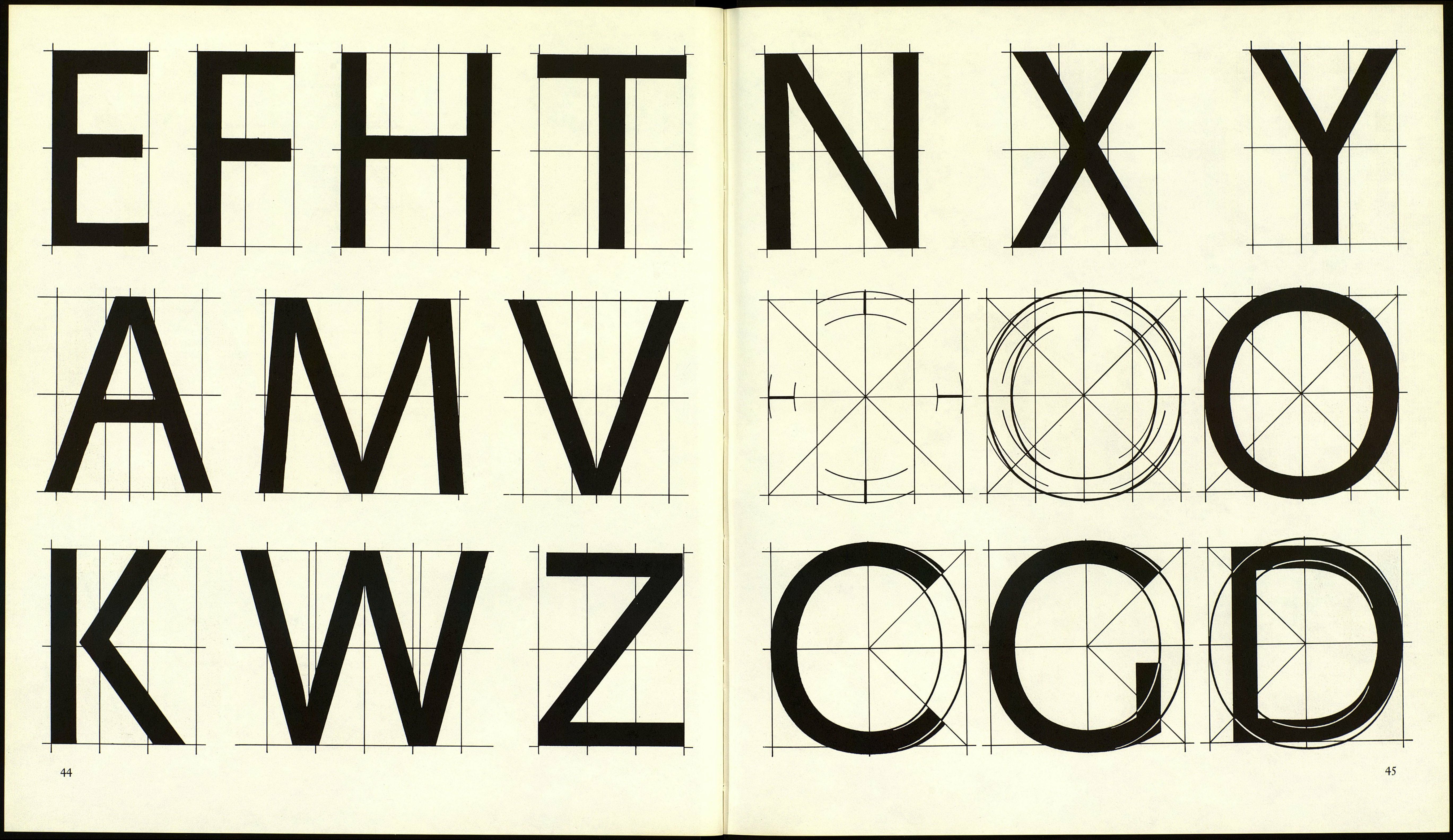
Draw straight lines with a ruling pen
and fill them in with a brash. If you con¬
struct curves with compasses, do not
forget to correct the shape (Figure 102),
and take into consideration the remarks
on optical illusions in Chapter 1. You
will achieve the best results with curved
letter parts if you draw them freehand
with a brash.
Figure 96
i b с d с f
8 h i 1
i --¿j:ifp ' у
Sixlllp: 4
::::х:И B: 6
И:: 7
I IS _ ÍÜ '■•■""~-t ~t*'
) -------Щ'-Щ
4 - --f" --(В ~ x Ü
i ----- jf:f ::j
6......Д.І...
- -j- - - - ig"-4------
8 - = :|;Í|Í;j:
a b с
d с f
S h i
Figure 97
abcdefghi
j^lmnopqr
STUVUJXyZ
Figure 98
wrong
Figure 99
Figure 100
right
BEEE
42
On page 42:
96 Construction of a Renaissance capital
letter. From Schreibbüchlein by Wolfgang Fug¬
ger.
97 Drawing from Romain du Roi, 1692.
98 Experiment in lettering by Herbert Bayer,
about 1926.
99 Drawing a letter.
Dilli
iiiïi
DHHH
Figure 101 on this page
Figure 102 on pages 44, 45, and 46
43
II
