letter В appears darker than the letter E.
An experienced letterer will narrow the
vertical lines of the В and slighdy widen
those of L or I to balance. Follow the
same principle for roman letters.
Figure 33 shows that a short vertical
bar appears thicker than a longer one of
the same width, which is why it is neces¬
sary to draw short verical parts of letters
with slighdy thinner strokes. For the
Figure 33a
same reason, all lowercase letters should
be constructed with thinner verticals
than uppercase letters (Figure 34). The
larger interior space of uppercase letters
also necessitates different stroke widths.
When two diagonal strokes intersect,
a black spot results and draws undue at¬
tention. Counteract this effect by deeper
cuts or angles at these points (Figure 35).
The transition from straight to round
lines also presents problems. The careful
observer can detect a break in the line if
the round section was constructed with
compasses. Sacrifice the perfect geomet¬
ric form to a gradual change in curvature
(Figure 36).
If you construct condensed sans serif
capitals such as O, C, G, and D with
compasses and ruler, the straight lines
will appear slightly concave. To make
GICHn
Figure 33b
Figure 34
Figure 35
Figure 36
Figure 37
Figure 38
Figure 39
+
+
22
BQBBHHñBG
Figure 40
Figure 41
WOLLGARNE
II - l..... I I I Г l Г I г^
wow
Figure 42
WOLLGARNE
Figure 43
MOHNMOHN
Figure 44
Figure 45
mohn mohn
mohn mohn
them look straight, draw them with a
slight bulge towards the outside (Fig¬
ure 37). Similarly, letter parts that are
geometrically perfectly straight will
seem thicker in the middle, but if you
narrow the verticals in the midsection,
the sides will appear parallel (Figure 38).
The smaller a form is, the rounder its
corners will seem (Figure 39).
LETTER, WORD, AND LINE SPACING
Letter Spacing
Letters are arranged next to each other
as words and lines, lines are combined to
make text blocks, and all are elements of
the page layout. It would satisfy neither
the demands of legibility nor of aesthet¬
ics to string one letter after another
without further thought. Empty spaces
inside the letters and the area surround¬
ing them all have specific ornamental
values, and the designer has to deal with
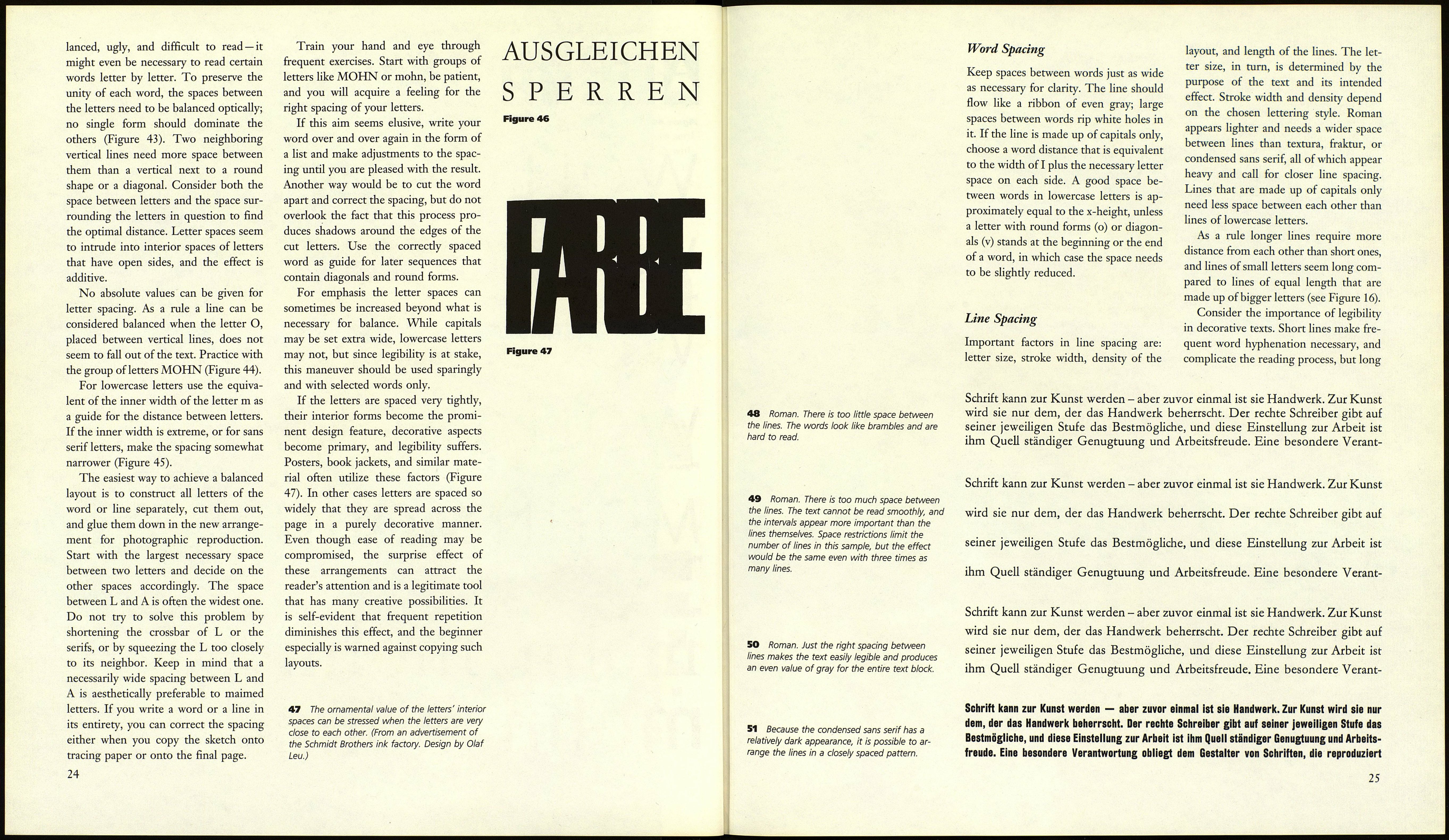
them (Figures 40 and 41). Spaces can be
neutralized or activated through man¬
ipulation; more information on this can
be found at the end of this chapter.
It is necessary to render the interior
spaces of letters optically neutral to
achieve clarity. If all spaces between let¬
ters were exactly equal (Figure 42) or if
they were decided in an arbitrary way,
areas of concentrated color would ap¬
pear on the page. Letters such as О, C,
G, on the other hand, would create
holes, and the surrounding spaces of
L, T, A, V, P, and others would act in a
similar way. The result would be unba-
42 Letters with equal spaces between them.
43 In a well-balanced word the spaces be¬
tween letters are optically balanced.
23
