Figure 22
Figure 23
НАКОМтт^
OPTICAL ILLUSIONS IN LETTERING
A good eye is much more important
than measuring equipment when the
aim is a well-drawn or -written letter.
Figure 22 shows rectangles, triangles,
and circles of the same height. Never¬
theless, the circles and triangles seem
smaller than the rectangles — the circles
because they touch the guidelines only
at two points; the triangles because they
only touch at one point, at the tip. Un¬
less the arc and the tip extend slightly
beyond the guidelines, the objects "fall
through" (Figure 23).
In Figure 24 the circle was placed
exactly in the middle of the rectangle,
the horizontal line exactly in the middle
of the vertical. Neither element, how¬
ever, seems to occupy the center posi¬
tion: the upper half seems larger. To
counteract this effect, the separating
elements are slighdy moved up in Fig¬
ure 25. They now occupy the "optical
center." The crossbars of letters such as
H, E, B, K, and S should not be placed
in the geometric, but in the optical,
center position. The upper part of these
letters should be smaller than the lower
part. In round letters such as O, D, G,
and C, the upper part should be more
expansive to give the letter a certain
tension (Figure 26).
A vertical separation makes an area
appear narrower; a horizontal separation
makes it seem wider (Figure 27). Serifs
have a similar effect on the proportions
of type: they stretch or widen the form
(Figure 28).
A bar appears long and narrow if it is
in a vertical position but wide and heavy
as a horizontal element (Figure 29). This
effect is important in the construction of
sans serif and Egyptian-style letters. If
the horizontal elements of a letter are to
look like vertical ones, they have to be
drawn somewhat narrower (Figure 30).
The same rule applies to round parts:
they have to be slimmer at the top and
bottom areas, while at the sides they
have to be considerably wider than the
straight elements. Diagonals require a
special adjustment; here the angle is of
importance. Figure 31 offers guidelines
for the construction of sans serif letters.
Even vertical lines require differen¬
tiated stroke widths (Figure 32). The
juxtaposition of E and В shows that the
30 Stroke widths of the capital letters of
Adrian Frutiger's Univers. From typography
9/65.
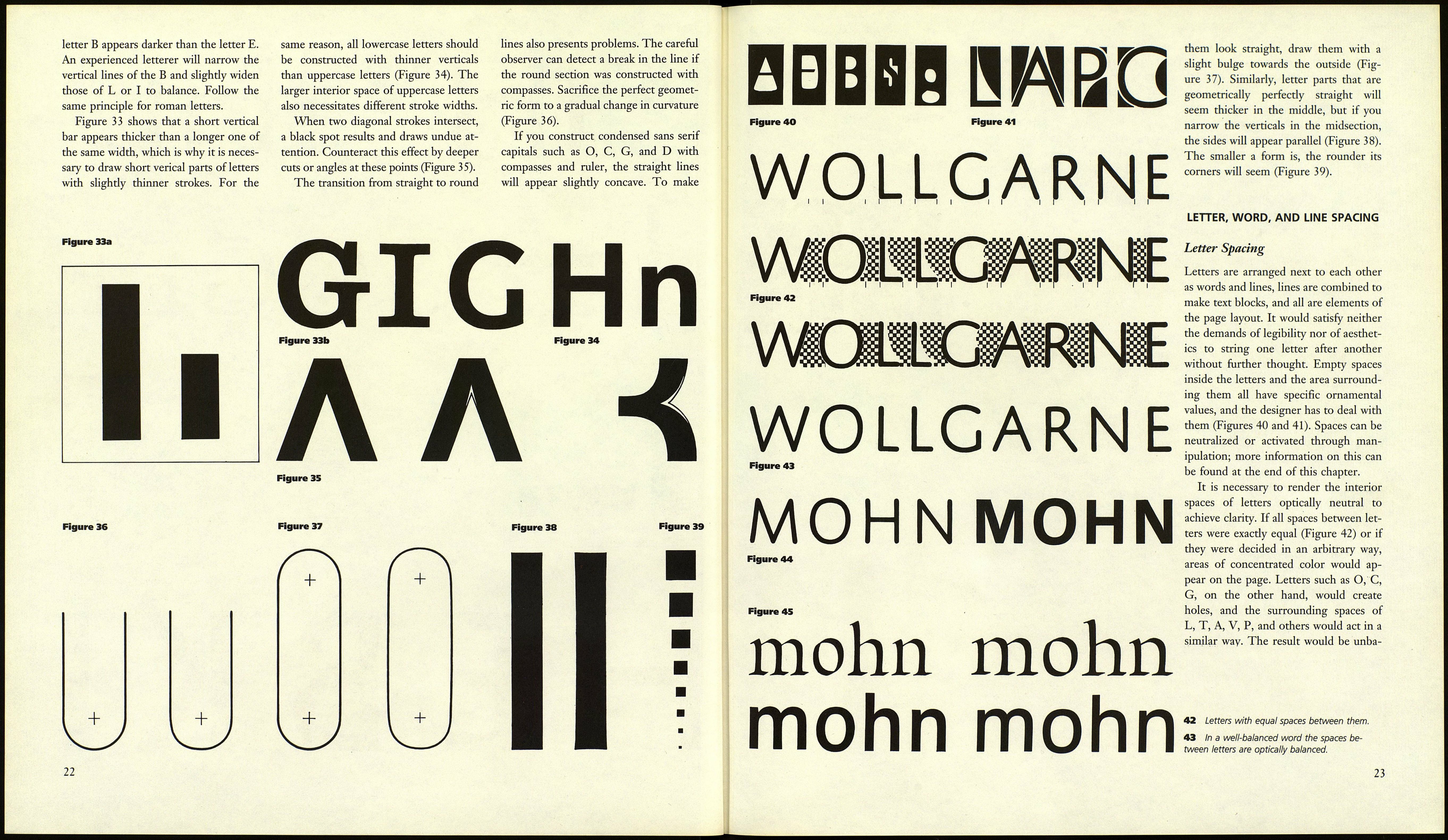
20
ІНЙІНВ
Figure 24 Figure 25 Figure 26
GGGEE
Figure 27 Figure 28
Figure 29 Figure 30 Figure 31
Figure 32
21
