Brian Sooy
1995
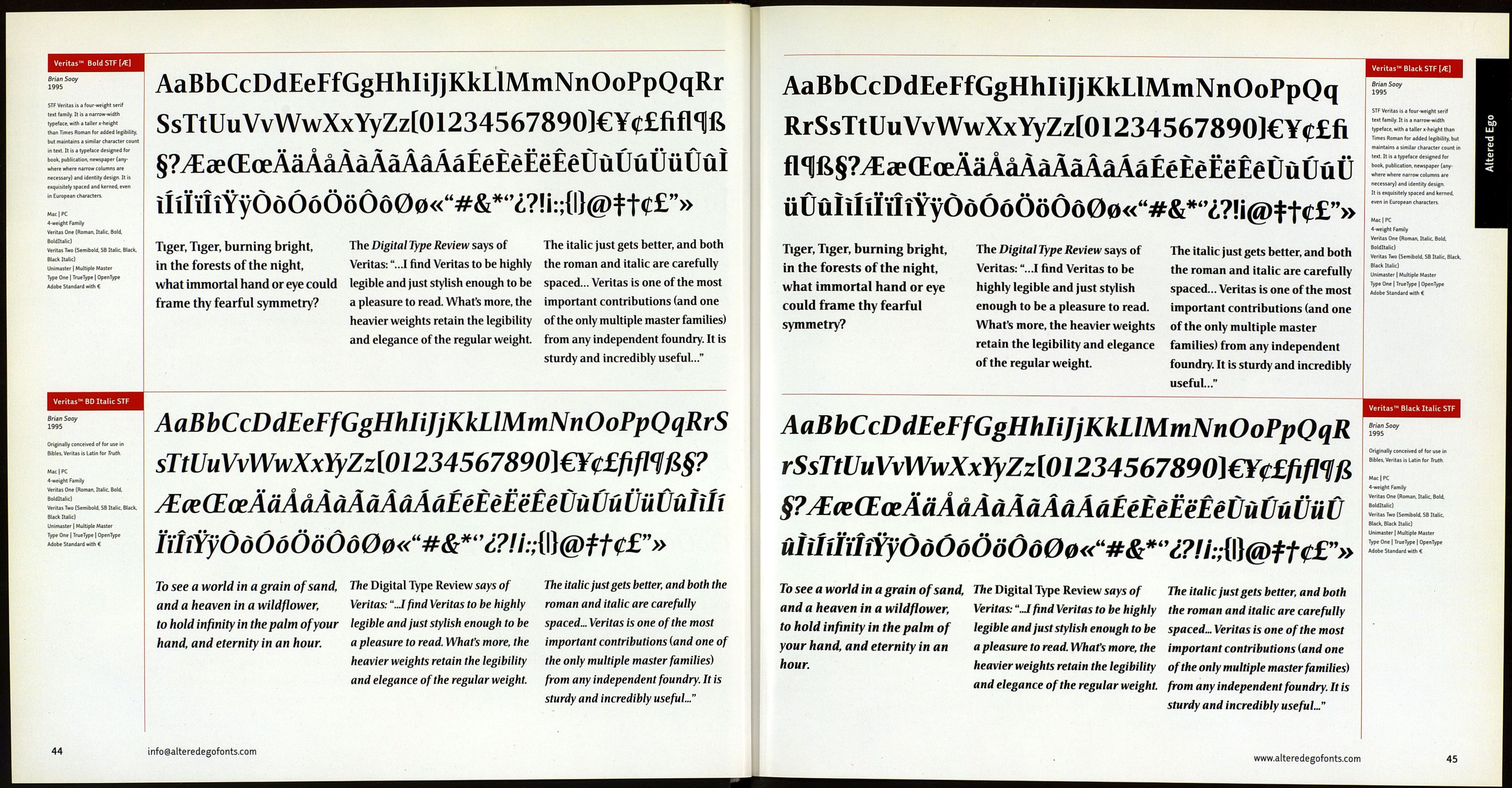
STF Veritas is a four-weight serif text
family. It is a narrow-width typeface,
with a taller x-height than Times
Roman for added legibility, but
maintains a similar character count
in text. It is a typeface designed for
book, publication, newspaper
(anywhere where narrow columns
are necessary) and identity design.
It is exquisitely spaced and kerned.
even in European characters.
Mac | PC
4-weight Family
Veritas One (Roman. Italic, Bold,
Bolditalic)
Veritas Two (Semibold, SB Italic. Black,
Black Italic)
Unimaster | Multiple Master
Type One | TrueType ] OpenType
Adobe Standard with f£
Veritas™ Italic STF [/E]
Brian Sooy
1995
Originally conceived of for use in
Bibles. Veritas is Latin for Truth.
Mac | PC
4-weight Family
Veritas One (Roman. Italic. Bold.
Soldltalic)
Veritas Two (Semibold. S8 Italic, Black,
Black Italic)
Unimaster | Multiple Master
Type One | TrueType ] OpenType
Adobe Standard with €
AaBbCcDdEeFfGgHhliJjKkLlMmNnOoPpQqRrSs
TtUuVvWwXxYyZz[01234567890]€¥e£fiflW^
œŒœAaAàÀàAâÂâAaÉéÈèËèÊêÙùUûUuÛûÎiÎiïïîî
YyOoÓóOoOo00«"#&*"¿?! i :;{l}@t Ш"»
Tiger, Tiger, burning bright,
in the forests of the night,
what immortal hand or eye could
frame thy fearful symmetry?
The Digital Type Review says of Veritas: The italic just gets better, and both the
"...I find Veritas to be highly legible and roman and italic are carefully spaced...
just stylish enough to be a pleasure to Veritas is one of the most important
read. What's more, the heavier weights contributions (and one of the only
retain the legibility and elegance of the multiple master families) from any
regular weight independent foundry. It is sturdy and
incredibly useful..."
AaBbCcDdEeFfGgHhliJjKkLMmNnOoPpQqRrSsTtU
uVvWwXxYyZz[01234567890)m£fiflW§?AceŒœA
MàÀMMMaÉéÈèËëÊêÛùUuUuÛûÎiImMyOoOoO
oOo00«"#&*-'¿?!i:;{\\@tU£"»
To see a worìd in a grain of sand, and The Digital Type Review says of Veritas: The italic just gets better, and both the
t • _ .. •! j л_____ « i£«J l/,».,;*,™ i., /-,,, /i i,i i-, /i ■ Insula sinA тѵѵгли nv\A itnìir nro rnrefullv сппгрп
a heaven in a wildfìower,
to hold infinity in the palm of your
hand, and eternity in an hour.
"J find Veritas tobe highly legible and roman and italic are carefully spaced.,
just stylish enough to be apleasure to read. Veritas is one of the most important
What's more, the heavier weights retain contributions {and one of the only
the legibility and elegance of the regular multiple master families) from any
weight. independent foundry. It is sturdy and
incredibly useful..."
info@alteredegofonts.com
AaBbCcDdEeFfGgHhliJjKkLlMmNnOoPpOqRrS
sTtUuVvWwXxYyZz[01234567890]€¥c£fifl1ߧ?
^aeŒœAaÂàÀàAaÂâAaÉéÈèËëÊêÙùUûUuÛûîiÎi
rmYyOoOoOoOo00<<"#&^?!i:;{l}@tt^£">>
Tiger, Tiger, burning bright,
The Digital Type Review says of Veritas: The italic just gets better, and both the
in the forests of the night, "...I find Veritas to be highly legible and roman and italic are carefully
what immortal hand or eye could just stylish enough to be a pleasure to spaced... Veritas is one of the most
frame thy fearful symmetry? read. What's more, the heavier weights important contributions (and one of
retain the legibility and elegance of the only multiple master families)
the regular weight. from any independent foundry. It is
sturdy and incredibly useful..."
AaBbCcDdEeFfGgHhliJjKkLiMmNnOoPpQqRrSsT
tUuVvWwXxYyZz[01234567890)€¥
• • О
*V> .Л.
OoÓÓ000000«u#&*"¿?t¡:;{Ü@ttt£n»
То see a world in a grain of sand, The Digital Type Review says of Veritas: The italic just gets better, and both the
anda heaven in a wildflower, "..J find Veritas to be highly legible and roman and italic are carefully spaced...
to hold infinity in the palm of your just stylish enough to be a pleasure to Veritas is one of the most important
hand, and eternity in an hour. read. What's more, the heavier weights contributions {and one of the only
retain the legibility and elegance of the multiple master families) from any
regular weight. independent foundry. It is sturdy and
incredibly useful..."
Veritas™ SB STF [/El
Brian Sooy
1995
STF Veritas is a four-weight serif text
family. It is a narrow-width typeface,
with a taller x-height than Times Roman
for added legibility, but maintains a
similar character count in text. It is a
typeface designed for book, publication,
newspaper (anywhere where narrow
columns are necessary) and identity
design It is exquisitely spaced and
kerned, even in European characters
Mac | PC
4-weight Family
Veritas One (Roman. Italic. Bold.
Bolditalic)
Veritas Two (Semibold. SB Italic. Black,
Black Italic)
Unimaster | Multiple Master
Type One | TrueType | OpenType
Adobe Standard with €
Veritas'- SB Italic STF [/E]
Brian Sooy
1995
Originally conceived of and
subsequently used in Bibles.
Veritas is Latin for Truth.
Mac | PC
4-weight Family
Veritas One (Roman, Italic, Bold,
Salditalic)
Veritas Two (Semibold. SB Italic, Black,
Black Italic)
Unimaster | Multiple Master
Type One | TrueType | OpenType
Adobe Standard with €
www.alteredegofonts.com
43