Regular _^_^^
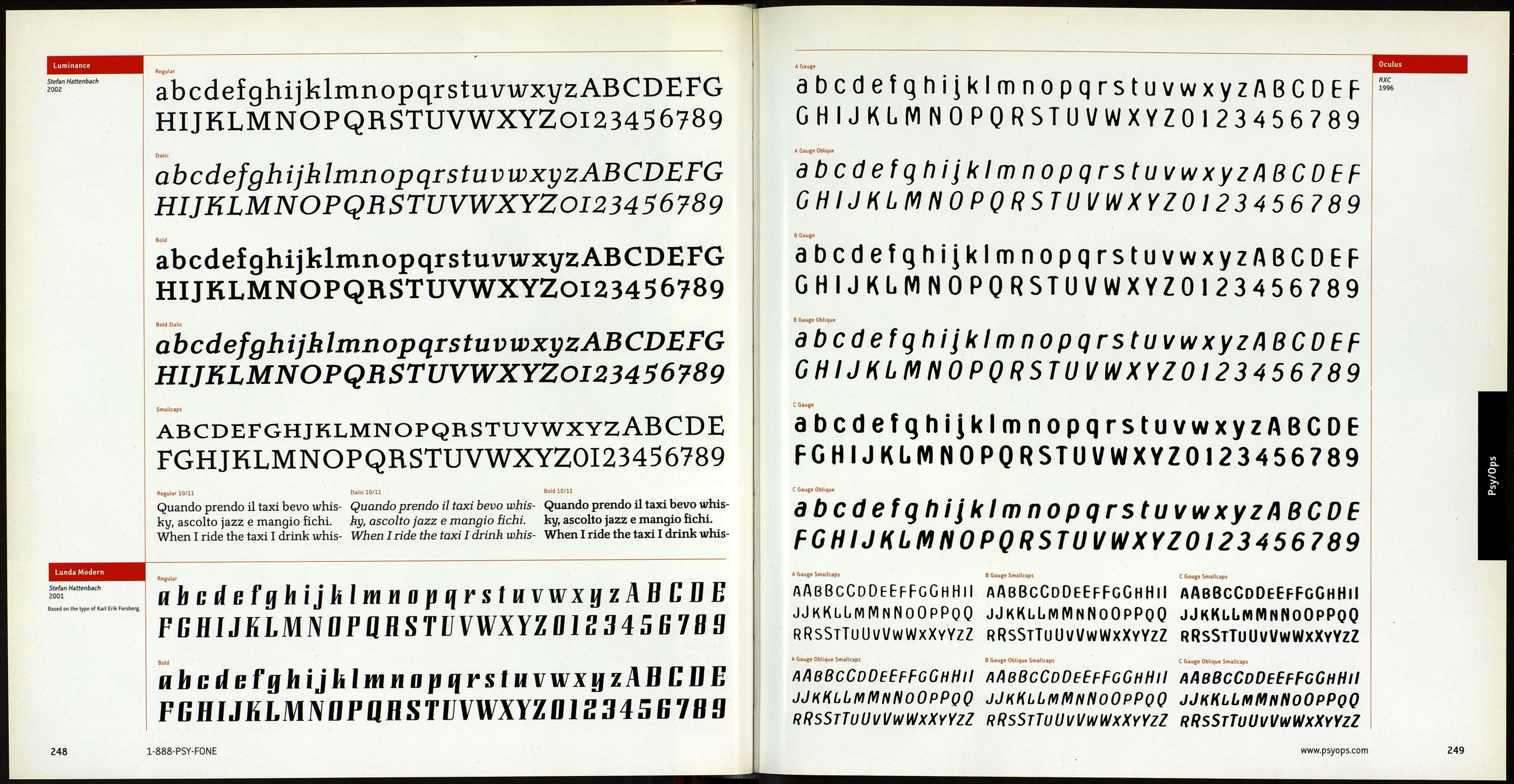
abcdefghijklmnopqrstuvwxyzABCDEFG
HIJKLMNOPQRSTUVWXYZ0123456789
Italic
a b cdefgh ijklmnopqrstuv wxyzA В CDEFG
HIJKLMNOPQRSTUVWXYZ0123456789
Bold
abcdefghijklmnopqrstuvwxyzABCDEFG
HIJKLMNOPQRSTUVWXYZ0123 4 5 6789
Smallcaps
ABCDEFGHIJKLMNOPQRSTUVWXYZABCDEFG
HIJKLMNOPQRSTUVWXYZ0123456789
Black Sans
abcdefghijklmnopqrstuvwxyzABCDEFG
HIJKLMNOPQRSTUVWXYZ0123456789
Three Special Fonts (Regular, Italic. Bold) U pt
¿IfbfJffifflfhfififkflftál Leyden is intended for general is no revival. Ley den has plain Ro-
oi23456789/OI23456789 book and text work. It was in- man, Italic and Bold fonts, small
fìihtfffifflfhfìfifkflfiCT sPirec* by Dutch type of the 17th caps, superscript/subscriptfonts for
0 1234 56 78 9/ century, possibly the golden age scientific notation and open-ended
/0 12345 6789 0f type design and the ultimate fractions, plus a strong Black for run-
¿t fb ffffi fflfttfif]fkflrtát source of perennials like Janson, in headings in dictionaries and the
012345678 9/o 123456789 Caslon and even Times, but this like. This latter font is sanserif, for
Blaek Sans 10/11 Smallcaps 10/11
...maximal blackness, but Dutch type of the 17th century, small caps, superscript/sub-
shares the basic letterforms possibly the golden age of type script fonts for scientific no-
and the proportions of the Ro- design and the ultimate source tation and open-ended frac-
man, in order to blend effort- of perennials like Janson, Caslon tions, plus a strong Black for
lessly with it. С Leyden is in- and even Times, but this is no run-in headings in dictionar-
tended for general book and revival. Leyden includes plain ies and the like. This latter
text work. It was inspired by Roman, Italic and Bold fonts, font is sans serif, for maxi-
1-888-P5Y-FONE
Regular
abcdefghijklmnopqrstuvwxyzABCDEF
GHIJKLMNOPQRSTUVWXYZ0123456789
Italic
abcdefghijklmnopqrstuvwxyzAB CDEFG
HIJKLMNOPQRSTUVWXYZ0123456789
Bold
abcdefghijklmnopqrstuvwxyzABCDEF
GHIJKLMNOPQRSTUVWXYZ0123456789
Sold Italic
abcdefghijklmnopqrstuvwxyzABCDEFG
HIJKLMNOPQRSTUVWXYZ0123456789
Bold a Bold Italic 10/11
Leyden News is avariant of Ley¬
den, optimised for use in mag¬
azines, papers and newsletters,
where type is often of necessity
smallish and compact. This
means that while basic Leyden
letterforms are used, x-height
is larger and detail work is
more robust and sometimes
simplified, all in the interest
Regular 9/10
Leyden News is a variant of Ley¬
den, optimised for use in maga¬
zines, papers and newsletters,
where type is often of necessity
smallish and compact. This means
that while basic Leyden letter-
forms are used, x-height is larger
and detail work is more robust and
sometimes simplified, all in the
interest of high legibility when
printing small size type on indif-
ofhigh legibility when printing
small size type on indifferent pa¬
per, and often with indifferent
printing too. In spite of this, fig¬
ures remain lowercase or ranging,
though the bold and bold italic
styles, which will mainly be used
for headers, have uppercase or
lining figures. ЧLeyden News is a
variant of Leyden, optimised for
Italic 9/10
ferentpaper, and often with indiffer¬
ent printing too. In spite of this, fig¬
ures remain lowercase or ranging,
though the bold and bold italic styles,
which will mainly be used for head¬
ers, have uppercase or lining figures,
y Leyden News is a variant of Leyden,
optimised for use in magazines, pa¬
pers and newsletters, where type is
often of necessity smallish and com¬
pact. This means that while basic
use in magazines, papers and
newsletters, where type is of¬
ten of necessity smallish and
compact. This means that
while basic Leyden letter-
forms are used, x-height is larger
and detail work is more robust
and sometimes simplified, all in
the interest of high legibility
when printing small size type on
Bold (: Bald Ital
Leyden letterforms are used, x-
height is larger and detail work is
more robust and sometimes sim¬
plified, all in the interest of high
legibility when printing small
size type on indifferent paper, and
often with indifferent printing too.
In spite of this, figures remain lower¬
case or ranging, though the bold and
bold italic styles, which will mainly
be used for headers, have uppercase
Lars Bergquist
2002
www.psyops.com
г47
