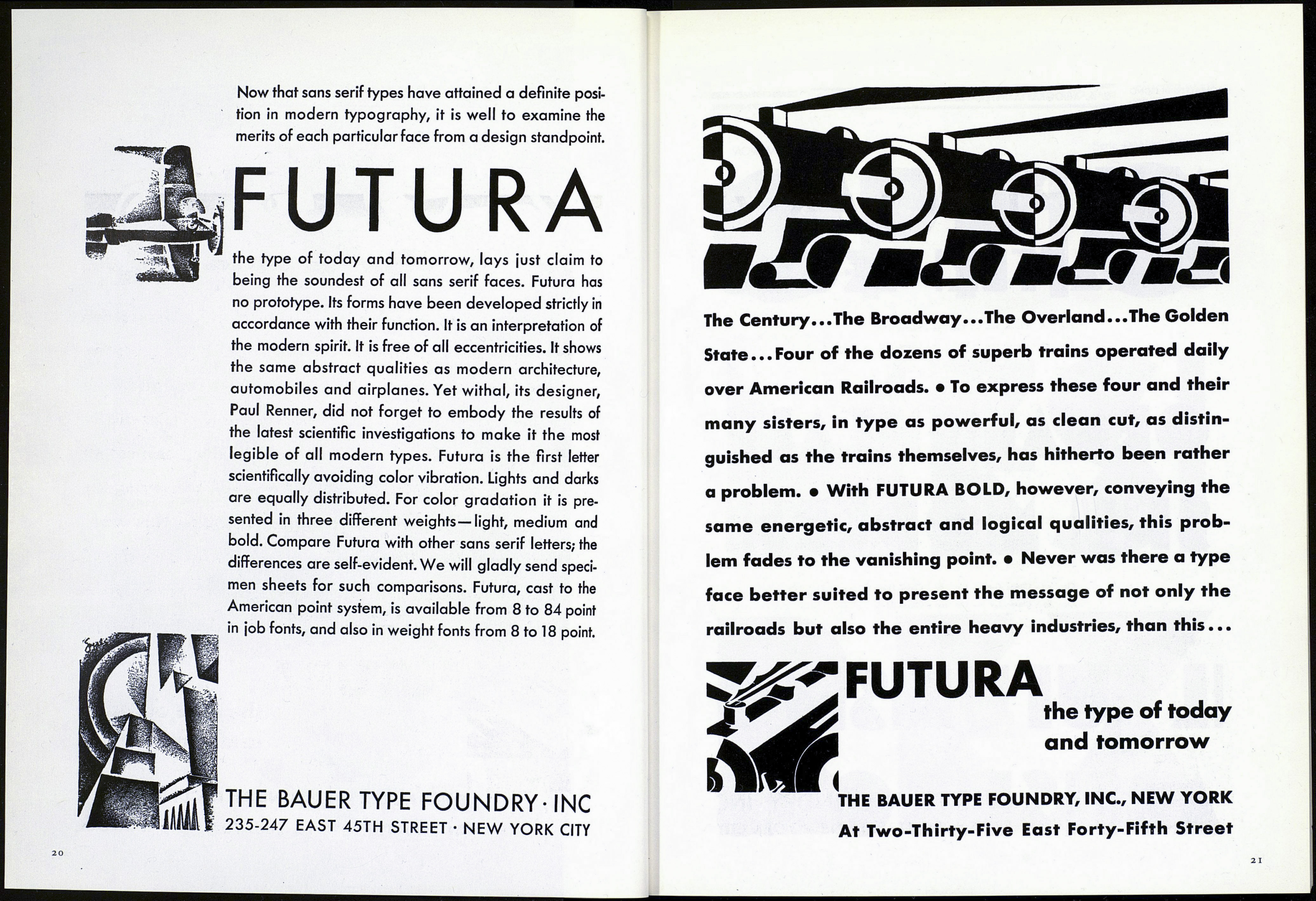
Now that sans serif types have attained a definite posi¬
tion in modern typography, it is well to examine the
merits of each particular face from a design standpoint.
FUTURA
the type of today and tomorrow, lays ¡ust claim to
being the soundest of all sans serif faces. Futura has
no prototype. Its forms have been developed strictly in
accordance with their function. It is an interpretation of
the modern spirit. It is free of all eccentricities. It shows
the same abstract qualities as modern architecture,
automobiles and airplanes. Yet withal, its designer,
Paul Renner, did not forget to embody the results of
the latest scientific investigations to make it the most
legible of all modern types. Futura is the first letter
scientifically avoiding color vibration. Lights and darks
are equally distributed. For color gradation it is pre¬
sented in three different weights—light, medium and
bold. Compare Futura with other sans serif letters; the
differences are self-evident. We will gladly send speci¬
men sheets for such comparisons. Futura, cast to the
American point system, is available from 8 to 84 point
in job fonts, and also in weight fonts from 8 to 18 point.
THE BAUER TYPE FOUNDRY-INC
235-247 EAST 45TH STREET • NEW YORK CITY
The Century...The Broadway...The Overland...The Golden
State...Four of the dozens of superb trains operated daily
over American Railroads. • To express these four and their
many sisters, in type as powerful, as clean cut, as distin¬
guished as the trains themselves, has hitherto been rather
a problem. • With FUTURA BOLD, however, conveying the
same energetic, abstract and logical qualities, this prob¬
lem fades to the vanishing point. • Never was there a type
face better suited to present the message of not only the
railroads but also the entire heavy industries, than this...
3^ FUTURA
the type of today
and tomorrow
THE BAUER TYPE FOUNDRY, INC., NEW YORK
At Two-Thirty-Fi ve East Forty-Fifth Street
