СИ
и
NN _л
H
■а
я
ел
І M
1 ft«« € .
о « о О M 5
О) œ »î n t s
о er> oo oo ю »
n
й i
рц ад
Jffl
S58
ч
es «s
Sil
S3«*
•4 S
ÖOOOQOOOOOOO
oooooooooooo
oooooooo о ю
li ;........•<
• ••........•"
si,* »•••«•*•« "
S < < m ci <-p çj «j д ci < <
Ö
о
•s
fc-«о lofcj слей m o> слот iîi о
95. A lottery hand bill of1810 [254]
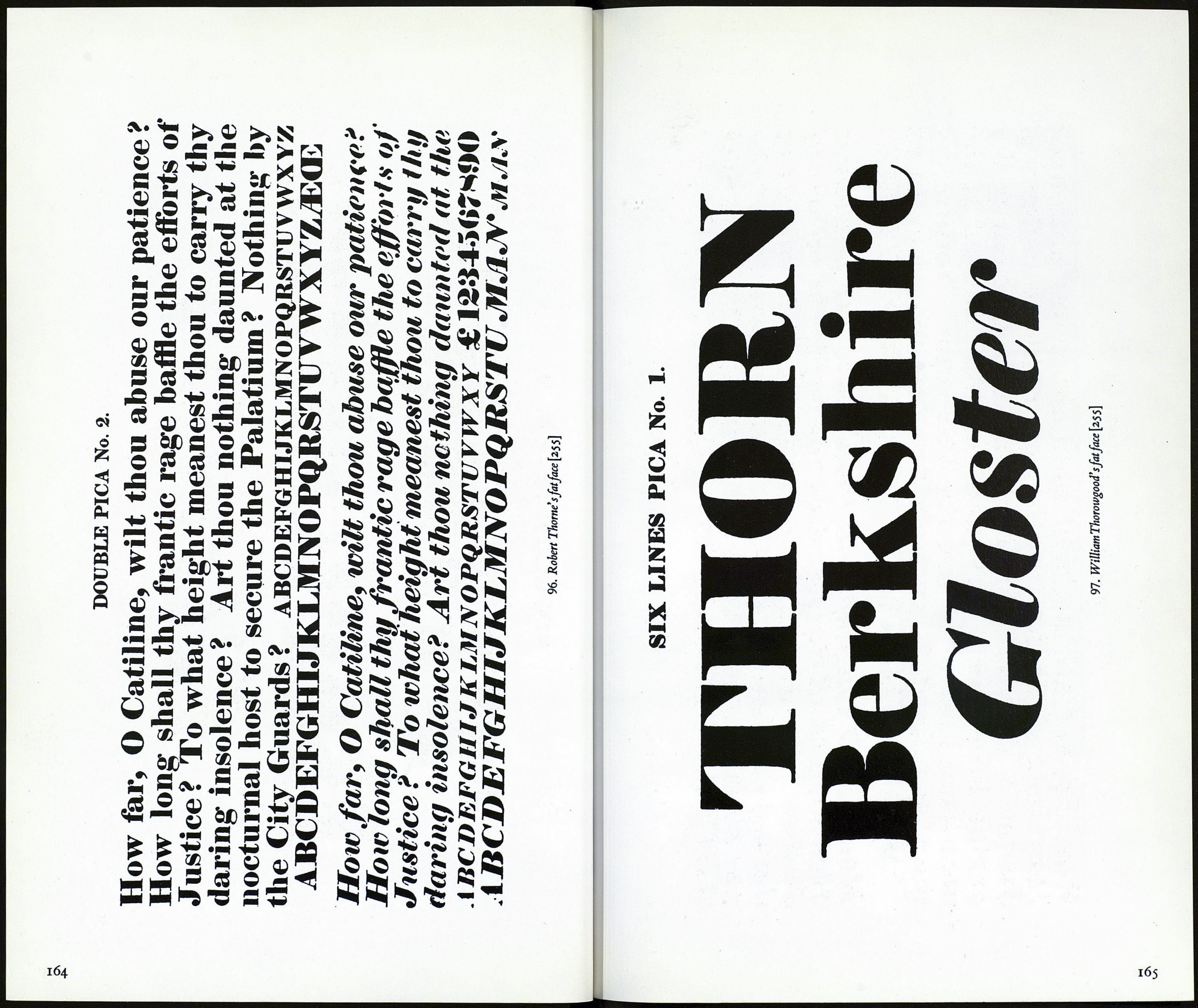
Fat Face
In his Practical Hints on Decorative Printing (1822) William Savage said
that Thorne 'has been principally instrumental in the revolution that
has taken place in Posting Bills, by the introduction of fat types.'And
Т. C. Hansard writing in 1825 in his Typographia remarks that 'the ex¬
tremely bold and fat letter, now prevalent in job printing, owes its in¬
troduction principally to Mr Thorne.' Thome's last specimen book
was dated 1803. William Thorowgood who bought Thome's foundry
shows the first specimens of the latter's jobbing types in 1820.
The other English foundries soon copied the original fat face design
and these types were widely used in much of the ephemera of the day,
e.g. broadsides, ballads, pamphlets, newspapers, etc.This early popular¬
ity waned however as the nineteenth century advanced, and though
never entirely out of fashion (they were used on royal proclamations
for example) it was not until the 1920's that their use was revived—not
in England initially, says Mr Johnson but in the United States and in
Germany.
In the same article he wrote 'The American Typefounders showed
their UltraBodoni inio28,wellnamed,forthat is exactly what a Fat Face
is, an exaggerated design after the true classical modern face or Bodoni.'
And he defines the characteristics of these faces as types with'thin, flat
serifs, vertical stress & abrupt contrast of thick & thin strokes.To these
characteristics we must add exaggeration of the contrast between thick
& thin.The thickness of the main strokes as compared with their height
is in the proportion of 1 to z\. At what particular point a type ceases to
be a Bold Face and becomes a Fat Face is hard to decide.'1
It may be noted in passing that Nicolette Gray in the work already
quoted from writes of Fat Face serifs that they 'may be unbracketed or
slightly bracketed, but those terminating a thin vertical stroke are al¬
ways bracketed.'2
^Alphabet & Image No 5.
2Students should note the triangular or wedge-shaped serifs used in some Fat Face designs,
e.g. A.T.F. Ultra Bodoni's A, E, F, K, L, M, N, U, V, X, Y etc.
163
