I Twelve Lines Pica. I
BGI
CRI
94. Twelve lines pica letters of Thomas Cottrell [254]
FAT
FACE
The shaded types cut for use in jobbing printing were not the first to
be designed specifically for the purposes of advertisement.The earliest
advertising types were what we now call Fat Faces. Nicolette Gray says
that the first step in their evolution 'was the introduction, for advertising
purposes, of normal letters enlarged beyond the scale of normal book
work. According to Edward Rowe Mores this innovation was due to
the English typefounder.Thomas Cottrell. His book of c.1765 shows a
twelve-line pica letter.The idea was taken up by. other founders and
later letters tend to grow bigger and fatter.'1 But Mr Johnson says that
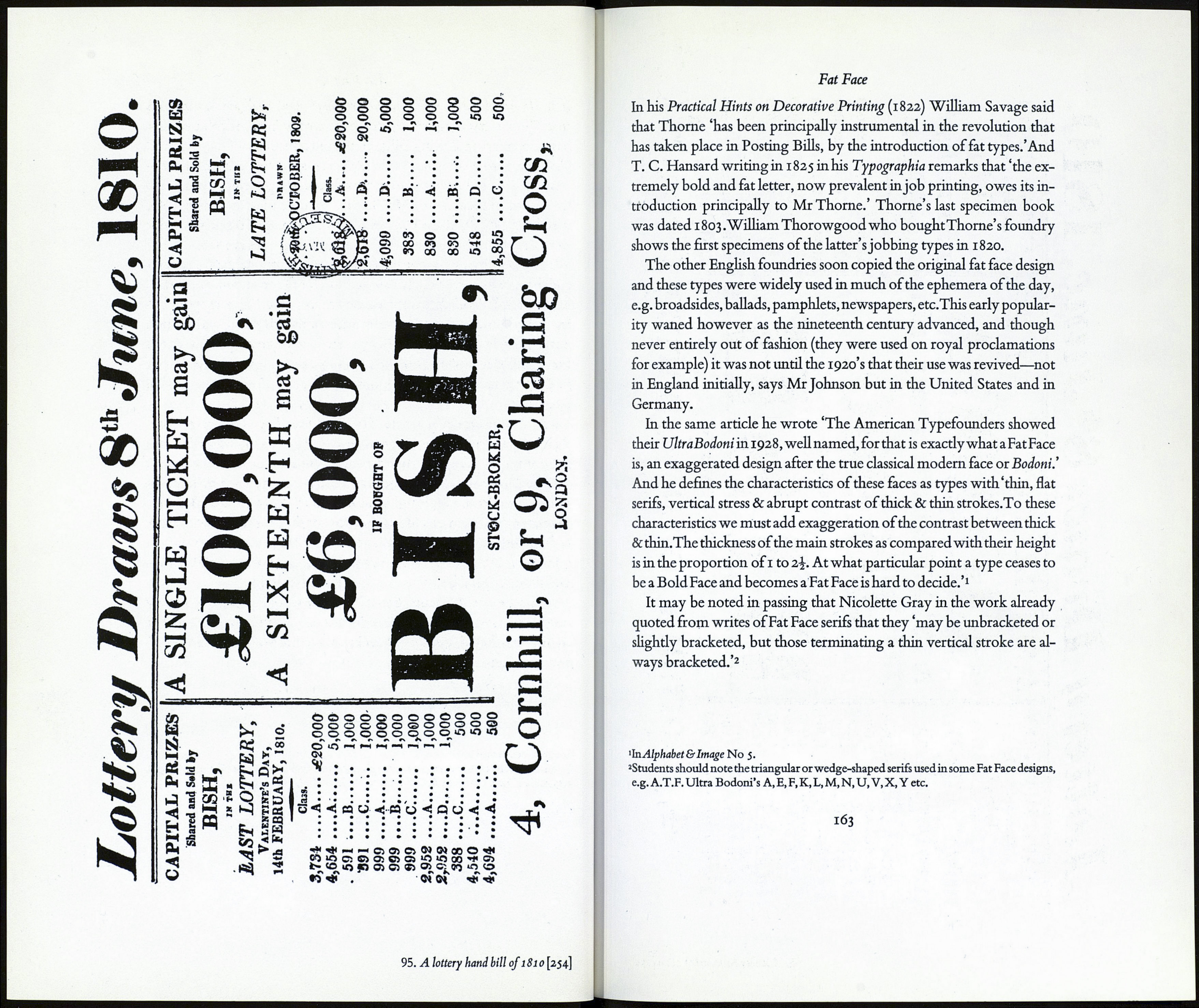
the lottery handbills of the early nineteenth century 'illustrate the de¬
velopment of the design from the Bold Faces, (i.e. thickened versions
of the normal book types) and suggest that these Bold Faces rather than
the placard types of Cottrell were the begetters of the Fat Faces.'2
Fat Faces were originally referred to simply as fat types and this term
probably included types from other groups, for example, the antiques,
(that is egyptians). All these fat types were extraordinarily bold and
(unlike the bold faces of the day) not intended for use in bookwork.
Two early nineteenth century writers ascribe the development of
Fat Faces to Robert Thome the typefounder, pupil of Thomas Cottrell.
'In Nineteenth Century Ornamented Types and Title Pages. Faber and Faber. London 1938.
г1п Alphabet & Image No $. September 1947. fat taces: their history, forms
and USB.
loi
