Afe crions point contre les plaisirs que nous
n'avons plus, ne condamnons point des
choses agréables qui nont que le crime de
nous manquer.
C'est par l'aversion secrète pour la jus¬
tice qu'on aime mieux donner que de rendre,
& obliger que de reconnaître : aussi voyons-
nous que les personnes libérales b1 généreuses
ne sont pas ordinairement les plus justes.
On peut vivre avec des indifférents, ou
par bienséance, ou par la nécessité du com¬
merce : mais comment passer sa vie avec
ceux qu'on a aimés, b1 qu'on n'aime plusl
Saint-Evremond.
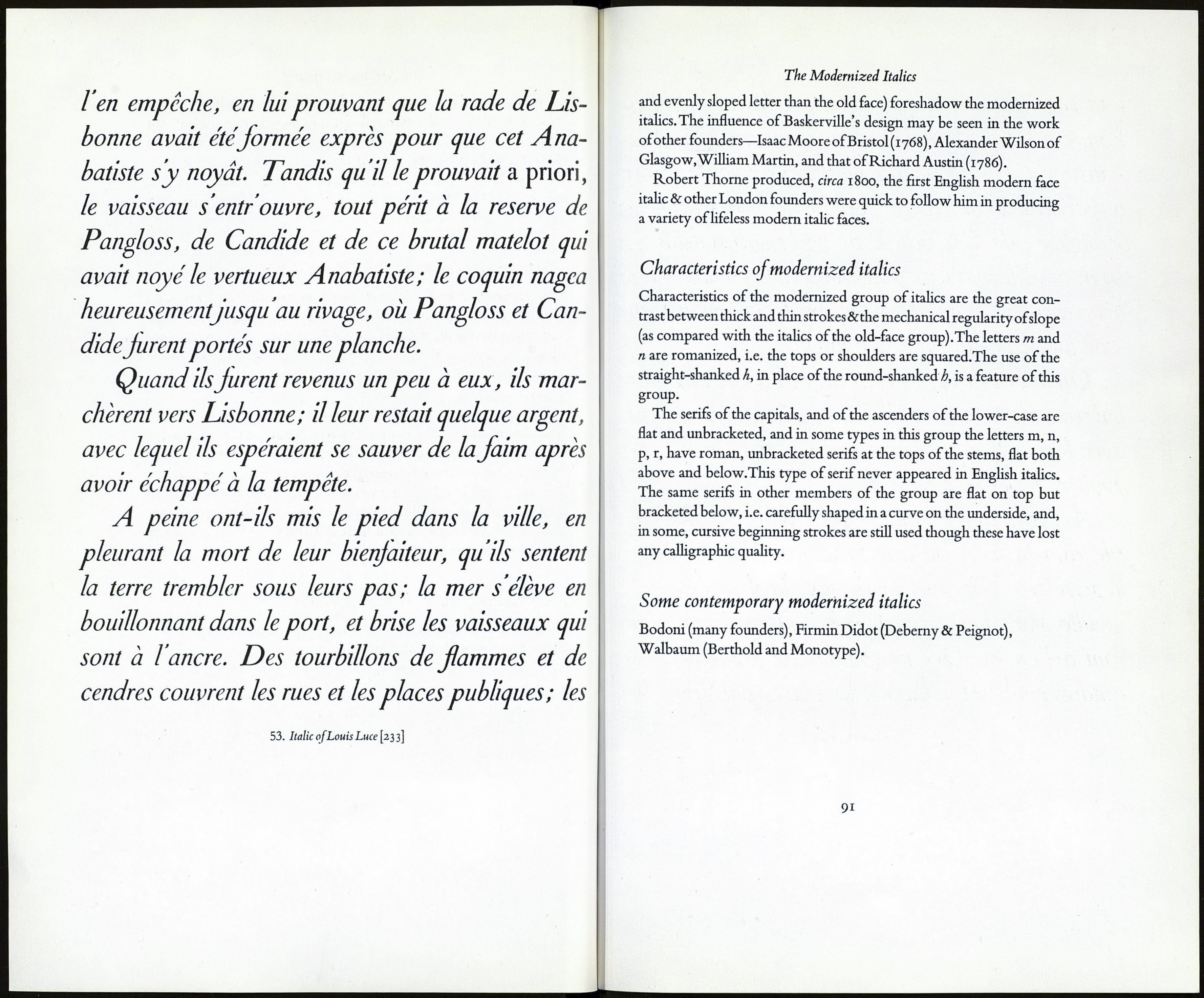
52. Grandjean's italic for the'romains du roi' [233]
The Modernized Italics
strokes until they were something half-way between serifs and the pen-
strokes of the old face.'1 Below, we show a five line example of Alex¬
andre's italic, cut between 1712 and 1716, in which the alterations in
these beginning strokes may be seen in the letters i, j, m, n, p, г and u.
La magnificence ¿X la galanterie ri ont jamais paru en France avec
tant d'éclat, que dans les dernières années du regne de Henry Second.
Ce prince était galant, bien fait ¿7" amoureux; quoique sa passion pour
Diane de Poitiers, Duchesse de Valentinois, eût commencé il y avait
plus de vingt ans, elle n'en était pas moins violente, ¿f il n'en donnait
Pierre Simon Fournier in his Modèles des Caractères, published in 1742,
remarks how greatly his italic differs from all previous designs. Based
to some extent on the formal hands of the engravers, & on the changes
introduced by Grandjean and his successors, his italic shows not only a
considerable differentiation between thick and thin strokes but an im¬
portant innovation in the serif treatment of certain lower-case letters,
e.g. m, n,p and r: he romanized the serifs of these letters. In his speci¬
mens of 1742 (our example is taken from his Modèles) it will be noticed
also that they are inclined and bracketed. From the same examples it
will be seen that Fournier regularized the slope of his italic letters and dis¬
pensed with ligatured, or tied, letters. He'carried the idea of conformity
with roman further than any earlier designer.'2 Bodoni, in Italy, and
Rosart in the Netherlands were among the designers who based their
italics on those of Fournier.
Notwithstanding the popularity of Fournier's italics they were soon
superseded by the italics cut by the Didots to mate with their fully
developed modern-face romans. In the first of these Didot cursives the
top serifs of the lower-case letters are roman (though unbracketed) but
by 1812 they had discarded these serifs and were producing 'cursives
of mechanical rigidity, with no life of their own, and not intended to
be used on their own.'3 See example on page 95. Mr Johnson says that
cursives of this kind killed italic as an independent letter.
As Baskerville's roman foreshadowed the modern face roman in
England, so likewise did his italic (which was a lighter, more regular,
12 3A. F.Johnson. Type Designs: their History and Development.
89
