^
«
ІЗ
-»с* • й ^ **
51. Seventeenth century italic, Elzeviers 1631 [233]
иіішшшиишии
І The i
3 Modernized E
3 Italics fe
ГЛПГШШГоТУУЛ
Of the italic faces, we have already noted the Aldine, the Vicentino
and the group which is the contemporary of old-face roman. Here it is
convenient to describe the fourth group—the modernized italics.
We have seen that the setting of whole books in italic was a common
practice in the sixteenth century.This use of italic as an independent
letter, that is, as a type form distinct from roman, continued through¬
out the seventeenth century also, no attempt being made to mate italic
to roman until Grandjean cut the romains du roi. But in the first half of
the seventeenth century appeared an italic which is remarkable for its
condensation, an effect in part obtained by the designer romanizing
certain letters—see the m and n, and also the a in our illustration.
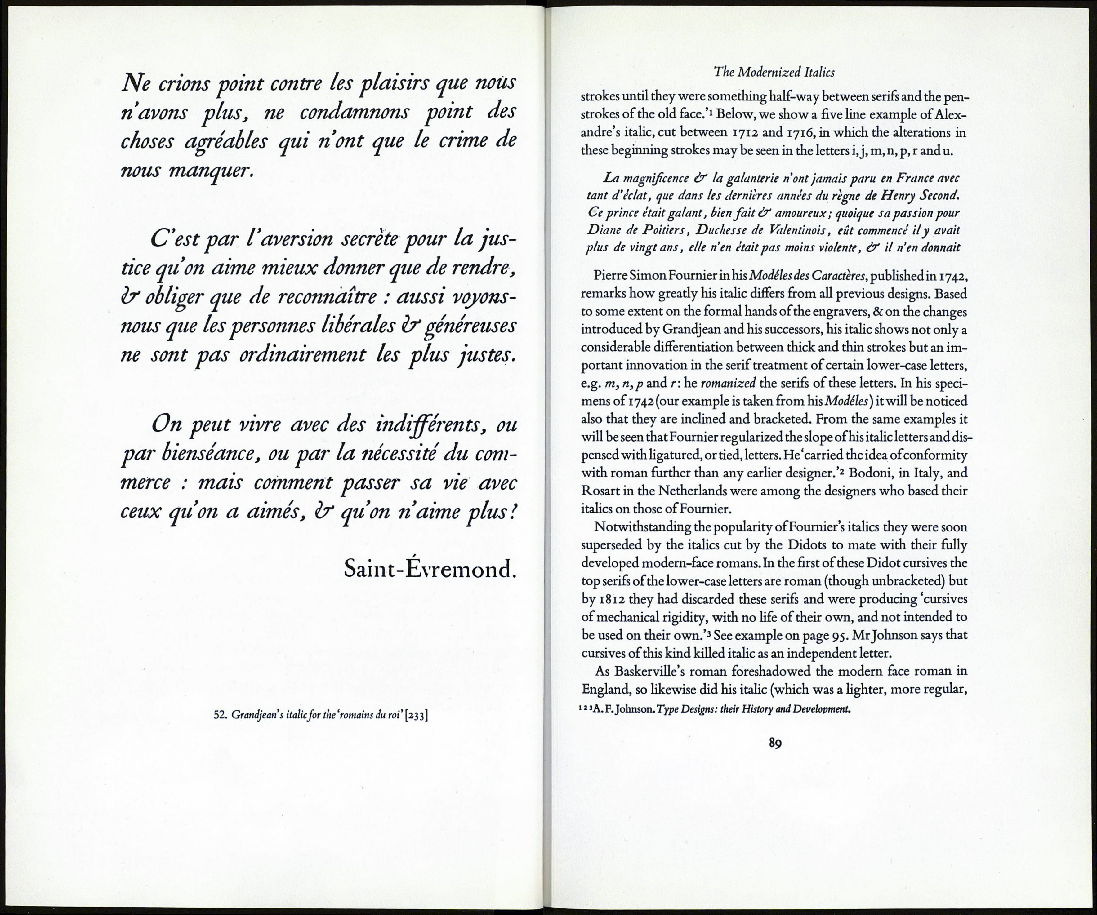
In Grandjean's cutting of an italic for the romain du roi 'we find a de¬
liberate attempt to make the secondary type conform to the roman.'1
He romanized the a, m and n, & thus made the slope of the italic lower¬
case more regular. He was the first to introduce the straight-shanked
lower-case h in italic (previously h ).The slope of his italic capitals was
to some extent regularized also.
Alexandre, Grandjean's successor at the Imprimerie Royale, main¬
tained this trend towards modernization. By 1712 he had altered the
cursive beginning strokes of the lower-case letters. He'reduced these
■A. F.Johnson. Type Designs: their History and Development.
87
