EPIGRAM MAT A«, 59
Infigne ingenui* fuit ohm bulla puellis:
Quum nonßs, bullam cur capis, ingenwtst
S cortea fume igitur : quadrant mage fcortea: prole
Libertinorum fie decorato tuam.
Inquendam.
i~4>me quarti, a met пит te tua Fuluia: habeto,
Si te non odit Fuluia,forfan amai,
Aenigma in filiam I ñachí.
Dic,precor,Oedipodes,fit qua-namfantina coiux,
Cui pater efl coniux,nec pater ipfitis eß.
\^ijfatur dominum,dominumqs affarier ufquam
yìxpotis eß: audit nerba,пес audit her its.
In Geraldum Galium»
Fiarebam, Galli cognomen ft alitis effet,
<^fùj£icio,an cafu,do¿le Geralde tuum.
"Prœuidere hominis uirtutemfatafuturam,
Нас certo cunclis alite confpicuam.
Huic etenim debet, quiequid Romana triumph i
Barbarici uiclo duxit ab hoñe manus.
Impulit ba>c Latios fafees, incedere turmas
Cenfuit,aut captos eß remorata gradii*.
Solaqsfy dereos uolucrum crebro afpicit axes:
Confciafublimisßt quoque ( crede ) dei.
Non harendum igitur, quin omnis curia ab acri
Ъ г Vendeat
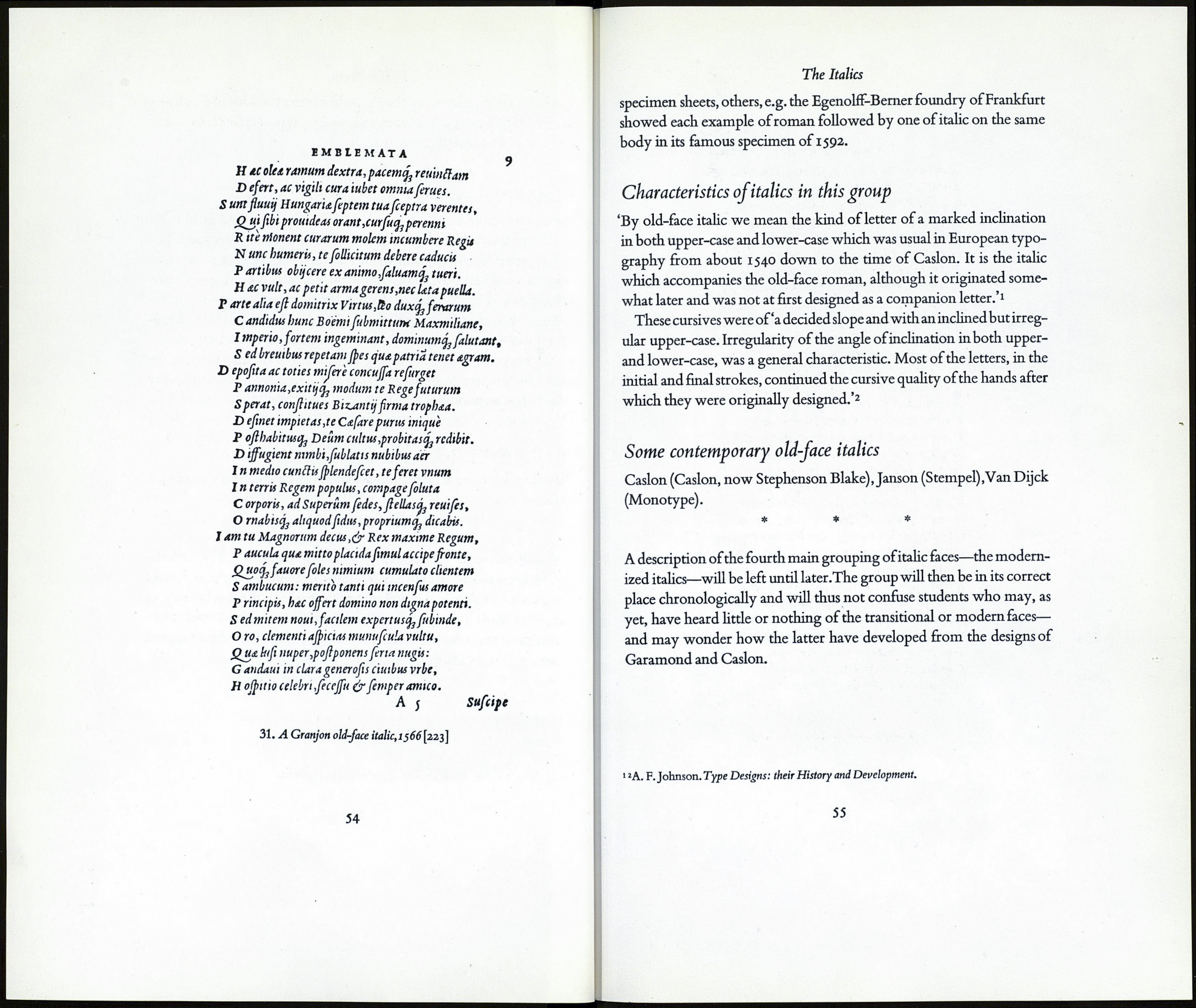
30. The Basle italic, Lyons 1537 [223]
The Italics
THE GROUP OF ITALICS WHICH IS
THE CONTEMPORARY OF OLD-FACE ROMAN
The sixteenth century has been called 'the age of italics.'1 In Italy, the
home of its invention, probably more books were set in italic than in
roman during that period.
Until 1524 the new sloping lower-case characters were accompanied
by roman capitals, but from that time on attempts were made to de¬
sign capitals which would accord, in inclination, with the lower-case.
Arrighi employed upright capitals with his italics but was the first to
design and use a variant with them—swash capitals. By the middle of
the century sloped capitals were becoming the norm in italic founts.
In the example on p. 52 is shown the italic which Mr Johnson says
inaugurated the old-face group of italics2 and which he calls the Basle
italic after its place of origin. It will be seen that the lower-case of this
letter slopes considerably while the upper-case is a collection of letters
—it can scarcely be called an alphabet—of very greatly differing de¬
grees of slope. Despite this peculiarity it became an extremely popular
letter, being used in Germany, France, Italy, and in this country.This
style of italic was firmly established by the French type cutters, the most
notable of whom was Robert Granjon. In our country'from John Day
to William Caslon, all designers were content to follow continental
models.'3
For a considerable time italic was regarded as a type in its own right,
or in other words, as a face distinct from roman. Gradually however
italic came to be employed not for complete books but 'for prehmin-
ary matter, citation, and emphasis'4 only. At the end of the sixteenth
century, writes Mr Johnson'... books set entirely in italic, especially
books of verse, were still common. But there was already one indica¬
tion that the cursives were becoming the servant of roman; they were
being cast on the same body as the romans.'5 And while some printers
& founders continued to show romans & italics quite separately on their
1 » 3 5 д. F.Johnson. Type Designs: their History and Development.
«Stanley Morison. Type Designs of the Past and Present.
53
