First published 1961
by Wace & Company Ltd
This edition published 1998
joindy by The British Library
96 Euston Road
St Paneras
London NWi
UK
and Oak Knoll Press
414 Delaware Street
New Castle
de 19720
USA
by kind permission of Wace UK Ltd
ISBN 0 7123 4577 9 (UK cased edition)
ISBN 0 7123 4563 9 (UK paperback edition)
ISBN 1 884718 43 4 (US cased edition)
isbn 1 884718 44 2 (US paperback edition)
© 1961 Geoffrey Dowding
© 1998 in Foreword Alan Bartram
Library of Congress Cataloging-in-Publication Data
Dowding, Geoffrey, 1911-
An introduction to the history of printing types : an illustrated
summary of the main stages in the development of type design from
1440 up to the present day : an aid to type face identification / by
Geoffrey Dowding.
p. cm.
Originally published: Clerkenwell [London]: Wace, C1961. With new
foreword.
Includes bibliographical references (p. ) and index.
ISBN о-7І2з-45бз-9 (British Library : pbk.). — ISBN 1-884718-43-4
(Oak Knoll Press : hard). — ISBN 1-884718-44-2 (Oak Knoll Press :
pbk.)
1 • Type and type-founding—History. I. Tide.
Z250.A2D6 1997
686.2'гі—dc2i
97-43152
CIP
British Library Cataloguing in Publication Data
A CIP record is available from The British Library
Printed in England by Wace Specialist Print
Burgess (Abingdon)
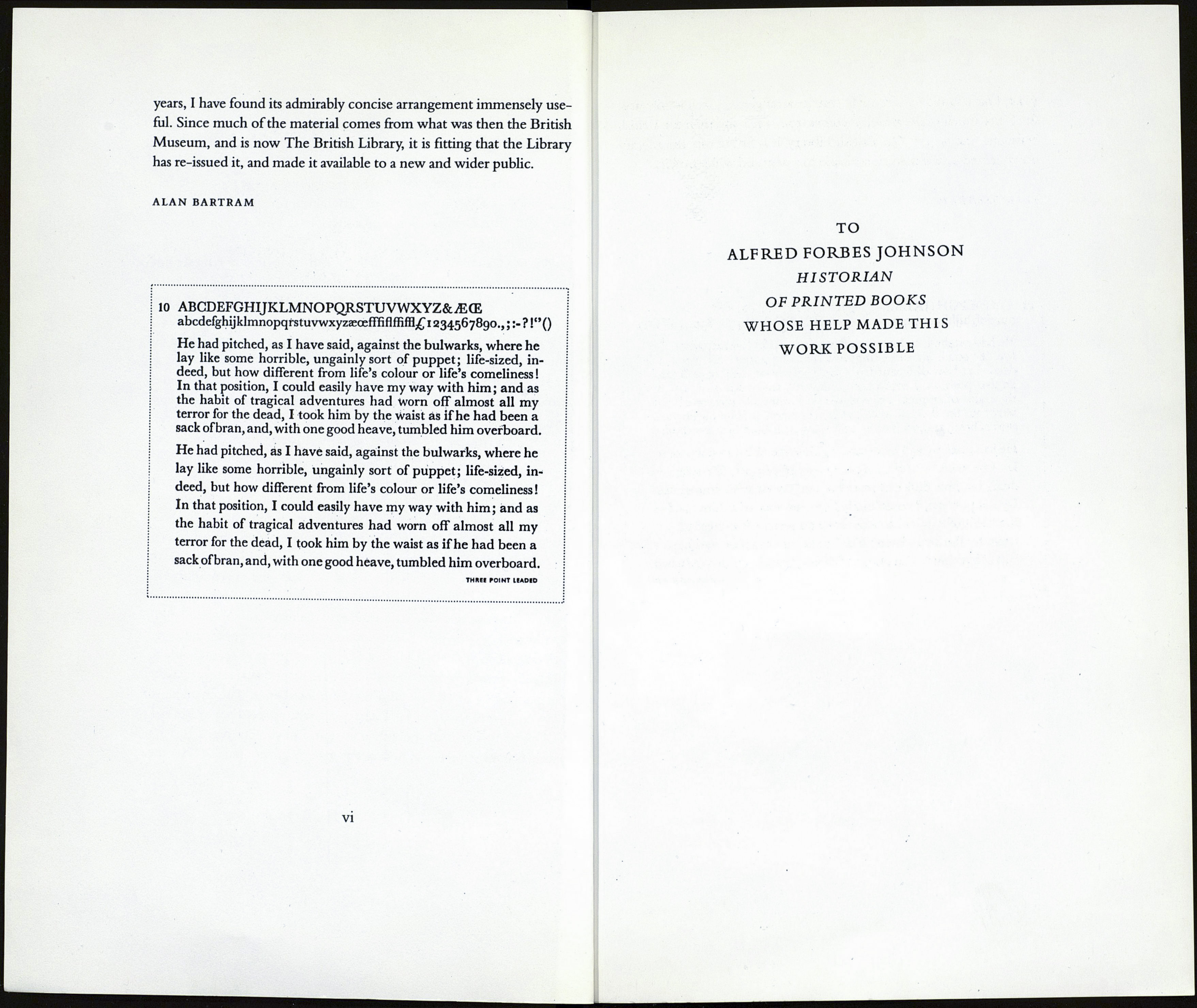
He had pitched, as I have said, against the bulwarks
I met Geoffrey Dowding once. He was checking a page proof. He fin¬
ished by scribbling at the bottom, 'Straighten up'. The printer I was
with said, 'But Geoffrey, you didn't check that, how do you know it's
not straight?' 'Never is, is it?' GD replied.
With today's film output, casually locked-up formes of type are not
one of our worries, and on the whole one need not shed many tears
for the demise of letterpress printing. And, in contrast to today's CD-
Roms, metal type required a lot of storage space. Nonetheless Wace,
like the other big trade typesetting firms of the 50s and 60s, held an
enormous range, both as matrices for hot metal composition and as
metal fonts for hand-set display. They produced a cabinet of type sheets
showing the full alphabet, with its italic and bold, and including figures
and ligatures, of every type and every size held. Four or usually seven
lines of text (taken from Treasure Island) were also shown set solid and
leaded, in all sizes from 6pt to upt. Each sheet was 9/2x14/2 inches.
The full range of Baskerville, for instance, required six of these.
Periodically augmented by new additions, the complete cabinet was
given free to regular customers. To such users, re-reading that imagin¬
atively chosen extract from Treasure Island summons up a vanished era.
A look at those specimen sheets usefully reminds us how subdy or,
sometimes, how extensively, the design of metal types was modified in
different sizes in order to look the same. Although we have learnt to uve
with it—meanwhile availing ourselves of the many advantages of digi¬
tal filmsetting—the use of one master for all sizes is one of the more re¬
grettable developments of the last 25-30 years. It comes second only to
the badly-handled adaptation of many PostScript types, a large number
perpetrated by producers who should know better. The meticulous
Dowding would, with one good heave, have tumbled them overboard.
This book, originally published in 1961, shows metal types. But it is
a history book, and history does not change. (Well, not much.) Over the
v
