Auendotiiodefcritto, Studiofo Lettor
mìo f'armo pentito uno furetto eia im»
farar ferirne fitter a Canee ffar efea,
(agmfe}a mio sudicio ¿iene iff rimo foco ftnif area in»
tetramente non hauertifatisfatto Je ancho non ti di»
moslrauaifmodo di acconciarti fapennaf cofa in taf
exercitio mofto neceffariafifero ingueño miofecon
do fiírecinojiefguafe anchova afatisfatione de modi,
ho fono alcune uarieforti de fitter e (come tu uederai)
ti ho uofuto deferiuere aitivi kern et chiaro modo che
io hofofjuto come tu haf>k a tempe»
rarti detta fenna*
Defeuarìeforti de fitter e foi,che in gueslo Tratta»
teffo trouerai fé io ti uofeffi aduna fer ma deferiuere
tutte fe fue ragioni Jaría troff о fonßofroceffo ¡ Ma
tu hauendo uofanta de imparare* ¿i terrai inanzique
fti exemf ietti, et sforcerati imitarti guanto me»
rai, che in o^nimodofedendoguefCt,fenon in tutto,
almeno inoran farte* te adìuterano confeguire gueffa
forte1 di kterafafiu in effo ti difetterà1. Vißfiafo
adnngue,et confaci ausjiciitiexet-citale a chi uno
(e conferire* ma mrtunientejfie' difítei^
26. The earliest of the formal chancery italics.iw [222]
46
The Italics
precisely that characteristic was discarded which made it most Aldine,
i.e. imitation of a cursive hand.'1
The second group of italic types was also based on the chancery hand
but on a more formal variety practised by the writing masters ofthe
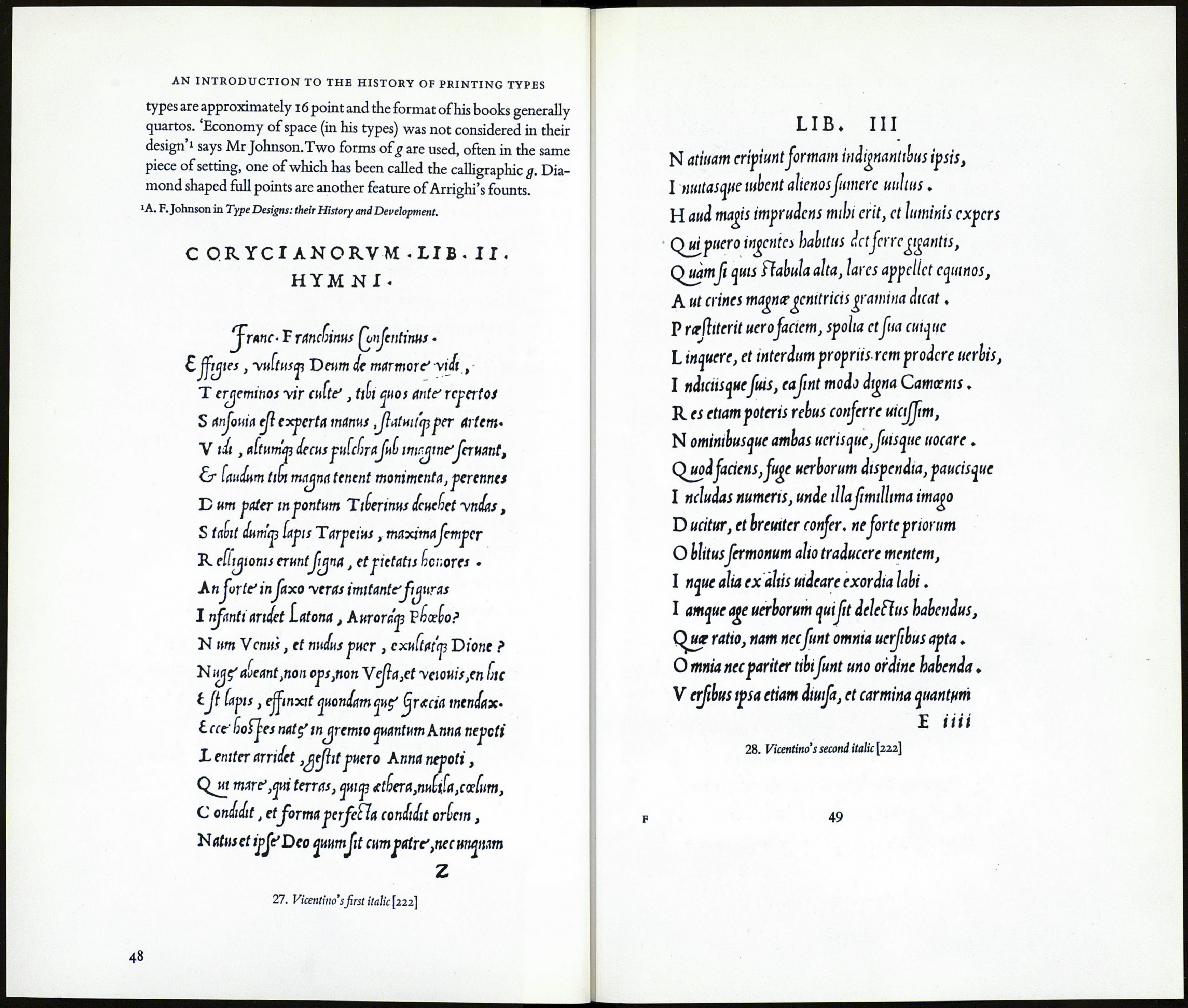
sixteenth century. Arrighi,2 one ofthe most brilliant of these masters
had setded in Rome where he was employed at the Papal Chancery
in writing out apostolic briefs. He published, while still in papal employ,
his first writing manual in 1522. It was printed from wood blocks. In
Venice, in the following year, Arrighi published a continuation also
printed from wood blocks, in which appeared a page of text matter
printed from type—'the earliest ofthe formal chancery italics.'3
In 1524 he turned printer but unlike Aldus, a printer interested only
in the production of fine limited editions. He designed several versions
ofthe formal chancery cursives.Their superiority as types both in de¬
sign and practicality compared with the italics of Aldus, and the hand¬
some books he printed—together with those printed in his type by
Antonio Blado.'the greatest printer at Rome in the sixteenth century'4
—made it inevitable that those of Aldus would be ousted and that the
new italic would be widely copied throughout Europe.
Characteristics ofthe Vicentino italics
'Cursiveness and not inclination is the characteristic of chancery, but
generations of printers have been so accustomed to the inclined italic
that they have come to believe that the word means sloping.'5
The letters are narrow, slightly inclined and are separately formed. In
Arrighi's early founts the ascenders have rounded terminals (called
calligraphic ascenders) in place of serifs but in his later founts serifs re¬
place these.The ascenders & descenders are of generous length. Roman
capitals, shorter than the ascending letters, were used but Arrighi was
the first to design and use swash capitals also.The bodies of most of his
■In Printing Types, Their History, Forms, and Use. Vol I.
'Lodovico degli Arrighi da Vicenza—hence the name 'Vicentino* for this second group
of italic types.
5 * 'A. F.Johnson in Type Designs: their History and Development.
47
