ALEXIS П.
N re fùm dico mfórmis tmi>permtm littore nidi,
ç un pldadum uenhsfhrct mart, non top Vdphmn
I udì œ te тешат ,ft nunquam fittat im лох ■
О tantum libtdt me cum nfci fordidd rurd,
A ta-, burniteti h.ibitare cafas,& fiffrt ceruos
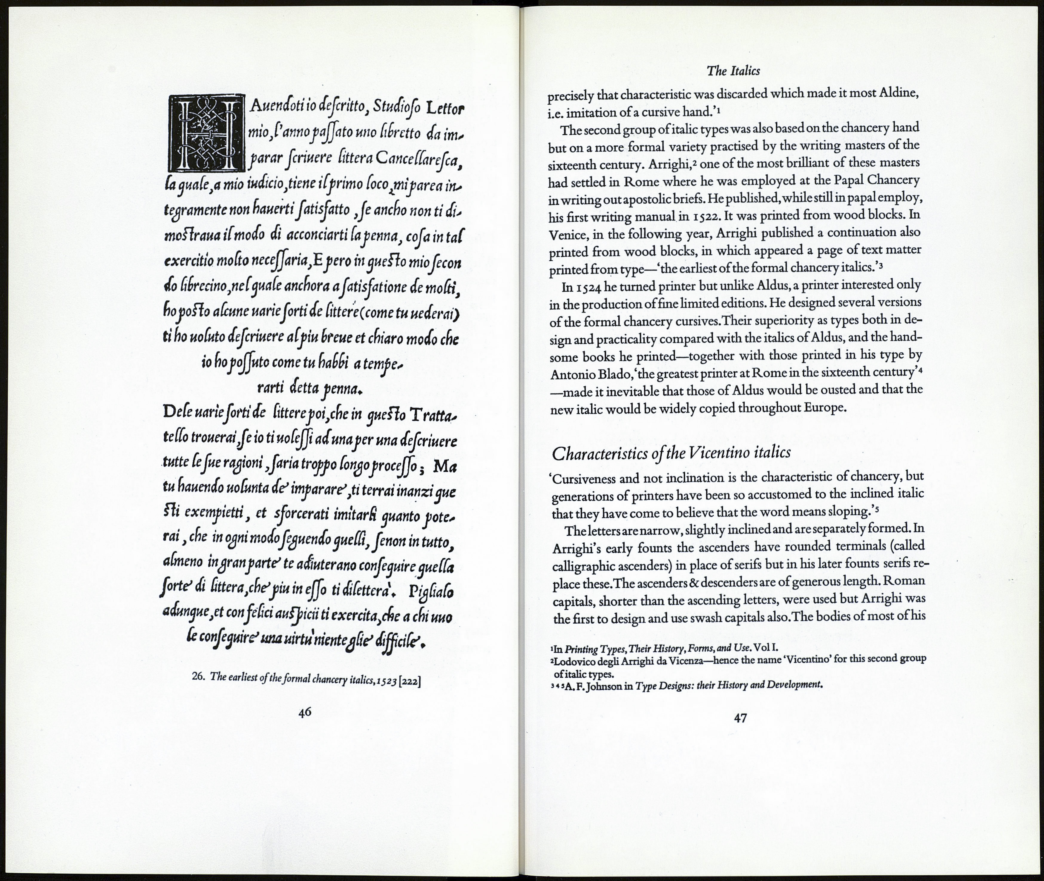
0 cdorumtygregm n'iridi competiere hibfco- Г nßituit,VdncHrdtouestouium'q;magftrof. 1 am pridem л mt illos abduccrc rheftylii or at- E Г dUenttsuioldtjt (ùmmapdpauerdcttrpcns, d itti 25. The first italic type.isoo [222] 44 The Italics of a type based on the Chancery hand he had the first of all italic types Characteristics of the Aldine italic With the chancery cursive hands the Renaissance scribes used roman The Aldine italic is a slightly sloped letter .The b,d,h,k and /, are seriff- The roman capitals are shorter than the ascending letters: even the THE VICENTINO ITALICS The wide distribution and popularity of the Aldine italics were not •In Printing Types, Their History, Forms, and Use. Vol I. 45
M emm una m fyluif mitabere l'dtidatnendo.
P an primuscaUmot e
N ее tt peenittdt caUmotriuiffè Idbellum-
H хс tddem ut Caret ,auidnon ßciebat ,Amyntas ?
E ft mihi dißidribui ßptemcompdebt acuris
F ißula ,Ddmœtas dono mihi quam de dit olvrn,
E t dixitmor'iensjxnunc habetifht ßrundum-
D ixi:Damcehts jnuiditßultus kmyntas-
V rdttred duo ntc tut* mihi uallc reperti
С dpreoli ,fpdr(is etidm nunc pclhbusalbo,
В ¡nadie ficrtntouif uberd,auostibi feruo-
E t ficict • auonUm ¡ardent tibi muntrd noflrd.
H Utddcí о fbrmofe puer tibi lilia pienti
M drciflùmtet floremiunojtbene oltntisdnethi,
T umcaftd,dta¡dlijsmtexens fuduibusherbis,
M oìlid luteold pmgt Hdcinid atlthd •
I pß eoo cAnd legtm ttnerd LnugnemaU,
с dfhtnedi'oitwctstmtd<[Hds Kmaryllisdmabdt•
A dddm cared pruna^t honos erit huit
cut in the year 1500. In the following year he issued his first cheap 8vo
volumes (page size ofthe Virgil approximately 6" X 3І") set in the new
letter .The popularity of these small books ensured a wide distribution
for the new cursive & it was widely copied throughout Europe,versions
of it eventually finding their way to England.'With the Aldine italic,'
wrote Mr Updike 'originality of idea in type-forms ceases.'1
capitals. Naturally Aldus followed them when he designed his italic
type. Unfortunately he also followed the scribes in ligaturing or tying
many characters and largely because of this his type has been described
by Mr Johnson as having the characteristics of a'hasty script.'2 Aldus
tried to make his new type imitate handwriting but only succeeded in
complicating the compositor's work: over sixty ligatured letters have
been counted in some of his books ! It is as well that no contractions
were cut for use with this type.
ed at the ascender line only and the p and a are seriffed at the descender
line only. In the latter this serif is a noticeably strong cross-stroke.The
shape & treatment of these serifs varies considerably in chancery types.
dot over the i is higher than the capitals. Sloping capitals for use with
italic lower-case were not generally introduced until about 1550.
sufficient to secure them to posterity—except in an historical sense.
They failed because ofthe weaknesses inherent in their design/Italic,'
wrote Mr Updike/became a workable type for the printer only when
»In Type Designs: their History and Development.
