Й5
to
g
1
3
9
=
В в!
¡
i
S
*9
OC
UJ
Û
oc
Ш
I-
Ш
z
о
<
и
I
I
s
5ß
5©
0\
oo
s
в
SANS SERIF
This group of faces represents the next essay on the part of the early
nineteenth century typefounders in types cut specifically for the job¬
bing printing field.The first sans serif type appeared as a single line
specimen under the name Egyptian in William Caslon IV's specimen
book of 18 ió.This type, roughly the equivalent of Gill Bold in weight,
was repeated in a specimen issued about 1819. Then apparently no more
was seen of the new letter form until black, clumsy versions appeared
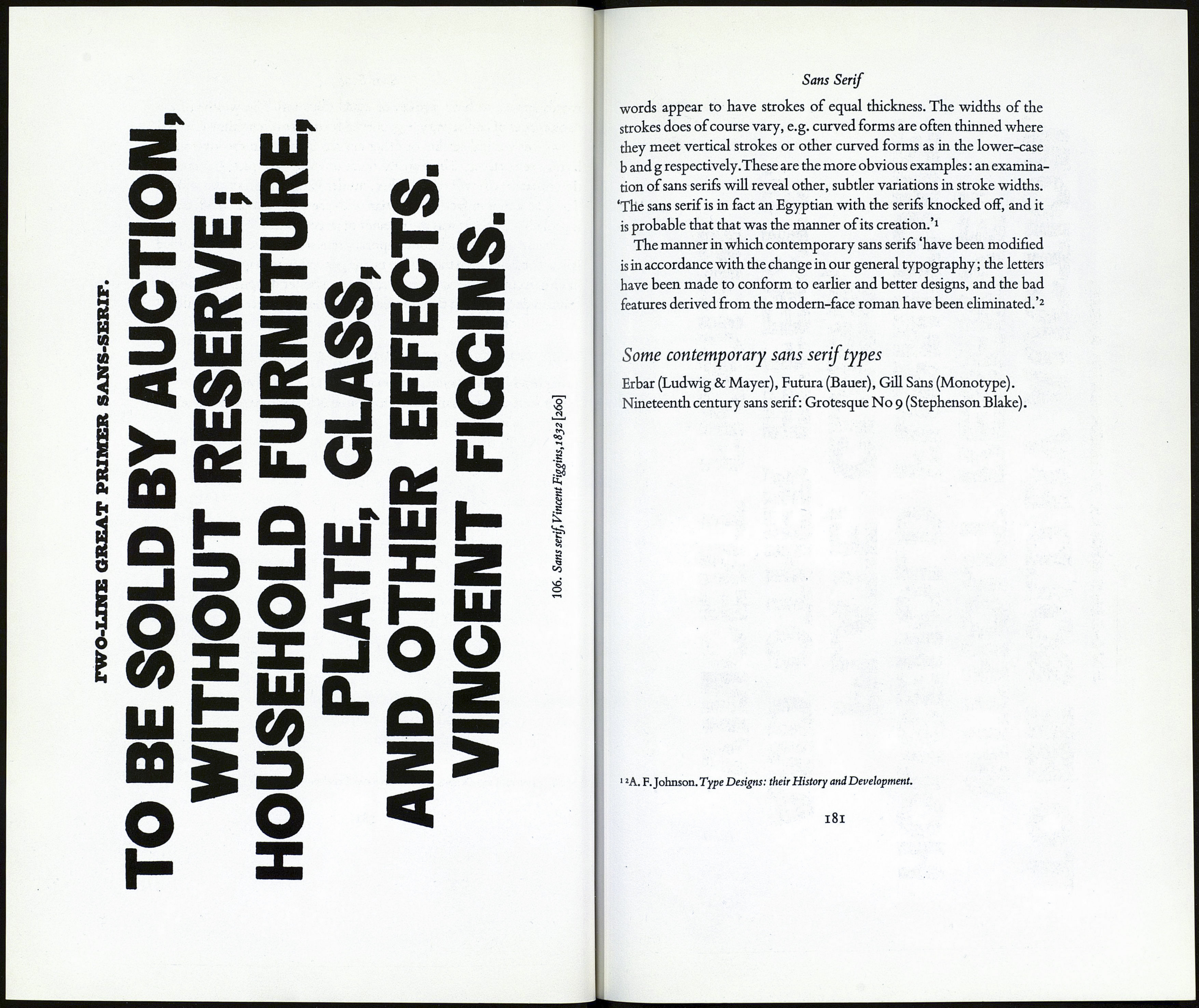
under their correct name, sans serif, inVincent Figgins's specimenbook
of 1832. In the same year William Thorowgood showed a specimen
under the apt name of grotesque, a name admirably suiting many con¬
temporary revivals of nineteenth century sans faces also. Besides the
descriptive sans surryphs used by Blake and Stephenson of Sheffield in
1833 curious names were coined for these early sans serif types includ¬
ing Doric and Gothic, the latter 'presumably due to the fact that the
early types in this style were heavy, black letters, which by their colour
recalled the early gothic or black-letter types.'1
Besides being heavy & black most of the early sans serifs were tidings,
with letters of monotonously uniform width, this trait, of course, de¬
riving from the'modem'face. Lighter cuttings of sans serif faces came
later. No lower-case appears to have been cut in England before the
1870's though in America and in Germany sans serifs equipped with
lower-case were in use long before that time.The Schelter and Giesecke
foundry appear to have issued such a letter in 1830.
The most important characteristic of types in this group is implicit
in the name—the absence of serifs.The letters are monoline, or, in other
■A. F.Johnson. Type Designs: their History and Development.
179
