centre of a letter would result from a simple
progression if it were left to the peripheral vision. But
though this seems to be chiefly so, the fovea which is
about a third of a millimetre across just alters the
results obtained by the great bulk of the eye's
receptors in the periphery. Further the fovea appears
to affect the letters at their tops. It is well known and
easily verified that the eye, at least when reading,
centres its vision just along the top line of the
lettering, be they capital letters or lower-case x height
The centring of vision seems, as I say, to follow the
top line of the x height of lower-case, and from a
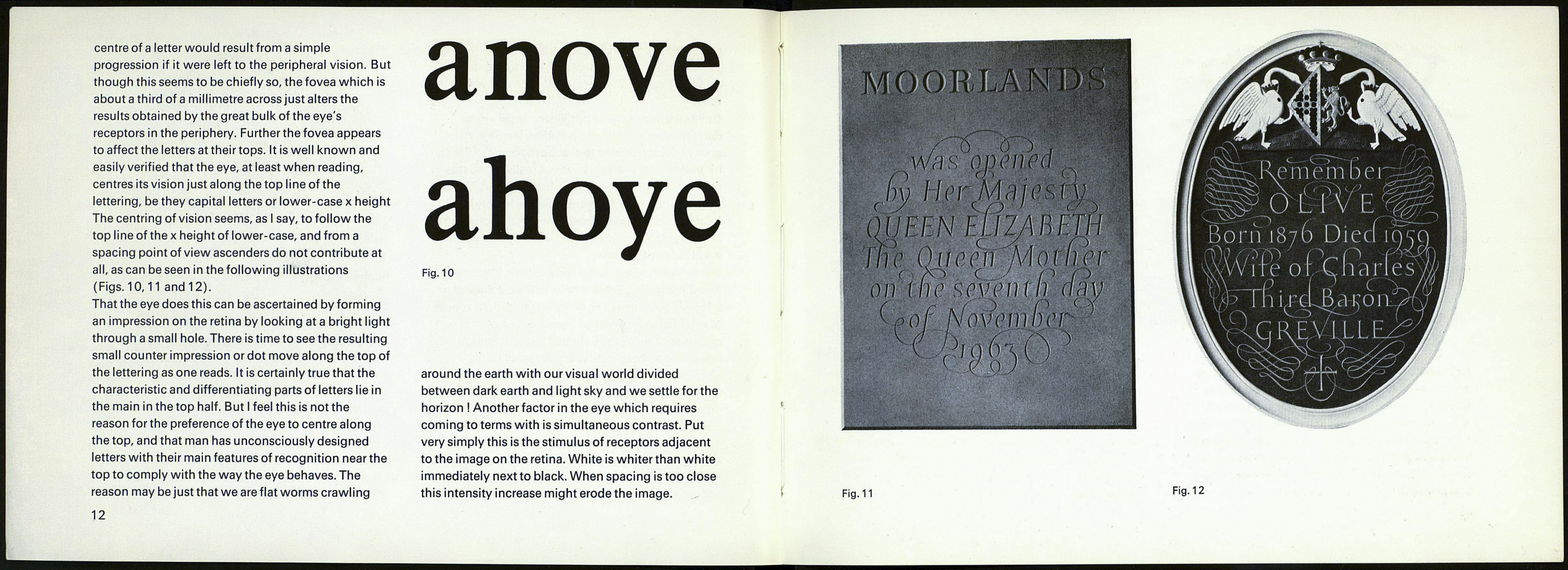
spacing point of view ascenders do not contribute at
all, as can be seen in the following illustrations
(Figs. 10,11 and 12).
That the eye does this can be ascertained by forming
an impression on the retina by looking at a bright light
through a small hole. There is time to see the resulting
small counter impression or dot move along the top of
the lettering as one reads. It is certainly true that the
characteristic and differentiating parts of letters lie in
the main in the top half. But I feel this is not the
reason for the preference of the eye to centre along
the top, and that man has unconsciously designed
letters with their main features of recognition near the
top to comply with the way the eye behaves. The
reason may be just that we are flat worms crawling
12
anove
ahoye
Fig. 10
around the earth with our visual world divided
between dark earth and light sky and we settle for the
horizon ! Another factor in the eye which requires
coming to terms with is simultaneous contrast. Put
very simply this is the stimulus of receptors adjacent
to the image on the retina. White is whiter than white
immediately next to black. When spacing is too close
this intensity increase might erode the image.
QUEEN E
Fig. 11
Fig. 12
