appear as they would if set solid in type. In other
words an example, more or less, of spacing based on
the widths of letters. My completed design for a
street name alphabet was turned down by the
Cambridge Council and a fierce correspondence
arose in the local press. Ultimately my alphabet plus
systems of spacing for two other alphabets - 'Gill
Sans' and 'Standard M.o.T.'-were bought by the
Ministry of Transport. Without realizing it Cambridge
chose my alphabet out of a catalogue and after all
my signs gradually appeared in the streets I
This, then, was the beginning of my interest in the
spacing of alphabets by eye so that all letters would
fit together automatically whatever order was chosen.
Whilst engaged on my street name alphabet I formed
a very strong opinion that I was only scratching at the
problem of letter-spacing, and that somewhere
deeper than I could see for the moment there was a
set of rules that could be applied to all alphabets, and
perhaps all symbols that were arranged laterally,
and that these rules if closely parallel to the function
of the eye would achieve good spacing. This is the
really important thing - the eye - how does it
balance, how does it space ; and yet this is not all,
because what we know of spacing seems directly to
contradict the simple interpretation of the image on
the retina. The cerebral cortex perhaps only uses the
retinal image and then blends this information with
experience received from the other senses.
Optical centres
It was many years before I could again return to the
problems of optical spacing. I n fact the first 'credit
squeeze' produced cancellations of commissions
which gave me the time to return again to the task.
I believe it was 1961 when we started endlessly
counting the millimetre squares on graph paper that
fell within the bounds of letters. I wanted to know
what happened if spacing were directly related to
letterarea (Fig.3).
CCDDFFIIJJLLMMOOPP
CCDDFFIIJJLLMMOOPP
CCDDFFIIJJLLMMOOPP
Fig. 3
6
Here we have
(1 ) optical spacing and centres ;
(2) letter width spacing ;
(3) area spacing and area centres.
No joy here, and yet there was something. In this
particular alphabet some letters had the same area
but obviously they could not have the same space.
Moreover they did not express the eye-preferred
centres when the area was divided equally on either
side of a vertical line. I had already learned from my
previous attempts at automatic eye-spacing that the
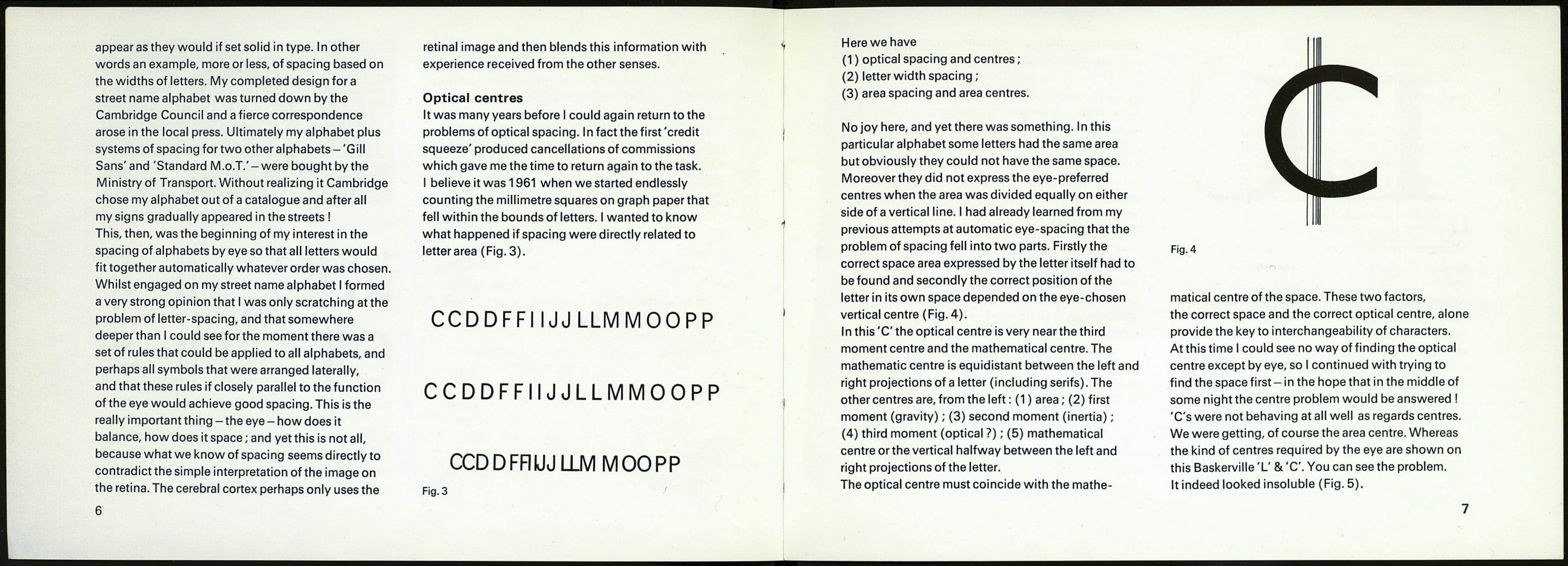
problem of spacing fell into two parts. Firstly the
correct space area expressed by the letter itself had to
be found and secondly the correct position of the
letter in its own space depended on the eye-chosen
vertical centre (Fig. 4).
In this 'C' the optical centre is very near the third
moment centre and the mathematical centre. The
mathematic centre is equidistant between the left and
right projections of a letter (including serifs). The
other centres are, from the left : (1 ) area ; (2) first
moment (gravity) ; (3) second moment (inertia) ;
(4) third moment (optical ?) ; (5) mathematical
centre or the vertical halfway between the left and
right projections of the letter.
The optical centre must coincide with the mathe-
Fig.4
matical centre of the space. These two factors,
the correct space and the correct optical centre, alone
provide the key to interchangeability of characters.
At this time I could see no way of finding the optical
centre except by eye, so I continued with trying to
find the space first - in the hope that in the middle of
some night the centre problem would be answered I
'C's were not behaving at all well as regards centres.
We were getting, of course the area centre. Whereas
the kind of centres required by the eye are shown on
this Baskerville 'L' & 'C'. You can see the problem.
It indeed looked insoluble (Fig. 5).
7
