TRUMPINGTON
STREET
The beginning
Shortly after the war, I think in 1947, Mr Crutchley,
the University Printer, and I were horrified to wake up
one morning to find the unique and characterful
cast-iron street names being removed from the
centre of Cambridge. Furthermore they were being
replaced by a particularly bad sample of Ministry of
Transport lettering - equally badly spaced. It was
believed that the new street signs were more legible
and thus the change was justified. All praise goes to
The City Engineer, who promptly put back the cast-
iron signs when it was pointed out that at least it was
doubtful whether the new signs were more legible
than the old. Unfortunately the patterns from which
the cast-iron signs were cast had ceased to be
available and new streets and roads required name¬
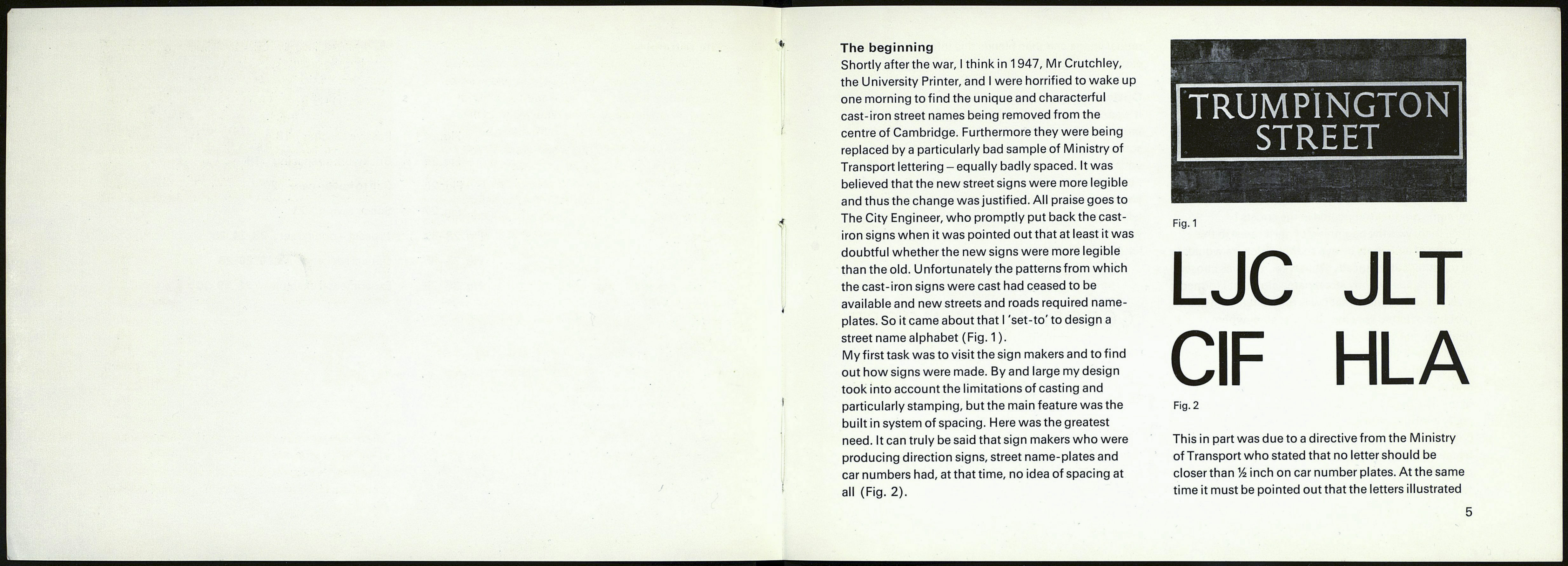
plates. So it came about that I 'set-to' to design a
street name alphabet (Fig. 1 ).
My first task was to visit the sign makers and to find
out how signs were made. By and large my design
took into account the limitations of casting and
particularly stamping, but the main feature was the
built in system of spacing. Here was the greatest
need. It can truly be said that sign makers who were
producing direction signs, street name-plates and
car numbers had, at that time, no idea of spacing at
all (Fig. 2).
Fig. 1
LJC JLT
CIF HLA
Fig. 2
This in part was due to a directive from the Ministry
of Transport who stated that no letter should be
closer than Vz inch on car number plates. At the same
time it must be pointed out that the letters illustrated
