abcdefghijklmnopqrst
uvwxyzabcdefghijklm
nopqrstu vwxyz abcdef
ghijklmnopqrstuvwxy
zabcdefghijklmnopqrs
tuvwxyz
Fig. 29
undertaken by Dr Poulton at Cambridge in
conjunction with the Council of Industrial Design
confirms one's belief that letter differentiation is a
strong clue to the achievement of a greater
comprehensibility of type matter. The results of his
research showed, amongst the types tested, no
real difference between a good sans serif and a good
seriffed type. However, it did show Gill Sans Medium
to be statistically superior to other sans serif faces.
This type is both classical and geometrical in design -
abcdefghijklmnopqrst
uvwxyzabcdefghijklmn
opqrstuvwxyzabcdefgh
ijklmnopqrstuvwxyzab
cdefghijklmnopqrstuv
wxyzabcdefghijklmnop
qrstuvwxyz
Fig. 30
two good reasons why it made such a good showing.
There is, however, one other factor, that may or may
not have contributed to its comprehensibility factor.
And that is its spacing. It has a markedly wider set for
all its narrower letters than the other sans serif types,
against which it was tested, and this in spite of its
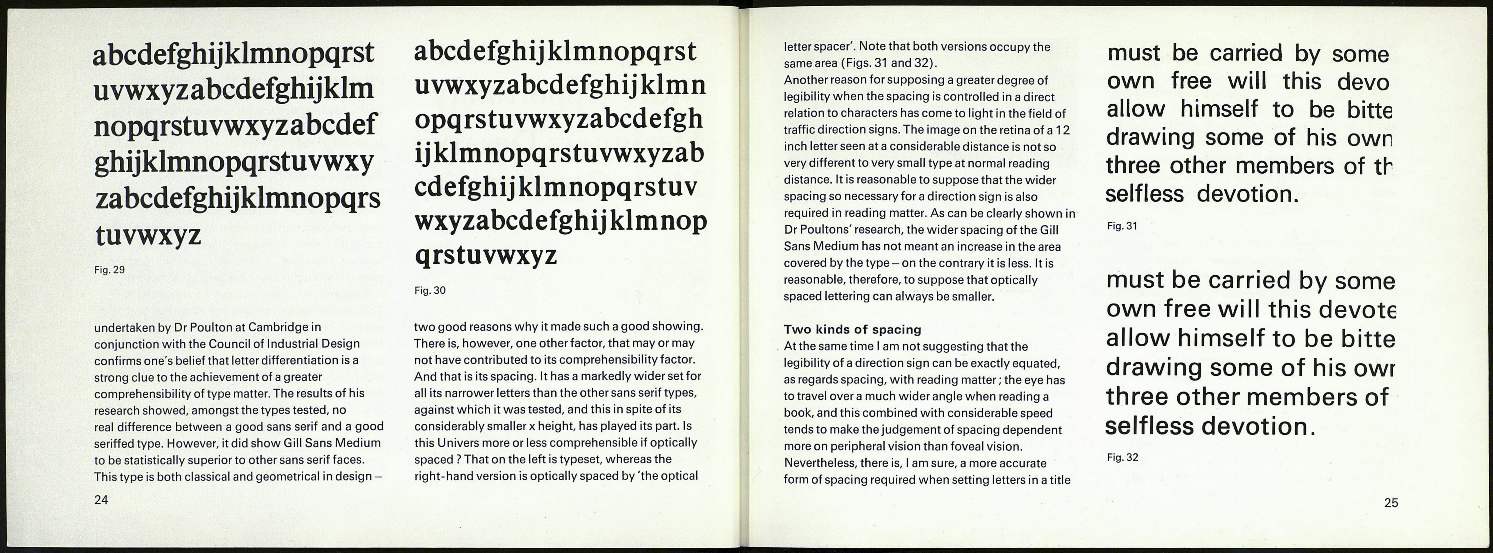
considerably smaller x height, has played its part. Is
this Univers more or less comprehensible if optically
spaced ? That on the left is typeset, whereas the
right-hand version is optically spaced by 'the optical
24
letter spacer'. Note that both versions occupy the
same area (Figs. 31 and 32).
Another reason for supposing a greater degree of
legibility when the spacing is controlled in a direct
relation to characters has come to light in the field of
traffic direction signs. The image on the retina of a 12
inch letter seen ata considerable distance is not so
very different to very small type at normal reading
distance. It is reasonable to suppose that the wider
spacing so necessary for a direction sign is also
required in reading matter. As can be clearly shown in
Dr Poultons' research, the wider spacing of the Gill
Sans Medium has not meant an increase in the area
covered by the type - on the contrary it is less. It is
reasonable, therefore, to suppose that optically
spaced lettering can always be smaller.
Two kinds of spacing
At the same time I am not suggesting that the
legibility of a direction sign can be exactly equated,
as regards spacing, with reading matter ; the eye has
to travel overa much wider angle when reading a
book, and this combined with considerable speed
tends to make the judgement of spacing dependent
more on peripheral vision than foveal vision.
Nevertheless, there is, I am sure, a more accurate
form of spacing required when setting letters in a title
must be carried by some
own free will this devo
allow himself to be bitte
drawing some of his own
three other members of th
selfless devotion.
Fig. 31
must be carried by some
own free will this devote
allow himself to be bitte
drawing some of his owr
three other members of
selfless devotion.
Fig. 32
25
