fanciful Victorian diaplay types seem to sense the
need for bringing the optical centre over as near to
the mathematical centre as possible. The secret of a
good fit and an economical one lies precisely in
moving the optical centre towards the mathematical
centre.
This is only one way the machine has of influencing
the design of letters. Another is in guiding the
designer to produce a letter in complete accord with
its space
As I have already stated, the space allotted to any
character must ideally be an expression of that
character. Therefore it would also be true that, if the
space is predetermined, the letter must be an
expression of the space. In other words, the intensity
of two characters that are to occupy similar spaces
must be equal for the retina. This does not mean of
course, that the designs must be similar, but that their
weight expressed in moment terms around a centre
must be equal. If therefore it is desirable to produce
an alphabet with only six different unit widths, it is
equally desirable that the letters have only six
different weights, if spacing and colour are
considered important.
To be asked as a designer to alter his design from this
point ofview seems to meto be something he would
understand and wish to do. But to be told simply to
22
narrow or expand the letter to occupy a larger or
smaller unit width is not any longer quite good
enough, particularly when the end result does not
seem quite to justify it.
The influence of calligraphy
I have always been mesmerized by good calligraphy.
Not only is there the marvellous co-ordination of
hand, eye, and attention to watch in the good
calligrapher at work, but there is the further miracle of
spacing. We with predetermined letter forms have no
excuse for bad spacing - in theory we can move our
letters about until they look right, or do it all again.
The calligrapher must do it right the first time. And by
right we mean shape his letters and space them at the
same time. This he does in an apparently effortless
manner. What judgement I We have been talking
about putting any one letter in a passive position
between any two. The calligrapher has the very
remarkable talent of placing a letter where it will be in
the passive position between two, but only when he
has put down the third letter. Little things may please
little minds, but this certainly pleases me I To make
things still more complicated the calligrapher can
expand or condense his letter forms in the minutest
way in order to justify his text. Indeed in the last
analysis 'justifying' can only be done if everything is
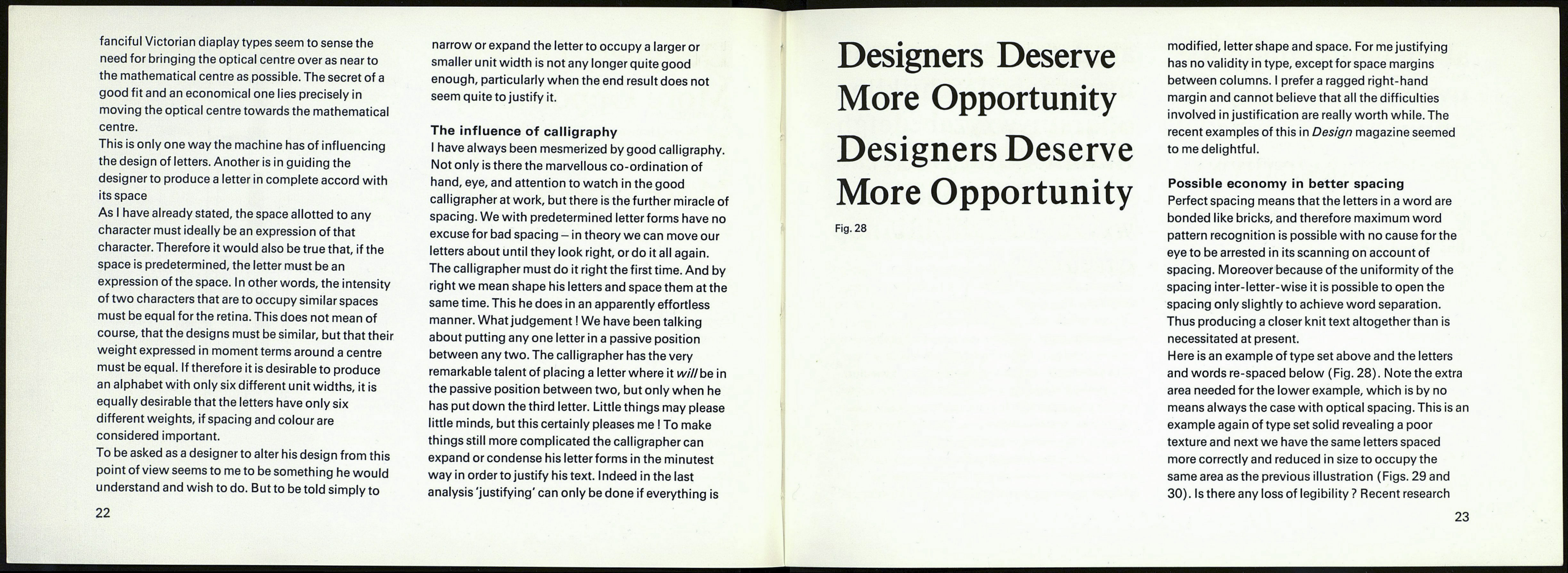
Designers Deserve
More Opportunity
Designers Deserve
More Opportunity
Fig. 28
modified, letter shape and space. For me justifying
has no validity in type, except for space margins
between columns. I préféra ragged right-hand
margin and cannot believe that all the difficulties
involved in justification are really worth while. The
recent examples of this in Design magazine seemed
to me delightful.
Possible economy in better spacing
Perfect spacing means that the letters in a word are
bonded like bricks, and therefore maximum word
pattern recognition is possible with no cause for the
eye to be arrested in its scanning on account of
spacing. Moreover because of the uniformity of the
spacing inter-letter-wise it is possible to open the
spacing only slightly to achieve word separation.
Thus producing a closer knit text altogether than is
necessitated at present.
Here is an example of type set above and the letters
and words re-spaced below (Fig. 28). Note the extra
area needed for the lower example, which is by no
means always the case with optical spacing. This is an
example again of type set solid revealing a poor
texture and next we have the same letters spaced
more correctly and reduced in size to occupy the
same area as the previous illustration (Figs. 29 and
30). Is there any loss of legibility? Recent research
23
