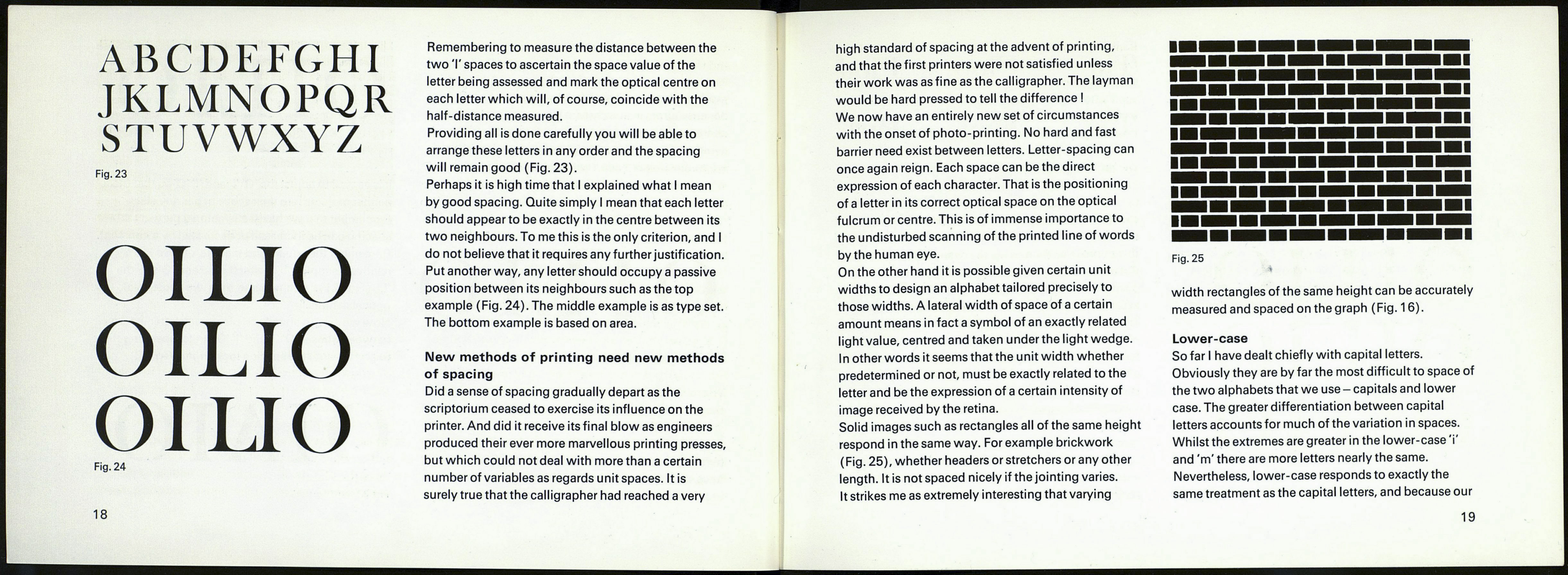
ABCDEFGHI
JKLMNOPQR
STUVWXYZ
Fig. 23
OILIO
OILIO
OIUO
Fig. 24
Remembering to measure the distance between the
two T spaces to ascertain the space value of the
letter being assessed and mark the optical centre on
each letter which will, of course, coincide with the
half-distance measured.
Providing all is done carefully you will be able to
arrange these letters in any order and the spacing
will remain good (Fig. 23).
Perhaps it is high time that I explained what I mean
by good spacing. Quite simply I mean that each letter
should appear to be exactly in the centre between its
two neighbours. To me this is the only criterion, and I
do not believe that it requires any further justification.
Put another way, any letter should occupy a passive
position between its neighbours such as the top
example (Fig. 24). The middle example is as type set.
The bottom example is based on area.
New methods of printing need new methods
of spacing
Did a sense of spacing gradually depart as the
scriptorium ceased to exercise its influence on the
printer. And did it receive its final blow as engineers
produced their ever more marvellous printing presses,
but which could not deal with more than a certain
number of variables as regards unit spaces. It is
surely true that the calligrapher had reached a very
high standard of spacing at the advent of printing,
and that the first printers were not satisfied unless
their work was as fine as the calligrapher. The layman
would be hard pressed to tell the difference I
We now have an entirely new set of circumstances
with the onset of photo-printing. No hard and fast
barrier need exist between letters. Letter-spacing can
once again reign. Each space can be the direct
expression of each character. That is the positioning
of a letter in its correct optical space on the optical
fulcrum or centre. This is of immense importance to
the undisturbed scanning of the printed line of words
by the human eye.
On the other hand it is possible given certain unit
widths to design an alphabet tailored precisely to
those widths. A lateral width of space of a certain
amount means in fact a symbol of an exactly related
light value, centred and taken under the light wedge.
I n other words it seems that the unit width whether
predetermined or not, must be exactly related to the
letter and be the expression of a certain intensity of
image received by the retina.
Solid images such as rectangles all of the same height
respond in the same way. For example brickwork
(Fig. 25), whether headers or stretchers or any other
length. It is not spaced nicely if the jointing varies.
It strikes me as extremely interesting that varying
Fig. 25
width rectangles of the same height can be accurately
measured and spaced on the graph (Fig. 16).
Lower-case
So far I have dealt chiefly with capital letters.
Obviously they are by far the most difficult to space of
the two alphabets that we use- capitals and lower
case. The greater differentiation between capital
letters accounts for much of the variation in spaces.
Whilst the extremes are greater in the lower-case Y
and'm' there are more letters nearly the same.
Nevertheless, lower-case responds to exactly the
same treatment as the capital letters, and because our
19
